A Handful Of Uniform Concepts
 Sunday · Aug 19 · 2007 | 9:17 AM PDT
  2 Comments
 My web travels today led me to Erik Kuhre's Portfolio of Art & Design site. Found a handful of jersey concepts I thought I'd share this afternoon. So let's dive right in.
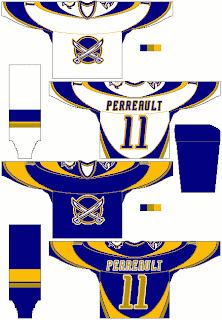
Buffalo Sabres fans, you want blue and gold? Here's blue and gold. And a lot of it.
That's quite something, I thought. A little too much to actually be an NHL jersey, but there it is. I'm a big fan of that crossed-sabres logo but I like it better in black and red.
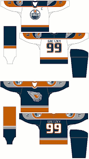
Here he had some fun with the Edmonton Oilers' third jersey logo — a logo I'm rather fond of. I don't like the orange in it, though. The blue looks better. That being said, I don't hate it on the blue jersey. I think the silver along the sleeves is pretty cool too. The Gretzky 99 sells me completely.
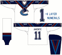
 We know the Vancouver Canucks are getting new colors for this season, but take a look at this design anyway. I like the use of the "V" around the collar of this jersey, but the recolored '80s logo is too far down the sleeve at the cuff. The gloves would hide it. I also like the "V" on the sleeves and pants of this uniform concept.
I've got one more design to share from this artist, but I'm going to save it for a later post. I've got a bunch of New York Islanders concepts to add in the near future.
But anyway, what do you guys think of all these? Good work or not so much?


Reader Comments (2)
y does it say amonte on the canucks jersey
anyway the white oilers jersey looks good IMO but the flying gear with the orange centre is a little much
This is the artist of those designs. These designs were made back in 2002 (hence why you see Peca's name on the Islanders jersey). As for Amonte, at the time there were rumors that he was heading to Vancouver in a trade.
With the Sabres, I was trying for a modern look to old colors. I then tried the same template on the Islanders with the lighthouse logo, which IMO the best design they had.
As for Edmonton. I was never fond of the current navy and copper scheme. I tweaked the original colors, added in the silver, and at the time, the craze of having an alternate logo on the dark jersey was in. The orange oil drop was to match the original logo's oil drop. The design itself, is a modernization of the original home jerseys with larger "shoulder" yokes.