A Wild Design!
 Thursday · Aug 2 · 2007 | 1:43 PM PDT
  11 Comments
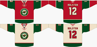
 Check this out, Minnesota Wild fans. Some among you seem to think your team can break from the pack and wear something other than white at home. Outrageous! Seriously, though. Check out this fan-created concept.
We have heard that the Wild will be converting their red third jersey to their permanent home jersey, dropping the greens altogether. But this design suggests using the wheat color on the road jerseys. A radical concept to be sure, I think it would be great! All that white... it blends into the ice, you know?
Actually, I like both of these designs a lot. I think they would be among the best in the entire league if the Wild go with something in this neighborhood. But I want to know what Wild fans think. Do you prefer the red or green at home? And would you like white or wheat for the road sweaters?


Reader Comments (11)
You've lost your mind Chris. They're God awful. They looked terrible last year and will probably look just as bad this year. Maybe it's the Christmas colours.
Too bad, they have a damn original logo.
The Quebec Remparts use this template for their jerseys. The simply substituted the green for black. Their wheat or cream jersey is actually very nice.
I've never had a mind, anonymous, so to just now have lost it would be incredible to me. Anyway, to each his own, right? You can't please everybody with anything. And what have you got against Christmas colors?
Thanks for the comment! How do you think they should redesign their uniforms to improve them?
they are cool but i really like the jersey's that they have now. they shouldn't change from them in my opinion.
Me too I agree with anonymous. I live in Quebec and the Remparts have a great looking cream jersey.
They should definately take that red jersey for their home games.
I love the Remparts jerseys too
I absolutely hate those third jerseys. Red and green on a jersey should only be used at Christmas time. I don't see why they'd take their awesome logo and make it smaller and put it inside of a circle. Not impressed if they do this.
(I love their current jerseys. One of the nicest in the league minus the third)
Sorry Anthony, there's a lot of people in Minnesota who would disagree with you here, and speaking of which, I don't live in Minnesota, and I love those designs.
It has been established that the red design, or something similar, will be used as their home jersey for next season. That leaves us trying to figure out the (off-)white jersey template.
Love the work done here.
I would love to see the Wild go with this design. Minnesota is a historical hockey bed, with lots of tradition- even though it is an expansion team. I think the Quebec jerseys look great. I agree that the Primary logo is too small- so I would hope that the chest crests would be larger to show off the best logo in sports (my humble opinion). The cream color whites would also look wonderful- but I do not think that the NHL will allow that.
If the NHL didn't suspend the third jersey program for at least one season, I wouldn't be so sure the Minnesota Wild were going to their red alternate jerseys as the home jersey for the 2007-2008 campaign. However, I'm glad they went with that choice given its popularity among Wild fans. I don't know why, but for some reason, the original road-turned-home green jerseys didn't look as good on television as it does in person. I own a mint-condition authentic Marian Gaborik jersey purchased in December 1999 and I think it looks sharp. Any tweaking of that jersey I would certainly welcome.
As for that concept you posted, if and only if the team decides not to continue wearing their original jerseys anytime in the future (even after the NHL brings back the third jerseys), I would not mind it. But I'm more of a fan of the original crest logo.
Meantime, I think you should really post this concept originally presented by "daynio" at sportslogos.net and has forwarded to the official Wild message board as well. This person created a very nice concept for a secondary logo as well, very innovative (if that's the right word).
http://boards.wild.com/index.php?showtopic=13913&st=120
Thanks, Paul! That is really an awesome design. Expect to see it posted here later today!