Hey, Canada! Part 1
 Thursday · Aug 23 · 2007 | 10:46 AM PDT
  8 Comments
 All right, my friends north of the border, today is going to be your day, by my own official decree. I've got Canadian team content up the you-know-what today. (Pardon.) I'm going to start out in your capital. (Sounds wrong now, doesn't it?)
We all know the Ottawa Senators just unveiled their new logo and uniforms last night to much fanfare. Response — at least here at NHLToL — has been widely mixed. Some love it. Some hate it. Some want it to go sit in the corner and think about what it did. Some are indifferent, too, or whatever.
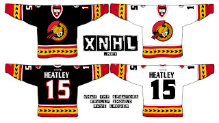
Having said that, I have a rather eager reader interested in gauging your feelings on a concept design he came up with. Behold.
I'd have to say it's pretty nice, if I'm being asked to share an opinion. I always thought the black third jerseys were the best they ever came up with. And I like the side-view logo which we all thought was going to be unveiled last night. It wasn't so I'm led to believe it will be a possibility for an alternate uniform when the league reinstates that program. But that's just me saying that. I have no idea if it's true.
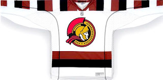
But wait, Sens fans, I have more. A lot's been made of the new shoulder patch that harkens back to the days of the Silver Seven, so what it if they took it a step further? This concept was sent to me and it's quite something.
I don't really have the words for that. Do you have any? Leave me a comment.


Reader Comments (8)
Yeah...I like that. It looks very authentic to me. I think of Lucius Vorenus ala HBO's "Rome" slicing heads off. That was a nice job.
-Charlie
www.SabresNotSlugs.com
thats not a concept. that is there AHL affiliate jerseys except there home one are red instead of black.
Thanks for putting mine up! I'll have more for you quite often, with a leafs one to start with in an hour or so.
i miss the horizontal striping that is lacking on EVERY RBK sweater!!!!
That's basically the Ottawa 67's home jersey with the new Sens logo...
It is the 67s jersey with the sens logo.
I love the top idea. The other idea is too much like the Ottawa 67's
I think the sens should just go with no logo and just black-red-white stripes for their new 3rd jersey. Who's with me?!?