New Source For Bolts Logo Leak?
 Friday · Aug 24 · 2007 | 2:52 PM PDT
  24 Comments
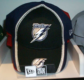
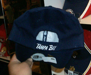
 The Tampa Bay Lightning's new logo may have been leaked back in July but we'll obviously find out tomorrow whether that's true or not. Reaffirming that belief are these photos of a new hat.
The team has responded to the original leak by saying that it's close but not quite how the new logos will look. That seems to be confirmed by the secondary logo seen on the brim of the hat. You'll notice the blue Florida outline is missing. Makes it a very dull logo, doesn't it?
Anyway, I'll save my commentary on the new logo for when it becomes official. And that will be tomorrow. It pains me, but I will not be able to show up for the event. As you know the Lightning are my team and I had planned on attending and shooting my own photos and video to post here as "exclusive content." But unfortunately, my plans have changed. I'll be here and posting images. Sad for me, but good for you guys.
To any Lightning fans reading, I'd be more than grateful to you if you could send in photos and/or video since I can't be there myself.
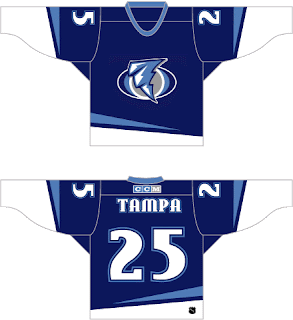
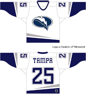
Until then, you know I always have concept art up my sleeve. I came across these long ago but just realized I have yet to post them on this site.
These are from two separate design sets, but both feature redesigned logos. I don't care for the first one, but I could live with the second.
Any thoughts? Be sure to check back tomorrow. The Lightning are scheduled to unveil the new logos and threads at noon. I'll have photos as soon as they're available.




Reader Comments (24)
its kinda hard to read the 'tampa bay' on the logo, but that might just be me. i think its an upgrade from the old logo, but still a decent distance away form being creative or good.
Not a fan of the logos at all. The jerseys I don't mind, but the blue jersey logo looks like a tornado. Look for a shinny silver instead of a grey on their jerseys this time around.
I actually like the logo a lot.
I'm excited for tomorrow.
I found some pics of the new Bolts logos you can see them at: http://www.modsquadhockey.com/pics/JR/TBMSH_2.jpg
Actually, I posted that here http://nhllogos.blogspot.com/2007/07/possible-new-lightning-logo.html" REL="nofollow">back in July (if your read the whole post). Thanks for the comments, everyone!
sorry about that.
-Anonymous who posted on August 24, 2007 6:23 PM
WHAT PROGRAM DO U USE TO CREATE THOSE JERSEYS TO MAKE YOUR OWN CONCEPTS?
PhotoShop?
i like tampa bay logo cause its different from all others...im a fan as is this poster..wooo go tampa
it's a decent logo
when u get to photoshop what do u press to like do stuff what do u start with?
Alright Chris...your big day is tomorrow...Good luck with the Lightning! I'll be pullin' for you guys getting a great look!
-Charlie
SabresNotSlugs.com
"The team has responded to the original leak by saying that it's close but not quite how the new logos will look."
Larry Quinn must be your PR guy...the Sabres said the same thing and what we saw in the G-Damned slug was exactly what we got and nothing else! But at least the leak looks good IMO.
-Charlie
For such a cool team name like the Tampa Bay Lightning, they've held on to such a bland logo for so long and this "modernized" version doesn't seem to be much of an improvement
to add a balck cloud with the word lighting in it on top of it should not be great or what
i made to spelling mistakes i was in hurry excuse me (lightning and black words)
I really liked the TB/"blue lightning" concept somebody submitted...and I'm really not crazy about the alleged "new font" but, oh well. Here's hoping for the best for Tampa fans!
I don't know about the curviness of the lightning bolt. Lightning strikes are inherently jagged, and the curves do make it look like a tornado as a previous commenter noted.
There isn't really anything exceptional about it, either good or bad, so I suppose that's better than having a dreadful logo.
The primary logo on the hat is the real new one... I saw this morning in the Journal de Montréal, Montreal's daily newspaper, a Canadiens publicity in which they were announcing game plans and one of those, a game against Tampa Bay is announced and they use the new logo. A big mistake from them, knowing that it hasn't been unveiled yet.
as soon as it is unveiled, post some pics or some links to it
thanks..
Hi guys sorry if i keep asking this but i was wondering what program u use to make these jersey ideas i no photoshop but photoshop what? cause i believe all i have is album starter can u do them at imageshack.com?
NEW JERSEYS ON WEBSITE!
[img]http://cdn.nhl.com/lightning/images/upload/2007/08/Splash_Image2.jpg[/img]
the new jerseys and logos SUCK!