Sunday
Aug262007
Suggestions For Atlanta
 Sunday · Aug 26 · 2007 | 11:32 AM PDT
  11 Comments
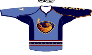
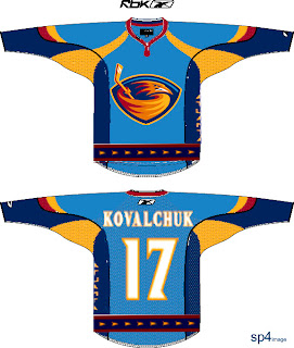
 You asked and I was listening. You want Atlanta Thrashers concepts? I've got them. Let's dive right in!
I'd imagine this design to be the one most Thrasher fans are hoping for. It keeps the light blue and the "ATLANTA" down the sleeve. It's pretty sharp. But based on what we've seen so far, don't get your hopes up.
I was also sent this jersey. But don't worry, this would probably be a little too much for Reebok. Very colorful, that's for sure.
So Thrash fans, you got your wish. What do you think? Do you like these fan-created concepts or should your team go with something entirely different? Comment below.


Reader Comments (11)
tanks for the concepts chris !
I AM AN SENS FAN AND I KNOW THEY ALREADY UNVEILED THEIR EDGE JERSEY , BUT I WISH THEY WOULD OF GONE WITH THE STRIPES AND THE 'O' AS THEIR PRIAMARY LOGO.GOT ANY CONCEPTS?
Atlanta needs to change their logo. The hockey stick is brutal.
whose idea was it originally to have the navy blue sleeve with "atlanta" running down it? that never has and never will look good. that sort of asymmetry in jerseys simply looks silly.
Careful there guy that doesn't like the asymmetry, you'll have Atlanta fans on you like yellow-jackets on chicken.
I could never understand it either, but Atlanta fans *LOVE* it.
Go figure.
us nhl fans shouldn't care if the thrashers fans like the atlanta down the sleeve why do we care i personaly think it looks good
those ones with the yellow cheese all over them look like crap... I'm a Thrasher fan and I think the blue ones they have now are nice, and I hope the new design is simple and plain. a jersey that is too detailed will never look classy
the different sleeves idea is just awful, it just doesn't work, i'd be embarrassed to wear that..
i agree with what one of the...uh...6 anonymous posters said when they said atlantas light blue thirds look like crap...
honestly, unless it's the crest of the jersey (a la NYR or Boston U) then words don't look good on jerseys (aside from names)...but that's just me...
I like the first one, but I'd rather have the laced jersey with the NHL logo behind it.
I too hate the wordmark down the sleeve, not only does it just look funky to me but when I've gone to games there are times you can't figure out who the player is (if you don;t know their faces) since there's no number on that side. You have to wait until they move a certain way to see the back or other sleeve. Drives me nuts!