More Thoughts On The Wild
 Friday · Aug 3 · 2007 | 3:14 PM PDT
  10 Comments
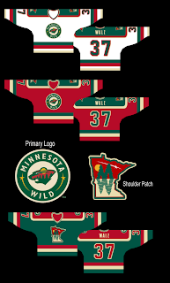
 After I posted a Minnesota Wild uniform design yesterday, a reader pointed out another bit of fan artwork that made use of a really cool take on a secondary logo for the club.
If you ask me, that shoulder patch is seriously awesome! Like the Coyotes, I always thought the Wild would be a good team to use the outline of their home state in a secondary mark. This is just one example of how well that can work. This design is of major professional caliber if you ask me. I'd be surprised to discover it wasn't a pro behind it.
Anyway, I wanted to make sure this got posted today because I thought it was very interesting. Wild fans, I'm curious to know what you guys think of this concept. Could you see your team wearing these uniforms or are you happy with what they've got?


Reader Comments (10)
That secondary logo is clearly AWESOME.
The best logo seen in a while.
I agree, that state logo looks really good and keeps with the Wild theme
great 2nd logo, but dont like it on that third jersey as the primary logo
That sweater is F'UGLY. Look at the first New Jersey Devil's Uniform to see what that was inspired by.
Just say no to green and red together.
The secondary logo is totally wicked.
The secondary logo is amazing..that is so awesome
Tom
Okay, seriously. That secondary logo is amazing. You got the state of Minnesota, the moon, the North star, trees shapes like an M, and the Trees reflecting a W into a body of water. Just fucking amazing.
Not a fan of green and red together, though. If there wasn't so much red and more green it'd be a lot better.
found new senators jerseyhttp://www.goaliestore.com/board/hot-stove-forum/67253-confirmed-new-rbk-jersey-designs-10.html
hey guys...i'm glad to see most of you like my logo, but i'm sorry to inform you that no, it isnt professionally done haha...i'm just a 17 year old guy who likes the be creative and come up with neat ideas....this being one of the better ones....
That secondary logo is -gold-. The jersey designs, not so much, but I love the secondary.