Get Your Pittsburgh Fan Art
 Thursday · Aug 30 · 2007 | 11:23 AM PDT
  12 Comments
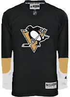
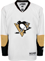
 I've got Pittsburgh Penguins concept jersey designs today. So get excited. This first set here is a recoloring of the newly unveiled Ottawa Senators sweaters.
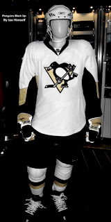 Continuing on this theme, though, someone recolored a mannequin donning that Sens jersey. Everyone seems to be concerned over the idea that Reebok has only created a handful of templates and that teams have had to choose between them. A color-by-number, if you will of the most ridiculous proportions. I don't see it that way though.
And those designs up there are rather plain. I think it works for the Sens, but not the Pens.
I also had something else rather unique emailed to me. Penguins fans, you know I've often talked about changing your logo — not that it necessarily needs to be. And right or wrong, you've shown that's not something you're at all interested in. But I thought this was interesting. Not sure it's better than what you have. In fact, the legs on the penguin make it look downright ridiculous.
You'll see what I mean.
Frightening stuff, right?
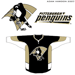
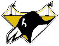 Well, on top of everything, the '90s logo which still graces the shoulder of the current Pens jersey has been much maligned. But then somebody sent me this logo design that I thought would make a pretty solid secondary mark.
Any thoughts on that? Thought it was pretty cool. Then I've been known to be wrong at times, though. I'm curious to know what those from Pittsburgh think of this idea — as too is the designer, I'm sure. Leave your comments below.



Reader Comments (12)
We're so used to the penguins' logo having ridiculous legs... pretty much everything is open to us. We know our logo is both classic for the Lemieux Stanley cup era, and ridiculous at the same time. But being that our team is now rad... we're ok with it.
Thank god we don't have those icky mid 90's gradient looking uniforms anymore.
That Penguin in the concept logo should be called a Manguin.
I like the manguin design. He's pretty cool. I think the current Pens logo is classic and classy and hope that they stick with it and never, ever go back to the hideous 90's logo and jersey. If they do make a change, though, the manguin gets my vote!
I personally love the old logo, the one they currently use for the shoulder. I guess I'm in the minority. I'll definitely try and make it to the unveiling. Should be a good time.
I think the penguins should use a little baby blue in their uniform
im not feeling the background for the fourth pic. it looks awfully familiar to bank of america's logo.
i like the dark blue 80's uniforms, those were sick, we should definitely use them again...
I love the Triangle Penguin head logo from the 90's. But then again that was the period I lived down there....
I don't like the current one. It's kinda looks like a joke, like someone was goofing around when they made it.
The last one that Chris posted with the bridges isn't too bad. It really captures the feel of the city, with the 3 main yellow bridges connecting the North Side with the Golden Triangle.
-Kindred-
Adam's concept actually makes that stupid-looking stickhandling penguin look half-decent.
Hehehe.. you never fail to amaze me. You think that skating penguin logo is atrocious, and then call that horribly amateur "shoulder logo" thing pretty cool.
heh.
Regarding the "sock Penguin" - No. Just no. *four* stripes? WTF?? no golden triangle = no.
As someone who grew up in Pittsburgh in the 90's, the triangle logo will always say "Penguins" to me. I remember being absolutely shocked when I saw what it had replaced - the elegant "omg it looks like a REAL penguin" was much more appealing than some ugly cartoon.
Say pigeon/Baldwin/corporate as much as you want, but guys, our sacrosanct "Stanley Cup logo!!" was unattractive, and if you want proof, look no farther than the fact that the skating penguin we have now is NOT the one we had then, and I'm not just talking about Vegas Gold.
http://pittsburghhockey.net/PensPages/PensJerseyHistory/PensERA/76RJersey.html" REL="nofollow">Look at the eyes and the beak. See a difference?
The version we have now thankfully looks much better, but I'm going to miss those old shoulder patches if they go.
Hey guys i designed the SOCK LOGO ha, its awesome to hear what you guys think. I had another version with out the stripes, but regardless I made the logo based off the crosby deke on montreal in the shoot out, and well i was just messing around...I love the pens but i figure with crosby, malkin, stall, fleury... its time for a change to signify a move forward (like the falcons change when vick arrived....lets just not bring up whats going on now ha)