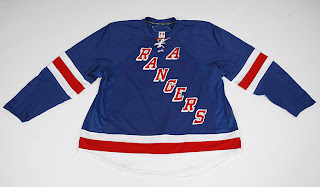
Danger Looming For Rangers?
 Friday · Aug 31 · 2007 | 2:49 PM PDT
  13 Comments
 That headline was a little dramatic, but it got you to read right? A reader named Nick recently sent me an email I thought might be worth sharing with the rest of the class.
Hey Chris. Let me first say that you are doing a wonderful job over at your blog and i check it every day for updates. Great idea for the tournament as well. I'm sure you are getting a lot more traffic than you thought. Way to go.
Just kidding. I can gloat if I want. Here's what he was really writing about.
I'm a huge Rangers fan and when the "new" jersey came out I noticed that it didn't look right. The word R-A-N-G-E-R-S is much steeper than the original uniform (most likely to fit on the specific fabric section, I'll call it the "body")
Notice how the R is way over to the right, next to the ties whereas on the old uniform the R started way over on the shoulder almost. Same goes for the S. The S is all the way down and to the right (won't be able to see it when skating, might be under the pants even) whereas the old one it was up higher and more visible.
I doubt these jerseys will stretch enough in the "body" to compensate for that weird angle.
But here's the kicker. What happens when you put an A or a C on the body area for the captains?
That's a petrifying thought, isn't it?
Personally, I don't think it will be that bad. I wonder if there's a reason why the "C" or "A" couldn't be sewn onto the stretchy material on the shoulder. The idea of sewing anything onto stretchy material may be a non sequitur but maybe the trick is you sew it on while it's stretched out. I'm not a tailor, though.
Anyway, don't freak out yet. It's just a thought somebody had. It's not necessarily the way things will be (as far as we know). What do you think?


Reader Comments (13)
I'm a BIG TIME Blueshirt's fan, and that jersey that has been floating around just seems off to me. How come the Rangers are still the only team with a "released" photo of their sweater without a media kit attached?
And their is no mention of it on their site... and the shop still says image coming soon...
I agreee, something is odd... I don't think it really is final.
to dan, the coyotes have not had a single picture released, or leaked, of their new jerseys.
Well, correction... there are photos of it on the site... but the jersey on the site is different... in the pics of Chris Drury and Scott Gomez wearing the jersey it is a different jersey than in these pictures... the "R" is not placed so close to the stitching.
gabe, if you read the caption, those are traditional style sweaters, not RBK EDGE uniforms. Anyway, that was just a promotional picture for the two new signings the Rangers made, they must have decided to throw some kind of picture that had something relevant on it.
those are the traditional ones not the new ones look at the fit
Hmm, yeah... I can't read.
In which case go back to my original post then that they have not posted any pictures on their site...
The Rangers traditional jersey logo does not fit the design of the new Rbk jerseys very well at all. I think they should position the letters as they always have, even if it overlaps with the "stretchy" material.
Here's a simple fix for the Blue Shirts.... Put either the Shield or Liberty on the front and vice versa for the shoulders. No worries about text not lining up and crap....
-Kindred-
just a thought... maybe they could combine their badge logo with their classic diagonal text...
http://i139.photobucket.com/albums/q303/ViolentJack/rangers.png?t=1188654922
You can't put the sheild on the front, we found out what that looked like the the 80's (I think), they wore them as a vintage jersey also a few years ago. Everyone hated it.
Can you put the Captain C or A o nthe bottom left?, Detroti put it on the top left, theres room on the bottom left, I don't know that might be an idea though.
I hate the Liberty logo they have been using as an alternate logo... I don't really know why...
The shield logo isn't alot better, the text on it looks crappy, but it is a nice simple design... I'm starting to become a little partial to the logo I made of their slanted text on a shield which I posted in my last post. I know the last time they tried to use their shield logo it didn't go too well but I think it just didn't fit well on the jersey style at the time, it was almost as though they just took their slant text jersey and slapped the crest on it instead. A jersey designed specifically for the shield might not be too bad.
THE RANGERS ARE AN ORIGINAL SIX TEAM! YOU CAN'T FUCK WITH THE TEMPLATE! Okay now that i'm done screaming.. Really. The Rangers' sweater is meant to say RANGERS down the front. Nothing else. The shield was a terrible idea, and they still wore the RANGERS down their chest during that time. It must look okay on a skater. Otherwise, this will be a PR suicide for the blueshirts (not the first time THAT'S happened.)