New Stuff For Ducks, Canucks
 Sunday · Aug 5 · 2007 | 8:57 AM PDT
  7 Comments
 Got some fun stuff for your Sunday. The first is a jersey design for the Anaheim Ducks that playfully (and pitifully) attempts to look like a "leak." Thought it was funny.
The designer himself said it's a manipulation of the old Nashville road jersey. As far as the webbed duck foot "D" logo, I'm really hoping its what Anaheim goes with this season. I've heard that they will be dropping the wordmark on the uniforms, but we have yet to see anything official from them. Anyway, enjoy this and try not to take it seriously. It's not the real thing.
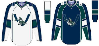
Looks like another fan came up with this concept for a new Vancouver Canucks uniform.
It seems to borrow from the newly unveiled Florida jerseys. It's not a well-balanced logo, but what do you Canucks fans think? Would you like to see something like this? Or do you prefer the orca logo, which we're hearing will stay on the new Rbk EDGE jerseys (in new colors)?
And for everybody else, what do you think about all this stuff? Don't be fooled. None of it is actual team artwork — just fan-created fun. But do you think it's good work? Or should it have stayed in the minds of these fans and off this site? Be gentle.


Reader Comments (7)
I really like the Canucks design. I think it's interesting that the designer went with a V for Vancouver rather than a C. I've seen the Canuck character in a C as well and liked that too. It beats the heck out of the stupid whale they currently use.
I don't like either of those uniforms. I think the ducks wordmark logo is fine, and I really hope they are not going to go with the D. The canucks logo is just stupid. It looks more like a junior B logo.
The V on the Canucks logo is waaay too long so that could never work and the ducks jersey couldn't b any worse than what they were wearing this past season
hopeless shit is so fake the real one is probably the one with the orca with vintage coloring
those canucks jersey's are awesome. i would love it if the canucks did some thing like that.
best jerseys ever.
kick ass jerseys