Wednesday
Aug082007
Red Wings Unveil New Uniforms!
 Wednesday · Aug 8 · 2007 | 11:29 PM PDT
  28 Comments
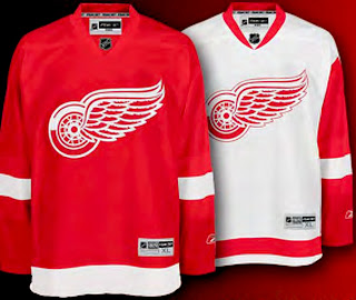
 Giant tip of the hat to a reader for emailing in this information. There was no big fanfare or public unveiling event, but the Detroit Red Wings have officially unveiled their new Rbk EDGE uniforms. Check them out.
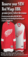
 The Red Wings join the Flyers and Rangers as teams making the new jerseys available for pre-order on the web site. The graphic to the left can be found on the Wings' web site and it links to the order form. Detroit has separated itself from the Flyers and Rangers, however, by making images of the new jersey available.
Anyway, the Red Wings become the eighth team to unveil their Rbk EDGE jerseys and we eagerly await the rest of the league.


Reader Comments (28)
And, of course, no real surprise, they aren't messed with in any way.
This will certainly please Red Wing fans everywhere.
Thank God they didn't mess with the jerseys at all.
Props to the red wing's orgainization for not messing with there jerseys. Also props for including a picture. A real classy team.
man, I'm so jealous.....this is proof that teams can simply replicate an existing look (or close to) on the stupid new reebok system...
the rangers came close, the lettering is kind of screwed, but these red wings jerseys aren't bad at all
being an islanders fan, i'm horrified over what is rumored to be our new jersey...it ain't fair
This is one Wings fan that is EXTREMELY happy.
Glad to see Detroit sticking to tradition, along with the Rangers.
Larry Quinn, are you paying attention? Nah, probably not.
Actually there is one small tweak to the design. On the white one there is no longer a white indentation on the upper red part of the sleeves near the shoulders. In the new one it's just a straight line across. That, and the RBK Edge collar, are the only things that have been changed.
Question for someone smarter than I...
I thought that the only teams that should have the lower stripes are the original-six ones?
I thought that's what separates them...
Am i wrong? Was that changed?
Either way- good job keeping Wings and (my boys) the Rangers steady!!
How about this idea- what would the league think of having the original-six do lace ups (a la Rangers/ B's) only...as a way to distinguish them/ make them appear more classy?
Those 2 i mentioned would look great. The Leafs i think would be outstanding with it. Blackhawks too. The Habs...don't know. Maybe the Red Wings is perfect as is.
What does everyone here think of that...
Anonymous NYRMike
Laces? A definitive NO for the Habs.
I hope they don't mess up our jerseys (Habs Fan), or just change the Logo a bit like the Boston Bruins (very classy, with a touch of new).
And yes, it's another proof (after the B's and the Blue Shirts) that horizontal striping is possible. So why in the world do teams have jerseys that ugly? Sorry for the Predators' and Panthers' fans (are there any of those?), but the yellow "vertical" stripe that goes up closer to the neck, well that shouldn't be there. I know it's part of the new RBK design, but don't make it visible, it's UGLY. And poor Islanders' fans, you have the worst rumors of all time. I hope it doesn't end up too bad.
I wish they would just go back to the simple shirt they wore during their dynasty.
Anon-
That's why i said 'don't know' concerning the Habs, so sorry to set you off.
I was acknowledging that for your team and maybe the Wings it wouldn't look great.
White Laces...on a jersey that's essentially blue and white (Leafs) would look great (in my opinion).
Don't you think the original-six (yes i know there were teams before them, but be that as it may)
deserve to have something that distinguishes them from, say, your Islanders and Sharks (save our classy old-school duds)...?
anonNYRMike
While I have respect for the original six, I don't think they "deserve" anything to differentiate themselves from the other 24 teams in the league. They have more history, true, but that shouldn't make them intrinsically "better" or "classier" than any other team. If I'm from Atlanta, and I want to cheer for the Thrashers, I shouldn't feel like I'm cheering for a second-class team.
(FYI, I'm not from Atlanta; just used as an example.)
But kudos to the Wings for sticking with a good jersey. Hopefully, we've seen enough jersey concepts to realize that the problem is not the EDGE system, but in jersey designers.
sorry folks, be as happy as you want but those are the replica jerseys ($130). I'd hold the joy until you see what happens to the real ones. The logos gonna be smaller to fit between the stupid panels. They wil be similiar to these but not the same. The cut is wrong and the rbk logo won't be on the sleeve. also you haven't seen the backs, will they have the stupid offset to highlight the rbk logo?
http://www.distantreplays.com/distant/assets/product_images/PAAAIAEEIOJKKFAF.jpg
"I was just wondering about the la kings and rangers jerseys because i've looked on some sites and found out that there not the New Rbk jerseys"
Well I can't speak to what's written on these "other sites" but I can tell you that the Kings' and Rangers' jerseys that I've posted as official are the real Rbk EDGE uniforms. I'm very careful about not posting fan art or anything like that as official designs. Thanks for reading, all!
The traditional teams will seperate themselves from the rest of the league, by being, well traditional! so it is not a matter of first class/second class teams. Some Teams Just Are Classy, while some are not! The Red Wings jersey looks alright except for the silly looking neck line, man those look lame! the tight cut will also look bad, but at least considering the NHL mandate, Boston, NY Rangers and Detroit have done alright!
I echo the same in "thank God they didn't mess with the jerseys at all". Couldn't agree more. Looks really good here.
Hawks still the best sweater in the league. I heard that if you changed the Hawk design it might bring back luck. Don't need any more of that.
And as much as it kills me to say this, I am glad they didn't mess with the Wings sweater (that's what real hockey fans refer to them as).
Go Hawks
I'm glad they didn't mess with tradition also but Oilfan82 pointed out something - that the inverted shoulder indent on the white jerseys has been eliminated, and I really liked that feature. A minor, but unacceptable tweak, in my opinion....
Ya, it changed but atleest it looks almost exactly the same. Happy that they didn't fuck it up since the jersey has been the same for a long time
Here is an interisting read from the detroit free press about the new jersey.
http://www.freep.com/apps/pbcs.dll/article?AID=/20070816/SPORTS05/708160443/1053/SPORTS05
It's nice to see that they didn't mess around with their jersey. It looks exacly like the "old" ones, except of course they're tighter. Good job!
Rumour has it, from the Uni Watch blog (link on right side of screen) that for the Detroit jersey, the Captain's C and Alternate's A will be on the left side of the logo (right shoulder).
Dude? Rumor has it? I posted that already. http://nhllogos.blogspot.com/2007/08/wings-rearranging-jerseys.html" REL="nofollow">It's fact. Go read about it here!
The white-shoulder/red-sleeve design was one of my favorite aspects of the Wings' design, given the design philosophy behind the Edge uniforms, I can live with a relatively minor change like this.
The bottom line: Mike Ilitch and Ken Holland aren't about to mess with a good thing. And the Wings' classic design is a very good thing.