Amazing Ducks Concept Art
 Wednesday · Aug 8 · 2007 | 2:27 PM PDT
  34 Comments
 Earlier in the week I posted some awesome concept art that went over a storm with you guys. We saw designs for the Ottawa Senators and Boston Bruins as well as the New York Islanders and Atlanta Thrashers.
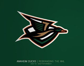
Today we're treated to some work on the Anaheim Ducks. These designs were based on concepts that "leaked" prior to the unveiling of the new Ducks logo last summer. Have a look and be impressed.
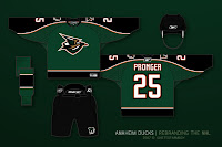
 If you ask me, that's what the Anaheim Ducks should look like. And it couldn't be further away from the old Mighty Duck look. However, while the green is sharp, tan doesn't make for a vivid secondary color. So what about orange?
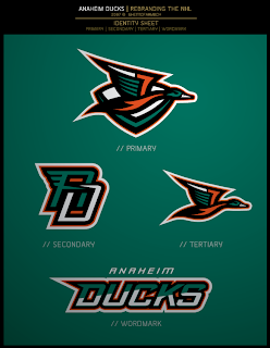
Our favorite designer upgraded his original logo with much more vivid colors. Can anyone deny this would be one killer logo package?
 If the logos weren't enough for you, check out the uniform designs. Any NHL team would be lucky to look that good. How come this guy doesn't already work for the league?
Are there any Anaheim fans reading that would be repulsed by something like this? Would that even be possible?
Anyway, it's artwork like this that gets me so excited to do a blog like this. So what do you think? Am I going a little over the top with my glowing praise? Or are these designs really that good?


Reader Comments (34)
No, the designs are fantastic. (although to use your own words, I'm surprised you don't find them a bit minor league ;))
The only mark I don't really like is the AD letter mark, looks like PO to me.
lol.. although that might be intentional.
I like the uniform variations better than the dark green...but why does the duck have so many corners? *puzzled*
Those designs are money
amazing
Those are awesome, except I would keep the same shade of green in the second one as the first. The second one is almost the same colours as the Sharks with the almost teal and orange.
Amazing, much better than current (email this site to brian burke). Only thing in the logo is it looks like a V behind the duck, I would add another line over the top to make a D...but otherwise really sharp!
this is way than plain writing of (ducks)
I think they are definately an inprovement, but I think the gold is better than the orange.
who is this guy doing all these designs? Is there any way you could convince him to do one for the Canucks? Please?
those uniforms are awesome, why didnt they go with those?? huge improvement over the ugly ones they have now
While I love the logo design and the jersey concept, the colors on the second jersey set remind me too much of the Islanders. I like the darker green, possibly with a slighter darker orange.
this was actually a little mini collaboration with a couple designers over at Creamer's forum ... GhettoFarmBoy created the initial concepts (with the brighter teal and orange), and then John Slabyk (the New Blue and Gold guy), did the color tweaks ...
Check out the thread http://boards.sportslogos.net/index.php?s=&showtopic=50794&view=findpost&p=782906" REL="nofollow">here.
I simply can't believe how mutch John Slabyk rule. Seeing these logos reminds also how mutch their current jersey is ugly and in no relation with the Anaheim Ducks.
I mean, watch the gold and blue project. What a way to understand Sabres fans. What are these NHL teams doing with their research and devellopement?
Kudos to Red Wings and Boston so far in the new jersey race. What? They didn't change that mutch? And?
I hope John Slabyk is making money with these things.
Wow that dark green looks great, and with a darker orange it would match the colors of a Mallard, which is what the logo looks like.
INFINITELY better than the crap they have now.
Yeah, their current jersey's are junk compared to this dark green.
Still can't believe these logos. If it were real, Il'l go buy one right now.
OMG- It's the Long Island Ducks...get it?
AnonNYRMike
these are sick and they actually have something resembling a duck on them as opposed to the webbed foot of a D they have now. too bad GMs cant see that
Wow that is very nice!! As a Duck fan though I wouldn't want them to come out though till like 2-3 years cause I and many others just bought the new jersey last year!!
Man,those are the most beautiful jerseys ever. I wish they'd won a Cup in those.
To Sephiroth:
These aren't Slabyk's designs, they were designed by the person who calls themselves GhettoFarmBoy.
John Slabyk merely tweaked the colors on this design, which some people like and others don't. (Personally, I like the darker green, but think the brighter orange should stay).
Thanks for the point.
GhettoFarmBoy will have my attention.
These uniforms remind me a lot of the old NY Islanders "fisherman jersey" colors (with the green and orange). Thumbs WAY down.
i love that jersey than that plain writing they have now
wear this jersey it is sick
I have no idea why the ducks don't use green in their uniforms. I would love to see them replace black with a very dark shade of green (even darker than Minnesota's). If they would only ditch that awful wordmark for the webbed "D," their uniforms would rank among the league's best.