Concepts From Dallas
 Saturday · Sep 1 · 2007 | 2:44 PM PDT
  9 Comments
 I've got loads of Dallas Stars fan artwork to share with you on this Saturday afternoon. So let's get right to it.
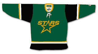
We're all well aware the Minnesota Wild decided to leak their new home jersey to valued season ticket holders. Based off that design, someone came up with this idea for the Dallas Stars.
I'm one who likes the "star" jerseys they wear now. They've got one of the league's most unique looks. Unfortunately, I don't think that would translate to the EDGE. It's a language Reebok doesn't quite understand. To be fair though, it's a limitation of the design that, if the players like it, who are we to judge?
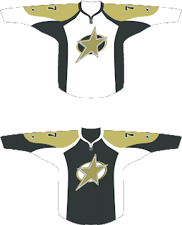
Someone else had the idea to transfer the Iowa Stars look to Dallas. Here's how that might manifest itself.
I don't know. Feels like a lateral move to me. I say we go back to the drawing board. What if they went all Old West on us in the great state of Texas? Might it look a little something like this?
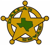 I feel like the Stars haven't done enough to differentiate themselves from the North Stars — this, despite the secondary logo with the outline of Texas. They still wear the same crest as the North Stars did during their last year in Minnesota. Personally, I'm hoping for a change when they finally show off their new uniforms.
I'm not necessarily saying this concept is the way to go as all I can see is Chuck Norris' reflection in the shiny badge. But Chuck's pretty bad ass so I'm not so sure it's a bad thing.
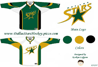
But while we're on the topic of design overhauls, check out this one.
It's sharp in a classic sort of sense. I think it could use a greener green as muted colors don't make for good sports uniforms, generally speaking. I do like the logo idea but it feels a little plain. It's like you just keep staring at it waiting to notice something. But nothing comes. Obviously, nothing's perfect but I think someone needs to get on a Stars overhaul.
The best Stars concept logo I've ever seen was this one I posted a month ago. For those who appreciate simplicity in NHL logos, you can't complain about that.
Anyway, go visit the Concepts Gallery to see these designs and others that I haven't posted. You can also see that first logo set I posted in green and silver (rather than green and gold).




Reader Comments (9)
I've always liked the logo on Dallas' third jersey, you knwo the black one but as a Canadian i've always wondered what it has to do with the city with dallas, or the state of texas?
if anyone could answer that that would be great.
-Josh-
LOL they scrapped that 3rd jersey because it belongs in sex education class not,on a hockey rink :P
hey, Chris
i was wondering i have some logo modifications that i made and i was wondering how i could send them to you?
Hi there, "bad ass bill." You can email me at nhllogos@gmail.com. I look forward to seeing your work! Thanks!
Aside from having Penguins colors, those last jerseys are awesome.
My biggest problem with Dallas' old jerseys was the really dark green and gold. The North Stars were so cool with he bright green and yellow. Hell, the whole league looks like crap with all these muted colors (primarily Oilers). Teams like Dallas, The Islanders, Edmonton, and Buffalo should go back to their bright greens and blues. seeing a whole team in Navy at home is really depressing, but they make for kick ass road jerseys.
Josh, what does an Orca logo have to do with a Canuck?
I love the last set of sweaters but I wish someone that can do that sort of thing would take that concept and put Dallas across the star.
Starsrule...I'm pretty sure that the reason the orca appears on the Canucks logo (and please, someone feel free to correct me if I'm wrong) is that the company that owns the Canucks is called Orca Bay. So, the logo is a reflection of the ownership group. It would be like putting the Comcast logo on the Flyers jersey just because they own the team.
In my mind, the Canucks have the league's worst logo just because of that fact. It's a bit too soccer sponsorship-y to me. The AHL already sells their jerseys like billboards. How long for the NHL commits the same sin? I think the
These concepts are all bad. Period. Patrick has it right in that the teams need to go with brighter stand out colors. Our North Star unis are still our most popular ever. We have to go back to the our 70s-80s concepts. It was actually in the works but because of the whole ownership debacle, things are being stalled. Who knows what will happen now but I believe the process will proceed once things are settled.