Saturday
Sep012007
Flyers Leak Like Wild!
 Saturday · Sep 1 · 2007 | 5:30 AM PDT
  35 Comments
 Including this one, the last five consecutive posts have involved the Philadelphia Flyers. Guess it's a good time to be a Flyers fan.
Yesterday, I posted a photo of a page in the Minnesota Wild season ticket holders book which featured a shot of the new uniform. Well — excuse the pun — but now it seems the Flyers have taken a page out of their book.
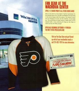
Season ticket holders were treated to this photo of the new Rbk EDGE home sweater. It's a much better look than the cell phone photo I posted yesterday. Looks good, Flyers fans. The changes are small but insignificant.
Thanks to everyone who emailed me this image!
And as far as the Reebok "templates" we've seen, this one doesn't appear to match any of them. What do you guys think?


Reader Comments (35)
I think the shoulders make it look like crap.
i wish they went back to orange.
these aren't bad but i'm not in love wih them either
the flyers jerseys were great how they were and compared to the old ones i'm not crazy about the shoulders/arms
one word... INCREDIBLE
it's a great modern version of our jerseys now, no major changes, but enough.
Well, you've destroyed your team and identity, and now destroyed any form of tradition you had whatsoever.
Remember that big silver thing you punched your way to a couple of times, before we took it back? Check out the colours of those jerseys - no-one thought you were 'less tough' in orange, believe me.
Nice call - not!
if you are from philadlephia like me and loved the flyers your whole life, there is no way you like these jerseys
Indeed the shoulders do look like crap. Black uniforms are so 90s. Time to go back to the classic orange.
terrible. The old ones were very original, this is just plain and bland
wow, most of you need to take a step back and look at some of the other crap that's being put out. we don't have it that bad, in fact the added more orange into the new jersey than the old home jerseys. stop complaining; alot of the new jerseys look "cheap" and keep in mind the numbers on the shoulders will fill up some of the white space.
no originality, destroyed our tradition? cut me a freaking break - these jerseys have more originality than the old jerseys did. most people are talking about the orange, the full orange body, which i completely understand but you'll get it back with the thrird jersey next year.
i grew up in south west and i've been a flyers fan since i was six. cut it with the bull that "true flyer's fans will hate these!!" if you love the team you love them inspite of what they wear.
I'm sorry....but that jersey is HORRIBLE! My 4 year old could have made a better looking jersey. Some of the other teams who have new look have been released look pretty good - Ottawa, Columbus, Calgary. Aggressive, not girly. Should have switched to 'Home Orange' and 'Road White' with black being the elusive '3rd Jersey'. They could have at least put the word 'Flyers' @ the bottom like L.A. or use the new logo with the silver lining. Just terrible! And I'm a former PA resident now living in Texas. Just image the rest of the fans in the league laughing...
Here's a link to the new home jersey. It looks like the pic above, this is just a little bit better one.
http://cdn.nhl.com/flyers/images/upload/2007/09/jersey2.jpg