Wednesday
Sep122007
Buffalo News Shows Off New Sabres Duds
 Wednesday · Sep 12 · 2007 | 9:33 AM PDT
  14 Comments
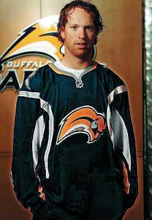
  An image appeared in the Buffalo News today showing Brian Campbell wearing the new Buffalo Sabres Rbk EDGE home sweater.
As expected, there are no real changes to speak of but for the addition of the NHL shield at the collar.
You can see what I mean in this photo to the left. Looking forward to better shots and as you know, I'll have them here when they're available.
Thanks to all of you who emailed in this information. You guys are an amazing help!
You can see and read the article for yourself here.


Reader Comments (14)
Were the numbers removed from the front? I don't see them in the picture ... I like them, but the sides look a little awkward on the new jersey. I thought last season's would have been perfect!
There are no numbers on this jersey what so ever so I'm sure they will be back on them when we get going.
Why does Soupie always have to have that dazed look in his eyes when he gets a pic taken off the ice but has a focused look on the ice?!?!?! HA! Gotta love Soupie!!!!
Glad to see no changes, the NHL logo looks kinda big on there but oh well...
boo! Not a surprise, but still disappointing.
I didn't know you could add trim to a practice jersey and call that your game uniform (at least that is what it looks like from the picture).
Reebok and the NHL strike again.
Campbell was wearing a generic jersey with no numbers...they will be on there.
That logo is still terrible. With being forced to update to the new mandatory RBK EDGE system, you would have thought that they would have re-worked the logo.
ugly slug, ugly lines.. nhl needs to set the clock back 20 years
They should have ditched the slug.
Salt the slug.
Salt the slug, or get off the sabres Bandwagon? That said, if they just went back to the cross sabres with a buffalo underneath, they'd be set.
actually the buffalo was on top, get your facts right
The Original Sabres logo is better than either they've had since. They should go back to it and get rid of the slug.
It seems that even the players can't stand the slug - last year in almost every Sabres games I watched they were wearing their third jerseys with the old logo.
adam the players dont choose what jersey they wear so how would you know they dont like the "slug" by them wearing the throwbacks. The sabres used the throwbacks as a promotional/3rd jersey and designated way before hand when they would be worn.
I do like the old logo better but the slug still beats the goat head in my mind. I dont mind wearing the slug on my hat or on a shirt.. but the huge buffalo head only looked decent on the jersey and no where else.
don,
That is true, I was being a bit hasty to conclude that the players don't like the new design.
Still, as the poll on this site shows, the original sabres logo is by far the most popular.
As an aisde, it would be interesting to see a game-by-game breakdown of when they wore the new jersey versus the throwback one.