Wednesday
Sep122007
Altitude Exhibits Avs Uniforms
 Wednesday · Sep 12 · 2007 | 9:44 AM PDT
  34 Comments
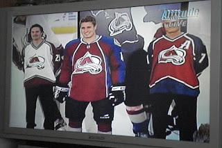
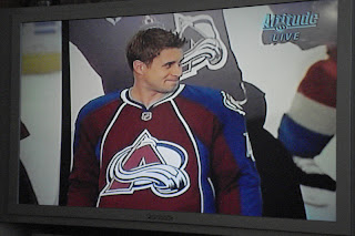
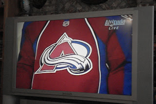
 The images were just sent to me, showing the Colorado Avalanche unveiling their new Rbk EDGE uniforms on Altitude. Our first look compares last year's sweaters with this year's.
I'm not normally one to judge these new jerseys negatively, but yikes.
I guess it's not the worst thing in the world, but it's certainly not an improvement. It's a shame because I always thought the Avs were among the league's best uniforms. Not so much anymore. Doesn't do the logo as much justice anymore.
But that's all just my opinion. Feel free to share yours below.


Reader Comments (34)
I don't think they're that bad.
And I think the away jerseys will look much better.
The last ones were butt ugly and this is a regression....
What the hell were they thinking?
As an Avs fan I have to say I am horrified, and I hope that they come to their senses after the negative reaction and put a rush order in for some proper uniforms.
They did everything in a rush in 1995 and it turned out great. They had time to think this one over and it looks like utter crap. Not impressed.
I liked the old ones a lot. Good striping on the old ones. Really bad striping on the new ones. Not a major change to the overall uniform, but it's a pretty big change to the design of the sweater. I don't like it.
Should have adopted the 3rd jersey as the away jersey. Besides, where does the "C" or "A" go on that jersey?
I as a young Avs fan, couldn't wait to see the new ones. These home jerseys are horrific but i can imagine the aways and they are going to loock much better with the contrast between white and maroon.
Bleh.
Welcome to Everyteam, NHL.
I'm a huge Avs fan, and my first reactions are that we really just took a huge, unoriginal, bland step backwards. I want my old threads back!
For whatever reason I thought it would be nice not to look like half the other teams in the league...
I'm sure I'll get over it, but I really feel like the organization just abandoned it's roots, more or less. So unoriginal! I don't mind changing the jerseys, but get a little creative, yeesh.
If it ain't broke, why fix it?!
Wow, the Vancouver jerseys are looking better (by contrast) by the day!
Where does Joe Sakic's 'C' go?
I kind of like 'em. I agree, they're not as good as the old style they used before, but as far as these crummy Rbk DULL jerseys go, it's no worse than the worst (Vancouver & Islanders) and a lot better than most.
WHAT THE HECK!? WHY!? It would have made so much more sense to do something that looks similar to the Blue Jackets, with the full length shoulder/sleeve stripe and leave the rest alone. Sad. Especially with no stripe in between the blue shoulder stripe and the maroon uniform body. that's bad design. The bib look is the worst template to come out of the RBK redo and the Avs bit the bib. Makes me angry and sad.
Okay, I admit to not liking the Avs because they pounded Flordia in the Stanley Cup a while back. However, they I always respected them and thought they had a cool logo and a cool uniform.
That being said . . .
WHAT THE #$@%!
The NHL should just make it official and force everybody to wear clown costumes and be done with it.
Yay, piping!
Ruined.
I'm sorry Avs fans.
And don't get over it madman...that's how you get stuck with it for 10 years.
These jerseys and about 85% of the others so far are horrible. I'm not in favor of this new RBK EDGE System at all. It seems a lot of the designs have to be restricted because of the way the jerseys are made, hence, a lot of team jerseys looking the same. I fear for what the Dallas Stars and Sharks jerseys are going to end up looking like.
i'm fine with the new rbk edge system, i actually like the tight fit, other than the curvy bottom hem. All the original six teams proved you can make a nice looking design on it. These teams are just getting conned by the rbk jersey designers into going with these messes.
The ruined them!!! Ahhh!
They're not great...but they're still better than the crap the Canucks produced.
I for one and in the majority loath the "new" Rbk templates. They are atrocious. For as long as Rbk is on the sweaters, I will not be buying them.
I believe we were PROMISED that the sweaters were not going to change too radically, but this is as bad as it can get.
Luckily the word mark, "Colorado" is not plastered on the sweater above or below the primary crest. Furthermore, the "C" and "A" will be too close to the crest and would look distorted. I already miss the mountainesque stripping from the old sweaters.
RIP Avalanche sweaters: 1995-2007.
They are awful! Really *#*! No way I'm gonna buy these! And I've been die-hard Avs since 95.
Frankly, and I know I'm showing my geek here, but I always thought that the old Avs jerseys looked like rejects from the Star Trek costuming department. That's not intended as a compliment! The more I see these new ones, the more I'm liking them.
Well, we have to remember that first impressions are not always accurate.
First impression is very bad from my point of view, but I will wait a little bit.
Problem seems to be the areas where the blue and the kind of burgundy are apposed on each other. That don't fit well.
And for the record, can we all agree on one thing? The V jersey's of the canucks (black and yellow) from the 80 are no longer the ugliest things to ever grace a NHL ring.
There are a lot of jersey's witch are, IMO, terrible, and mutch worse than these babes. I own both, and they are absolutely not so ugly.
So far so good for the avs, but why say that the jersey will not have major changes? These ones are clearly having major changes.
The Avs site has (better) pictures up.
SEXY.
Am I the only one thinking that this Colorado Rockies jersey is looking quite good?
Like many of you, I'm not thrilled by the Rbk Edge uniform system and how it's killing what used to be the greatest uniforms in all sports. My question is: was the speed in the NHL that slow that the league needed to ask Rbk or any other company to design a whole new uniform? And if all 30 teams wore the same old "non-streamlined" uniforms, they would at least be on the same playing field, so to speak. I've heard many fans saying that the outcry against the new Rbk Edge uniforms (not only designs but also higher cost to buy them) will force the NHL to revert back to the old system, which were perfectly fine IMHO.