Blackhawks Unveil New Uniforms!
 Friday · Sep 14 · 2007 | 4:40 PM PDT
  19 Comments
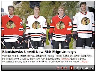
 Keeping with tradition and a design that many have called the best in professional sports, the Chicago Blackhawks unveiled their new Rbk EDGE uniforms today. Look at them here.
So you want to know the first thing I noticed?
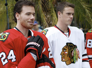
They altered the secondary logo on the shoulder. And I think it looks great! There wasn't really anything wrong with the old one in my mind, but the changes have given it such classic feel that it lacked a little bit in years past.
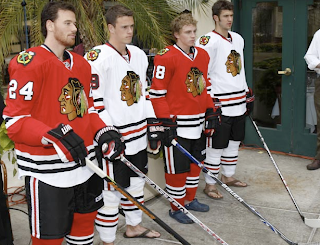
Martin Havlat, Jonathan Toews, Patrick Kane and Brent Seabrook were on hand in the Windy City to model the jerseys for the cameras. You guys know how I feel about the Blackhawks' logo and uniforms, but I like these a lot. They've done a very nice job keeping with their tradition while also moving forward with the design. It kind of makes me glad the NHL and Reebok are doing this.
Any thoughts on this matter?


Reader Comments (19)
why is the blackhawks logo the greatest in all of sports again?
Full hockey uniforms with flip-flops!!!! That has to be a first
Same is good for the Hawks.
Nice sandals.
I'm happy to see that kept their uniform as close to the previous ones as possible.
The Blackhawks couldn't have done better. Thank God they did not mess with their uniforms at all. The new collar is the noticable change and I like it for the fact it is an element that pretty much blends in with the overall jersey design.
flip-flops and crocs...thats pretty styling
Don't mess with a classic. Simply awesome.
Now if only the Hawks would be as committed to winning.
eh, I'm not a big fan of that white lip on the bottom of the red jersey.
patrick kane is wearing crocs.
i think that's the worst part about this whole thing.
Jason Blake and Darcy Tucker wore sneakers for the Toronto Maple Leafs promo pics - check out the side profile pic for a laugh as well :)
I do like the updated 'Hawks jerseys overall., but do agree with "chris" regarding the 'white lip/tail' on the red jersey - looks a bit off to me as well.
What do you think they did to the secondary logo? I don't see anything!
what do you think is different? its the same color scheme as before on the shoulders.
One of the best jerseys (home and away) in all of professional sports. I'm glad they've done away with the black one (for a season at least).
The shoulder logo on the red jersey is different. The tomahawks used to have green handles and white heads. Now they have red handles and green heads. The white jersey didn't change. (It's always had the logo with red handles and green heads.)
How does the old saying go "If It's not broke, don't fix it". The Blackhawks Logo is the best, bar none. I'm not real crazy about the shirt tail hem, other than that it looks fine.
Daniel said...
The shoulder logo on the red jersey is different. The tomahawks used to have green handles and white heads. Now they have red handles and green heads. The white jersey didn't change. (It's always had the logo with red handles and green heads.)
September 15, 2007 4:36 PM
if you look at the pics the hone reds have the white/green tomahawks on them.
Hats off to the Hawks for keeping things the same! A lot of people on this and various other sites are starting to complain about the look of the horizontal stripes on these new system jerseys. Let me remind everyone that the problem is NOT WITH THE HORIZONTAL STRIPES,but with the ridiculous Reebok curved hemline. All complaints should be directed to this curved hemline, which is a complete joke on all of the jerseys. I don't know what purpose they serve. Reebok originally wanted these things tucked in, but since that idea was rejected,there is no explanation. I guess they just kept that aspect anyway on all of the templates.
is it just me or does the trim on the pants kinda resemble that of the pants trim of the chicago bears?