Stars Unveil New Uniforms!
 Friday · Sep 14 · 2007 | 4:37 PM PDT
  30 Comments
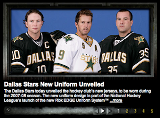
 Add the Dallas Stars to the list of teams that have unveiled their new Rbk EDGE uniforms this summer. That was done today and they're exactly what everyone feared.
The first thing I'll say is that I was never behind this whole idea that manifested itself in the form of these new home sweaters. But after seeing these photos, consider me a convert.
In a "new" NHL where cookie cutters are being doled out for even the smallest of things (i.e.: web sites and the like), I find it comforting if not overwhelmingly reassuring that one team managed to step outside the prescribed boundaries and come up with something — wait for it — different.
Now many of you will respond to that superfluous thought with the suggestion that in choosing to be different, they've ruined something good. Obviously I disagree but am always open to a good argument.
Oh and to the next person who suggests that the reasoning behind "DALLAS" being written across the chest is anything other than to remind fans where they are — a giant gold star. From me to you. I really don't understand the number of people seriously under the impression that any NHL doesn't know where the teams are from. Dallas and Vancouver do not have text on their jerseys because their residents lack cognitive function and at various points during a three-hour period forget where they are. Now I'm done with that...
Even if I were the kind of person who could spend money on anything hockey-related that didn't have a Lightning logo, I still probably wouldn't buy a Stars sweater. But that doesn't mean I don't like them. I think the designers knew what they were doing and hit the nail on the head.
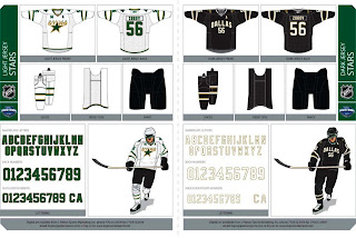
Which reminds me, the Stars did a cool thing and posted on their web site the entire graphics package for the uniform set. It's pretty cool.
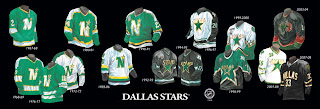
Finally, the Stars also gave us a look at the history of their uniforms. I'll leave you with that.








Reader Comments (30)
They aren't "bad" by any means, but they're simply too plain to be a primary home jersey. MAYBE a third jersey.
the black one will grow on us...
check out the designer's template on the stars site + a great visual history of stars and north stars jerseys.
The more I look at the dark one, the more I like it. Now, I really liked the "star" jerseys (and the obvious 3rd jerseys with those would have been a dark green version, not the awful bull one), but I like the white one like this also. More classic, simple yet attractive. The dark one is not that bad. We've seen much worse (current Vancouver, Atlanta...)
love them
Yes, it really is that bad. Earlier commentors aside, it's an awful direction for the Stars - who had a fantastic logo and uniform - the star shaped jerseys were terrific and the logo has long been one of my favorites. Before that logo, the old North Stars logo was also fantastic. Dallas written in an arch is not a logo, it's not interesting, it's a college jersey ported to the NHL or as I said once before - a basketball jersey with shoulder pads and sleeves. A sad, sad day.
The home jersey is not bad, but it seems everywhere you look there's a #. I don't mind the wordmark at all. I saw the Canucks jersey in person for the first time today and I love it! Vancouver's jersey has really grown on me. Classic, clean and sharp. Vancouver and Dallas could start a trend here with the wordmarks and I think it looks great! But I'm not sold on Atlanta's yet.
The Stars white away jersey is just way too plain for me however. They should have gone with just a white version of the home jersey.
I guess the Stars had to adhere to the new league policy that every home jersey must be either navy/blue, black or red. There are 30 teams and 3 different colors for uniforms! Now that's some variety!
Look at the expression on their faces for my opinion of the jerseys.
I like the wordmark but they should have put the logo undernieth it like Vancouver did. I think the Canucks have one of the best new jerseys in the league.
The home jersey just so doesn't do it for me. This isn't NCAA hockey, it's the NHL. They'd think they would've learned from the Ducks with that horrible "ANAHEIM" script logo on their last alternate jersey.
I would rather had their original alternate turned home jersey stay as the home jersey (minus the "DALLAS" across the top of the primary logo). Now their colors on their new home jersey are nearly the same as Anaheim and Pittsburgh.
The road white is halfway decent, but I'd prefer the Iowa Stars template for both the home and away Dallas Stars jerseys. But, oh well.
The new dark jerseys are way to plain and boring. They should have added something else to it. Maybe like a shooting star or some other kind of star design. Also, I don't like the number of the front of the white jersey.
I'm one who believes these uniforms are an improvement. The Rangers of 46/47 used a concept similar to the Star's new home jerseys.
What I find funny is... that they put a hem stripe on the *white* jerseys, which don't need one because they contrast well enough with the black pants anyway, but didn't put one on the black jerseys.. causing things to run all together and look like they're wearing a gigantic jumper-suit.
Mind-boggling.
Also, anyone that thinks that anyone saying things like, "Does the team think that fans don't know who they are?" in regards to the city name on the home jerseys is actually being *serious* needs a quick shake. That's sarcasm. It's being facetious due to the relative ridiculousness of it all.
My goodness......... the black jersey looks too 'barren' with just the city name and number there.
They shoulda just adapted the 'star' shaped pattern to the new jerseys. That's what I have to say.
I actually like the new Dallas road uniforms, as they look sleek and clean, but it could have done without the arm stripes. The home one is very plain and boring,just like the bland ones they used to have in the early 1990s.
Even though the home sweater is sharp, clean, simple...
They can still rot in hell for including the North Stars on their uniform history poster.
The North Stars died that day in '93...
Different != "better", Chris. I almost wish they used the Mooterus for their home emblem over this. Complete lack of effort.
wow. i love them...
very ncaa, (but thats not why i like them)
For a team with a history that started in Minnesota and the incredible crest and logo of the North Stars, the last couple of years, the Dallas Stars have gone out of their way to try and become the worldwide leader in bad uniforms. The "Mooterus" was inexplicable and inexcusable and this... for a professional team is straight up lame. These kinds of things are OK in the college game and many classic uniforms are done like this (BU and Cornell come to mind) but the Stars have a logo - two if you count the secondary Texas logo they've used on the shoulders (which isn't half bad comparably). Sure, they use the logo on the road whites, but I just don't see how this plain Jane boring jersey is going to inspire the home fans to the merch tables.
I feel bad for Stars fans that want to buy a home jersey but don't want to get it named and numbered. That big "DALLAS" with nothing else is going to look pretty sad.
With that said, simple and plain beats the hell out of some of the crazy stuff we've seen. I'm a sad Oilers fan with half an arm stripe.
This is a shame.
The Nashville away jersey is Classey. Workmarks are underrated.
The word mark is definitely utilized in a more aesthetically pleasing manner than Vancouver (which is not bad either, just too big in typeface!). "Dallas" sits lower and isn't trumped by a bigger logo like Vancouver. The numbers are a nice touch and overall, I do like it and different is good here.
Nice job Dallas!
Why have "Dallas" on the home?????
I mean....go figure?
The home sweater is, in a word, brutal. It looks like a t-shirt somebody made in his garage. And, as the previous post asks, why on Earth put "Dallas" on the home sweater -- unless the NHL is going back to white homes a year or so from now ...