Thrashers Unveil New Uniforms!
 Friday · Sep 14 · 2007 | 10:06 AM PDT
  19 Comments
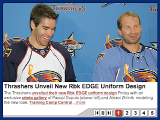
 The Atlanta Thrashers unveiled their new Rbk EDGE uniforms at a press conference today.
There were no real surprises or alterations from last year's uniform set.
Alexei Zhitnik and Pascal Dupuis modeled the new sweaters for cameras this morning. One interesting note is that they managed to make the left sleeve element work with the new Reebok jerseys. I always liked "ATLANTA" down the arm. It's something unique that no one else has done.
By the way, you can't see it here, but on the photo above, the secondary overhead thrasher logo has been added to the blue jerseys. It wasn't there last year, but it's a great logo. Glad to see they put it back.
And here's a close-up of the collars. They're pretty much sticking with what they know here.
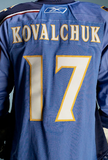
And that's what the back looks like. Same lettering and numbering — just with much larger numbers. What do you guys think? Do the Thrashers have a winner here?








Reader Comments (19)
very nice... the blue jersey is the best jersey in the league
I just don't understand how people like that arm thing on the blue jerseys.. it screams amateur and bad design to me.
*shrug*.. To each their own.
However, for my own, the blue jersey has always been ugly, and remains so, and the white jersey has lost most of it's individualism and is a huge downgrade.
"the blue jersey is the best jersey in the league"
No. It's not.
Not bad. I find the asymmetrical sleeves to be pretty hideous honestly. Unique, that's for sure. But not necessarily pleasing to the eye.
The whites aren't too bad.
it's pretty bad when the collar is the best aspect of your jersey.
Don't like the white gap in the road uniform sleeves. Should just be solid navy blue throughout. And I never really liked the blue home jersey either. When the Thrashers first revealed them a few years ago, it looked like they got tired of designing one side before designing the other side. And I don't understand where the powder blue theme came from in Atlanta? In MLB, the powder blue uniforms that the Cardinals, Braves, Expos, and other teams wore in the 70s and 80s were laughable. Definitely not a retro-look to revive.
Atlanta needs some design help.
I like them a lot, the road sweater is an improvement. I've been a big fan of the blue jersey from day one even though I know a lot of folks odn't like them.
No one has done text down the arm before because it's a bad idea. ;-)
The first time I saw the text down the arm of the Thrashers jersey, I hated it. However, overtime, it's grown on me and now I like it. I hate that they got rid of the horizontal stripe, it makes the bottom of their jersey look so empty and boring.
Why did so many teams get rid of the horizontal striping on the bottom of the jerseys when tams like the Wings and Devils have shown that it is possible to maintain them? It really hurts the designs in my opinion.
For a bird stirring himself in a glass of tang of a logo, the jerseys are not bad. They are in the middle of the pack.
Not bad at all...
As much as some may disagree, I think the Thrashers new jersey set is a winning design. If they eliminated the ATLANTA down the left sleeve on the home power blue jersey, it would be perfect for their color scheme and logos.
To this day I still don't get the point of the single-sleeve ATLANTA.
The point of the Atlanta down the side is its unique. They don't want the same jersey as everyone else, just different logo/colors!
The Blue came from the line across the top of the logo.
I actually like the new ones a lot and the atlanta this is pretty cool
"The point of the Atlanta down the side is its unique. They don't want the same jersey as everyone else, just different logo/colors!"
Why does everyone associate 'unique' with 'automatically better'? 'Unique' can go very, very wrong. Dallas proved it, Atlanta continues to prove it.
I can never figure out why the idiots who run the NHL allow teams to sport uni's with different logos?????
Talk about product identification.
Can you imagine some bozo in Arkansas trying to figure out what team is what?
So props to the Trashers for going it with just one main logo and I like them.
The worst jersey in the league continues to outdue the compitition! The powder blue jersey has been horendous from the beginning. It's just not right. Unique? I'll give you that, but that doesn't make it better than any of the other 29 teams. Only jersey I've ever hated more than the powder blue Atlanta jersey was the mustard yellow Preds jersey. Go with navy blue, and you if you insist on keeping powder blue; use it as an accent!
I've never had a problem with the white jerseys, but the new ones are a bit of a downgrade. Not as bad as the powder blue, but not as nice as the old white jersey. I really wish the NHL would go back to white/home color/away. I suppose it's wishful thinking for the time being though.
Personally I don't like the Thrashers all together... I think the name is corny. I mean come on. The thrashers? How can that compete with the Sharks or Flames. But on to the jersey. I think the jerseys are alright. I still don't like the robin egg blue. It's quite girly. This is hockey, not figure skating. And the chicken feet that ran across the bottom was a little dumb. Glad they at least got rid of that...