Flyers Unveil New Uniforms!
 Friday · Sep 14 · 2007 | 10:09 AM PDT
  24 Comments
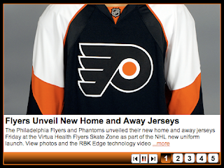
 The Philadelphia Flyers officially unveiled their new Rbk EDGE uniforms today.
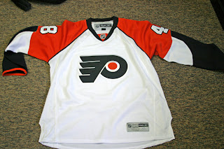
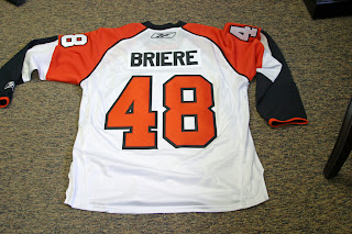
At the moment, the team doesn't have any photos up on its official web site, but I was emailed a couple photos of the new road sweaters.
If the tag on the front is any indication, this particular example is a replica. But it does have the giant numbers we've grown to love.
As more photos become available I'll post them here and at my official Rbk EDGE photo gallery where you can find oodles of photos of the new jerseys both in action and on mannequins.
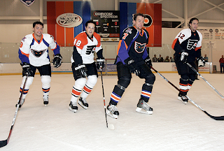
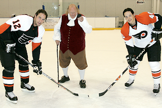
UPDATE (7:50 PM): As noted in the comments, the Flyers have posted photos from the unveiling event that took place today along with the AHL's Philadelphia Phantoms. Grabbed a couple to post here.
Two uniforms you'll never see on the same ice again. Here's something else you'll never see on the ice again.
That just reminds me of that episode of The Office where Michael brought in the Ben Franklin "stripper" for the ladies. Anybody watch The Office? That shit is funny! But I digress.
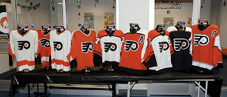
Nice uniforms on the Flyers. Can't be displeased with those. Minor alterations, but they fit in nicely with the progression of sweaters over the years. I'll leave you with a photo reconciling the past with the present.



Reader Comments (24)
people have been saying bad things about it but its not that bad at all...there are far worse new RBK Jerseys in the NHL
i agree..some stupid unintelligent flyers fans dont understand change and the modern style as time goes on...i think they remained classic with some tweeking involved...there are horrendous jerseys out there..and the flyers are not in that category....check out florida, oilers, nashville, avalanche, islanders, etc.....those baby bib lines in the front...horrible..that ruins most of the jerseys out there....anyway....go flyerssssss
These are my favorite of the new jerseys so far. Granted, I'm a Flyers fan, so I'm biased, but we could've done far worse. I think these are instant classics.
the fans may have been looking for a more dramatic change or retro look. to say that the fans are stupid and unintelligent because their opinion doesn't reflect your own is ignorant. let's face it, the jersey design really hasn't changed much.
for ed....some of these fans are stupid because all they think about is a tradition we are breaking...what friggin tradition are you breaking if you change a pattern on a new jersey....the logo didnt change.thats been the same for 40 years..so what the hell are they complainign about....relax and enjoy a slight change...iam not ignorant...iam being striaght up with all the people complaining on philly.com......just relax people
Could I... use more periods..... in a single...post? I don't... think...so.....
Everyone hates change no matter what but these Flyers jerseys are looking pretty sharp and I'm not even a Flyers fan.
i would almost like the white IF...
if i didn't absolutely love their classic white before, and if it had a hem stripe. So i hate it.
yeah... the Philadelphia Sabres' jerseys don't look too bad....
...... frickin flyers take 2 of our good players.....
....... grumble grumble grumble.........
I don't hate change, when sanjose, ottawa, tampabay, anaheim, florida expanded into the league they all had unique new color schemes and logos but they all still looked like hockey jerseys. Sweaters have always just been some combination horizontal arm and waist striping, and optional shoulder yoke. It wasnt 'til around 1995 (with some exceptions i'm sure) when people started desecrating those unspoken rules. Now this piping and patchy arbitrary coloring has just taken it to far. I would look like a clown wearing this out to a sports bar.
I must say I did hate the black jersey when it was originally leaked. However, it really has grown on me and it's not bad at all. I actually really like the white jersey. I think they're pretty sharp. A little change and update but not too much. To the people who are hating on the jerseys it could be A LOT worse. Have you seen some of the other jerseys that have come out?
While I do like the new sweaters (the sleeves look much better with on the players, with numbers than they do on the mannequin), I really wish they would have gone back to wearing orange at home. There are too many teams wearing black, the orange would have been the return to tradition so many fans love. The orange and white sweaters instantly make you think of the Broad St Bullies
Not bad at all, considering the new designs.
As a non-Flyers fan who has an orange Mellanby jersey, I admit I held out hope that they'd go back to orange as the main road, er home, er whatever-isn't-white-now jersey.
Why, why, why must they be predominantly black? Orange was so great. They were the only orange team, and it wasn't a wimpy orange. *sigh*
I like but I want to see pics of them on players!
Also, I hear orange third jersey next year? Hopefully they switch that to a home jersey. It seems like most Flyers fans want orange. Plus, whats with all these teams adding orange to their logos? Ahem... I am talking to you Anaheim and San Jose...
Hey, just an FYI for some of you wishing the flyers went back to orange, here's what FAQ on the flyers website says:
"What colors are available?
Black and white jerseys are available this year. A third orange jersey will be released next year."
It seems pretty likely that they're refering to an official orange jersey, likely one the team will wear. Not a guarentee, I know, but it seems likely we'll see the return of the orange soon enough.
I personally love the black, but orange is pretty unique in this league, so I hope they use both.
LOVE THEM... i was at the unveiling... my friend ended up buying one.
See more pics - including Daniel Briere and Simon Gagne in the new uniforms at www.philadelphiaflyers.com
about the last post, the pic with daniel brière and bernard parent in goal (!) with his old mask is GREAT!
Yeah, I agree with the last post - Bernie almost looks like he could still play!
The new Flyers jerseys are better than I expected. The only thing I'm not totally in favor of is that the shoulder panels isn't continuous and meets up at the collar. Of the two new jerseys, I like the home black one better.
Overall, I like what I see with Philadelphia's new look. No radical changes, just enough modifications to make it look different from last season's jersey.
To me, the best Flyers uni was the first one back in 67. Same for Buffalo too. And that was the uni the Flyers won the Cup in as well.
i love them, they went with change but still kept thier basic design.
i went to the unveiling and i hated the jerseys so bad......... that i ended up buying one
i don't like the sleeves below the elbow. not sure what they were going for there, but the streaming colors are weird. they should have just gone with one solid color. it's awkward.