Coyotes Unveil New Uniforms!
 Saturday · Sep 15 · 2007 | 7:06 PM PDT
  9 Comments
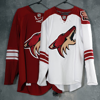
 At long last, the Phoenix Coyotes have updated their web site to indicate to us that their new Rbk EDGE uniforms have actually been unveiled. Behold the proof.
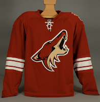
While no further photos have been posted to the site, I do have a few from the team's press packet so we'll consider them with this being the "official" post on the subject.
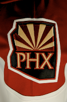
They're a little plain but I think that helps accent the logo. They're nowhere near the simplicity of the new Leafs' sweaters — which aren't helped any by the monochromatic logo. It's at least visually interesting to note that the shoulder patch is only on one side. As I pointed out earlier, it switched sides. No word yet on why.
It's a very clean and sharp uniform set and Coyotes fans should be thrilled.
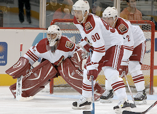
UPDATE (9/16 7:50 AM): The Coyotes finally updated their web site late last night or early this morning with a great photo gallery from CoyotesFest. There were a couple of great action shots in there that really show off these uniforms.
They might be a little plain but they've got that old-time hockey feel and there's nothing wrong with that. One thing I never noticed before (since the Lightning almost never play the Coyotes) is the moon symbol from the original 1996 logo set has been retained on the pants.





Reader Comments (9)
You know, I'm surprised, but I actually like the new white Coyotes jersey. I think it's pretty sharp, especially compared to some of the new jerseys. The red one is pretty standard, but the white one is (and should be) a home jersey. I hope the NHL isn't too far from going back to white at home.
It's nice and simple. The same reason why I like the new Leafs jersey. You can call it "plain", "boring" and "too simple" all you want. I perfer to call it classy. Back to the Coyotes....it's a nice jersey. Well done!
That shoulder patch is gorgeous. Not as awesome in my opinion as the Caps new shoulder patch, but I'd buy that patch alone.
Worst logo, worst colors, and possible worst team in the NHL.
The Plain jerseys (Leafs, Wings, Coyotes ect.) make the overall uniform look better. When you see the socks, pants, helmet ect. matched with the plainer/simpler designs they look the best.
Actually I like the new coyotes jerseys. There very plain and yet it looks good. The only problem I have is the shoulder patch, looks kinda goofy to me but, overall they look good. Still miss the old Coyotes logo tho :(
those are beauties.
I just wish Doan was in a Pens uniform.
I'm a Coyotes fan very pleasantly surprised. The white jerseys look SO much better when I see it on a player in action. You see, when I saw the EA screen leaks I was horrified.
Anyone have a picture of the players in action with the home reds? By the way, the moon has been on the pants since the original re-design (and before that, it was the Kachina-doll coyote head on the black pants.
I like the Coyotes white jerseys as well. Nice touch with having laces on both jerseys. The red actually looks like an old jersey. Very nice! I agree with Brandon, I hope the NHL will bring back the home to white jerseys! We don't have to be like the NFL...