First Photos Of Coyotes' Sweaters
 Saturday · Sep 15 · 2007 | 5:01 PM PDT
  10 Comments
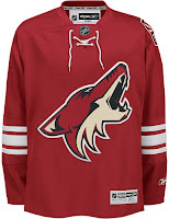
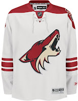
 Greetings, all. With much thanks to Paul and Wayne for their lightning quick responses to my previous post, we finally have actual photographs of the new uniforms for the Phoenix Coyotes.
We'll start with the NHL.com Shop images. The photos haven't been released on the site yet but have been uploaded to the servers.
The biggest alteration to the sweaters are the brick red sholder yokes now present on the road sweaters. I like that because although it's an irrational thought, I always feel like solid white jerseys blend into the ice too much. Also, the horizontal stripes around the bottom of the jersey are gone.
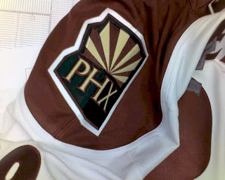
One more minor note is that the "PHX" patch is now located on the left shoulder. It was moved from the right. Not sure why though.
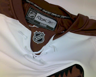
These photos were just posted over at HFBoards.com so I thought I'd keep them circulating. Apologies for the color. I would've done some retouching, but I just wanted to get them posted quickly.
I feel like the Wizard of Oz standing behind a curtain when I tell you to pay no mind to those iron-on letters that appear to be detaching themselves from the back of this jersey. If I were to guess, I'd say it was worn by a prospect at a recent tournament. Anyone want to confirm?
And as a special treat, our friend Wayne has also dug up the following graphics deep from the bowels of the NHL web servers. Have a look at the Sabres', Rangers' and Devils' new road jerseys.
But wait, if you thought that was it, get ready for this. Here's our first photograph of the Edmonton Oilers' new road sweater.
I just want to know what happened to the sleeves. At least when Florida did the whole interrupted elbow stripes, it was because of a swatch of color riding down the arm. Here, I just don't know. I'll wait to pass judgment until we see more photos.







Reader Comments (10)
i love the phoenix jerseys...its a shame they are a terrible team.
Too bad that the Phoenix Coyotes jerseys weren't of that darker, more "maroon" color. But I think this is definitely a winner!
I'll have to see these in person to know for sure if I change my mind or not on whether I like the brick red shoulder paneling (yoke) on the new road jersey.
I love 'em! Very classic NHL, nice colour. I would have liked to see some striping on the waste. Other than that, very classy look. And no piping!
I really like the Phoenix jerseys, it's just a shame that they lost the stripes on the waste.
Every time I see Edmonton's jersey I just start to laugh.
How far they've fallen.
I want to nominate EDM's new jersey as the worst of the bunch. Half sleeve stripes? And piping all the way down the front? Ha ha ha!! A two year-old could have made a better design. Doesn't matter, the jersey will mimic the crappy on-ice product they will put out this year anyway.
I'm an Oilers fan and there new jerseys make me want to puke. How horrible those things are! Even Jarret Stoll said they look like a practice jersey. It's like there computer froze when they were being designed and they never bother rebooting.
As an Oilers fan, I was thinking this is a joke and maybe it's a practice jersey... Seriously, I've been waiting this long for this garbage?
PS - Chris, you're doing the Lord's work here.
Phoenix' stuff is nice.
Oilers, not so much. :(
Those Oilers jerseys are bad.