Sunday
Sep162007
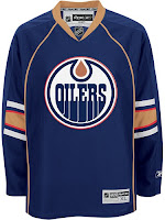
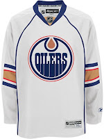
Preview New Oilers Jerseys
 Sunday · Sep 16 · 2007 | 11:57 AM PDT
  16 Comments
 The Joey Moss Cup should just be getting underway in Edmonton but the Oilers have yet to post any photos of their new Rbk EDGE uniforms on their web site. But thanks to our pal Wayne, we have a preview courtesy of the NHL.com Shop.
I've really liked the designs of most of these new Reebok jerseys, but I just can't figure out the half-stripe thing going on at the elbows here. It at least made some sense for Florida because of the red stripes going down the arms. But here, I just don't really understand.
We'll continue to wait for official word from the Oil. Hopefully they don't take as long as the Coyotes did yesterday.


Reader Comments (16)
I just don't understand this jersey. Apart the fact that it's the ugliest white jersey in the league, why cut the stripes on the arms?
I just can't get why the designer choose something so boring and that doesn't fit together.
I hope they will not serve us the bullshit of the two years of developping and testing colors. This jersey can be made in five minutes by anybody. In fact anybody will make an improvement on that, by letting the stripes on the arms got all the way.
I'd be sorry to be a oilers fan roght now. At least, they will not see the wite one at home.
So for me absolutely the worse one white jersey of the league.
The above must have be written by a Flames fan. The away jersey are not the worst, but not the best either. These are average jerseys no better no worse then the countless others league like the Leafs, Coyotes, Flames etc. Basically, it looks like most teams took their practice jerseys and made them their regular jerseys.
I actully don't mind these at all. I think they look quite simple and sharp. I'm sure once you add the pants, socks, and helmet they won't look so plain and will be quite a classy combonation.
Nice jerseys! Simple and effective. I don't mind those half stipes at all. Very different but not too out there. I like the way they've incorporated both the copper and orange colours into the elbow stripes. That's a great detail! I'm not an oilers fan but I think the team has stayed true to it's roots and produced a classey jersey here.
the only thing i don't like is the fact there is no secondary logo patch
They have to be seen with the entire uniform. They're pretty sharp, when the pants and socks are included.
I really, really like these jerseys. One of the best I've seen.
I find them rather boring and the half stripe on the sleeve is strange.
I have seen the full uniforms, on HFBoards, and they're just as plain and boring and practice jersey with everything added.
It boggles the mind, and as a long old-time oilers in my youth, I want to cry or laugh, every time I see these monstrosities.
It shows a distinct lack of effort, and an almost push-over attitude to reebok's template.
It's almost as if someone on the oilers wants to piss off fans enough to get the team moved.
im overall impressed with their new jersey's but im not a fan of the half arm stripes on the side but other then that there not too bad just a little on the boring side.
they ripped off of the panthers... i loved the panthers but i hate these cause they ripped off florida... that's why i hated pittsburgh. whats with all the teams ripping off each other?
PIPING...PIPING...PIPING = LAME!!!
so... they are wearing practice jerseys in the real games now?
These jerseys look great, except for the lack of elbow stripe. It's because that part is a full arm panel but it just looks like it's lacking something. I was right behind the bench, first row for the Joey Moss Cup and the jerseys look great.......just can't figure the stripe out!
TERRIBLE! As a long-time Oiler fan I absolutely loved the original blue, orange and white design. It was colorful, bright, fun and it signified the Oiler mystique. In 1996 I was upset with the first uniform change, but I really didn't mind it. Now, seeing this monstrosity has me really annoyed. These things are brutal. No color, no creative design, just plain white or plain dark blue with hardly any striping at all. Who the heck designed these pieces of junk? The only thing good about these overpriced practice jersey look alikes is that I will be saving myself alot of money since I will not buy either one of them.
Half Stripes? 5 Stripes = 5 Cups...Badge of some sort.