Thinking About Minnesota
 Sunday · Sep 16 · 2007 | 9:58 AM PDT
  8 Comments
 We're waiting for the Edmonton Oilers to show of their new uniforms today, the least I can do is offer up some Minnesota Wild concept art. Let's get right to it.
I don't think this design is trying to prove anything. Probably just a bored artist having a little fun. For those who didn't recognize it initially, that's the new Rbk EDGE home sweater for the Montreal Canadiens. The colors and crest have been changed. It's not bad, but I definitely think the Wild went with the right look.
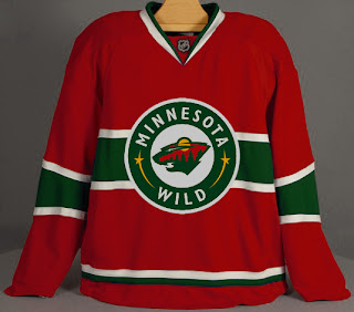
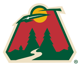
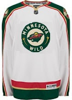 With this concept, the designer was just trying to see what the crest on the home sweater would look like on the road. Once again, I think the Wild got it right by using the large bear head logo over this circular one.
Quite honestly, I really like the Wild's logo and uniform design. Some folks have lodged Christmas-related complaints with regard to the color combination, but I find fault with that. I think the wheat color
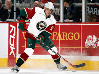
But let's mix it up a little. What if the Wild just recolored the home pattern white and called that the road jersey. Might it look a little something like this?
It just might. Anyway I've also got some concept logos that were sent to me by John.
This redesign morphed the bear head into an "M," keeping the major elements from the original. I'm a huge fan of the bear head, but this is not a terrible idea.
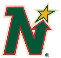 This logo is simply the Minnesota North Stars logo in the colors of the Wild. Personally, I think it was best like it was. But this does make me laugh.
So while we wait on the Oil, I might even have another concepts post at some point today. Hope you've enjoyed what you've seen here.
By the way, get ready as tomorrow I plan to open a poll where you all will get to decide on the subject of the next logo tournament.




Reader Comments (8)
As I expressed I believe in the "jersey unveiled" blog entry, I wish the Wild simply kept the exact same look even with the new RBK Edge template. The Red Wings did it. The Rangers did it. Why not the Wild?
I cannot stand the new collar and thinner shoulder trim on the new road jerseys. The addition of the NHL logo makes it look like there's a necklace around the collar.
Their alternate turned home jersey should've been left as it was. Same with their road white jerseys.
As for those concepts, the road white version of the new home jersey with the alternate crest logo wouldn't be bad (the game action photo), but not good in slapping it on the current road jersey.
That morphed primary logo doesn't do it for me. It looks like it gained a 50-pound tumor. And no way do I want to see the North Stars' N logo in Wild colors. I don't mind the team wearing a 1991 throwback jersey in game, but the Dallas Stars own the logo at this point.
Hey! You used my logo switch! Thanks!
i am a little confused... people keep talking about the bear head on the home jerseys... i can't see it, can someone explain that to me?
but the wild jerseys are some of the nicest of the new RBK jerseys (top 10), well done!
HockeyFan4Life said...
i am a little confused... people keep talking about the bear head on the home jerseys... i can't see it, can someone explain that to me?
hey man...its actually quite easy once you find it the first time.
http://nhllogos.blogspot.com/2007/05/wild.html
go on there and take a look...the bear is looking to the left, and the moon is his ear. the eye is the star and the mouth is the left part of the logo with the river making up its mouth. the curves of the river create the teeth. theres a small greenish blocky part on the far left which is the nose. see it now? its really an amazing logo when you notice it...
oh wow... thanks for explaining it... as soon as you said the bear is looking to the left and the moon is his ear... it is really easy to see... i loved the logo without knowing that and it's even better now! thanks for pointing it out!
I absolutely love that 'M' logo. Good work John.
The "M" logo would look sweet for the shoulders. Nice job!
Btw, I'm John, the guy who made the 50-pount tumor alternate logo :p I appreciate the comments it got though, and promise that you'll some more work of mine very soon.