Updating The Wings
 Friday · Sep 21 · 2007 | 2:19 PM PDT
  15 Comments
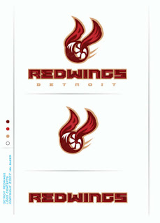
 Yesterday I posted a great Florida Panthers rebranding concept and lots of you responded. I know one comment in particular asked about a Detroit Red Wings concept of similar quality. Well that reminded me of this logo I came across a while back. And I would contest that it's even of a higher quality than that Panthers' concept.
Before I talk about it any more, take a look at it.
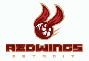
It took me a second to even realize what I was looking at. It's just so different. One thing I've always thought about with regard to updating the Wings' logo was maybe using a more contemporary-looking wheel.
 The current wheel is classic but dated — and as long as we keep making new cars, that will always be the case. But this thing just floors me.
First of all, the design itself is top-notch. I mean, don't get me wrong, I know nothing like this will ever don a Wings' sweater — not even a third jersey — but it's way cool to look at. Second, it definitely has a "now" sort of feel as opposed to something stuck in the 1950s.
My favorite thing about this logo is in the wings. At first glace, you may not have noticed, but hidden within them are an "R" and a "W" — standing for Red Wings, naturally.
Like I said, nothing like this would ever come to be accepted by hockey fans in Detroit, but it's fun to wonder.
If somebody wanted to create a concept uniform around this logo, I'd be open to posting it. In the meantime, what do you guys think of this? Worthy of a Detroit jersey? Or too crazy to ever make the cut?


Reader Comments (15)
Wow, I suddenly regret expressing curiosity about this on the Panthers redesign discussion. That looks abysmal compared to what they've kept for the last half-century. It follows a very bad trend (Nashville, Ottawa) of 3/4-view logos. I've yet to see a single logo or logo idea in 3/4 that looks anything close to as good as a similar idea put in profile. Likewise, I don't see any 'modernization' with the design's wheel. If anything it looks more like a wagon wheel than something you'd find on a car, not that having a modern-looking wheel in the logo would look any good either (oh lord, a logo with spinnaz?). The wheel is supposed to be evocative of the auto industry in its art-deco golden age, something you're just not going to get with a modern wheel.
Meanwhile, the wings look downright flimsy - to me they look more like paper streamers tied to the hub of the wheel. The R and the W is an alright touch although incredibly redundant - 'red wings' marked out on a pair of red wings?
All in all it's a decent effort but it gets the big thumbs-down for me. I'm more interested in seeing what sort of ideas might surface for a shoulder-patch idea - something obviously simpler than the main logo but still tying in to the classic design without trying to 'modernize' it unnecessarily. As for the main logo the only alteration I could see that would be potentially acceptable would be a redesign of the wheel's 'spokes' to create a new pattern while still keeping the 30s-40s appearance
I should also ask, was this done by the same guy who did the Florida revamp from yesterday?
I should also ask, was this done by the same guy who did the Florida revamp from yesterday?
No, this concept was created by a guy named Ian Baker.
No. Just no.
And the whole "if you look real close there's something hidden in it" thing is lame.
The Wings are a classic and will never, and should never, be changed.
PATHETIC. if that was ever on a wings sweater i would probably stop watching hockey altogether. and this is coming from someone who is not a detroit fan. it looks like something harry potter should be chasing after in a game of quidditch.
i think it's pretty cool, for what it's worth. no biggie, they'll obviously never use it, but who knows? maybe seeing this artwork will spark something in someone elses mind? i think it's in no way as good as the current, but still cool, original, and plain good artwork in it's own right.
i dont know if bashing this design is right to do, this designer just wanted to share his concept ideas with fans...dont get mean wrong i wouldnt want to see it on a wings jersey but i respect his creativity. i say good job Ian
this looks like a lifesaver candy with wings
It's not that it's a bad design. It's just that seeing that and trying to imagine that affiliated with the Reg Wings causes me to immediately reject it.
And again, the "hidden" stuff. Weaksauce.
I think the Red Wings should ditch the whole wheel thing and just use a "red wing" as their logo. It would make so much more sense. I mean, what does a wheel have to do with Detroit?
As a die-hard wings fan....that "logo", and i use that term loosely, is the worst thing since the Blue's jersey that Mike Keenan vetoed oh-so-many years ago.
Vickie - Are you serious? You DO realize that Detroit is pretty much the epicenter of the North American auto industry, right? Jebus...
Probably would work better as a secondary logo, but it's a good concept and if fans weren't so blinded by "tradition" they'd see that it really has a lot of potential. Great design work.
All I can see when I look at the concept logo is a 'Golden Snitch' from Quiddich.
There is nothing wrong with change, but sometimes subtle, small steps, are better. And some times....leaving things alone are best.
This Red Wings Fan would NEVER buy anything with the concept on it. *YUCK*
GREAT SITE!
as a wings fan i think a secondary logo for an alternate jersey would be cool, but this is the worst concept art ever 1/10