Prepping For Habs' Big Day
 Monday · Sep 3 · 2007 | 12:56 PM PDT
  20 Comments
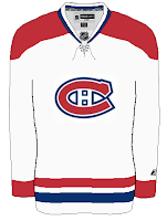
 Along with the Calgary Flames, the Montreal Canadiens will be unveiling their new Rbk EDGE uniforms tomorrow. To get everyone ready for that, I have concepts.
Unlike the the Flames, the Habs haven't really leaked anything whatsoever regarding their new sweaters. I don't know of one solid rumor or suggestion thereof that we have to go on. It's going to be a total surprise. Or else, they won't change a thing and simply adapt the present design to the new cut and style like the Red Wings and Rangers have.
This concept is based off of the New York Islanders' new duds. They're pretty sharp and would probably go without too many complaints from Habs fans.
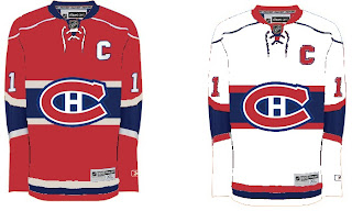
 This fan-created design is closest to what the Canadiens wear as a road jersey at the moment. The white one above seems more like the vintage alternate jersey.
Not that there would be anything wrong with either. But I've been reading comments from Habs fans who would like to see a new road sweater more similar to that one.
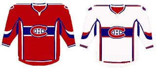
If you're a fan who fears these uniforms will be too busy and feature an overabundance of striping, don't look now, but we have concepts to scare you.
Whoever wears those jerseys will need pretty big shoulders to fill them out. I'm not entirely convinced those aren't football jerseys. Anyway, I've also got a fan-created logo redesign to show off. What do you think?
Personally, I like it with the "H" in the middle and would hate to see it change. Furthermore, it won't change. The world will end before the Canadiens get a new logo, of this I'm quite certain. Perhaps it's my crystal ball or perhaps it's an understanding of human behavior and an overwhelming hatred of change in the hockey world.
Anyway, hope you've enjoyed what you've seen while you wait for the new sweaters to be unveiled tomorrow at some point. This goes for the Flames as well as the Habs, but naturally, as soon as I can post pictures, you know where to find them.


Reader Comments (20)
KEEP THE RED SHOULDERS ON THE WHITE ROAD SHIRTS PLEASE!!!!!!!!!!!!!!!!!!!!! pretty please.
I don't know who you're begging, but if it's me I have no control over that. If it's the team, they've already done whatever they're going to do. But I'm with you, I like the red shoulders too. Thanks for commenting!
I like the idea of changing the 3rd jersey to their away jersey. I always wondered why they didn't have that blue stripe on the white jerseys.
I like the logo idea, but I agree that it will be a cold day in New Jersey before the Habs change their logo.
It's never cold in New Jersey?
I really hope they don't make the current alternates the full-time away jerseys. The blue stripe clashes horribly with the number on the back, and makes it nearly impossible to read.
They gotta keep the red shoulders. They're the best aways in hockey.
that new logo has already been used.
They used the globe on their jerseys in 1924...check it out at NHL Uniforms.com.
"Personally, I like it with the "H" in the middle and would hate to see it change. Furthermore, it won't change. The world will end before the Canadiens get a new logo, of this I'm quite certain. Perhaps it's my crystal ball or perhaps it's an understanding of human behavior *and an overwhelming hatred of change in the hockey world.*"
Uh, what? You've stated repeatedly that you've wanted Tampa Bay's logo to change. And you've deemed Detroit's logo as being one in need of a revamp.
To Chris P:
I was merely trying to be clever. The usual expression is a cold day in hell, and as both hell and New Jersey are home to devils, I thought I'd be cute and give it a hockey theme and substitute New Jersey for hell.
As a Habs fan, I'd be OK with the blue-striped white jersey, but only if the numbers are white with a thick red border, not the current red w/blue border. The white number would provide the contrast with the blue stripe, while the red border would do the job against the white jersey. This would be pretty close to how they were worn in the 40s (the numbers then were all-white with blue borders but didn't extend beyond the blue stripe).
The current third jerseys are really nice up close, but don't work from a distance or on TV because of the numbering problem. I can't figure why the Habs never fixed them.
"As a Habs fan, I'd be OK with the blue-striped white jersey, but only if the numbers are white with a thick red border, not the current red w/blue border. The white number would provide the contrast with the blue stripe, while the red border would do the job against the white jersey. This would be pretty close to how they were worn in the 40s (the numbers then were all-white with blue borders but didn't extend beyond the blue stripe)."
I like this idea a lot. But here's what I thougt of when reading your post:
Blue borders! It would let the blue stripe go around the numbers. I think this would look pretty sharp.
As for the home jerseys... I hope they make no change at all like the Rangers and Red Wings or do something like the Bruins, a little upgrade but I can't really think of anything that should be upgraded on the Habs uniforms.
I think their practice jersey's would be awesome, but I cannot see them going with blue instead of red as a home jersey and it seems that white must be worn on the road. I also hope the habs keep the red shoulders/
"Blue borders! It would let the blue stripe go around the numbers. I think this would look pretty sharp."
I thought about a blue border but it might make it look like the number "shrinks" into the blue stripe. Maybe if it were a thin blue border to minimize the effect?
Any Photoshop gurus hanging around to do a couple of mock-ups?
They're out:
http://cdn.nhl.com/canadiens/images/upload/2007/09/nouveau_jersey.jpg" REL="nofollow">http://cdn.nhl.com/canadiens/images/upload/2007/09/nouveau_jersey.jpg
Picture of new sweaters at http://canadiens.nhl.com/team/
app/?service=page&page=NHLPage&id=17869
Cut and paste the above URL into your browser so that it is one line.
they are exactly the same....
this sucks!
it would have been great if they came up with a new design
and the away jersey is lacking blue
I REALLY liked the first set of sweaters in this post. The old-school white jersey is far superior to the current white. Ah, well. Status quo.
They are the same thing as the older one hahahaha
http://cdn.nhl.com/canadiens/images/upload/2007/09/nouveau_jersey.jpg
http://canadiens.nhl.com/team/app/?service=page&page=NHLPage&id=17869
habs unveiled