Rbk EDGE Review: Coyotes
 Sunday · Sep 30 · 2007 | 3:57 PM PDT
  9 Comments
 Part 7 of 30. All 30 NHL clubs have unveiled new jerseys under the new Rbk EDGE Uniform System for the 2007-08 season. Here at the NHLToL, we're going to review every one of them. Read up and then rate the new sweaters. We'll do a full ranking after completing all of the reviews.


The Unveiling
Saturday, September 15. The Coyotes unveiled their jerseys at CoyotesFest in Phoenix.
Home vs. Road
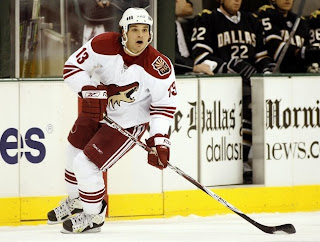
Home: Brick red. Road: White. The two sweaters are essentially mirror images of each other but for the shoulders and both feature secondary logo patches on the left shoulder.
The brick red home jerseys are completely solid in color except for three white stripes around each elbow. The middle stripe is about twice the thickness of the other two. White laces hang from the collar and the primary logo serves as the crest.
The white home jerseys feature a brick red shoulder yoke and three brick red stripes around each elbow. The middle stripe is about twice the thickness of the other two. White laces hang from the collar and the primary logo serves as the crest.
In The Details
The shoulder patch featuring the secondary logo is found only on the left shoulder of each sweater. The same numbering and lettering style has been retained.
New & Old
The biggest differences in the new jerseys are the lack of stripes around the waist and the addition of the shoulder yoke to the road sweater. One minor change seen here is that the shoulder patch has switched sides. It was previously worn on the right shoulder.
Standard FAQ
Numbers on the front? No.
Laces at the collar? Yes.
NHLToL Editorial by Chris
I have to say that I was always among the fools that loved the original Coyotes jerseys. They may have been a little busy, but boy were they unique. They looked like no other team on the ice. I especially liked the old logo as well. I'm not nearly as fond of the new one. Still, it's simplicity that works. I like the addition of the shoulder yoke to the road jersey and I think the "PHX" patch is top-notch. As a uniform, I won't say it's among my favorites, but I respect it. 3/5


Reader Comments (9)
I find it funny that I have voted 5/5 for every one so far.
Basic as it gets but I like it - After watching a few games I'm finding myself liking the no stripes at the bottom of the jerseys
I too liked the originality of the old jersey...goofy as it seemed
I love the 3 vertical stripes on the pants too
I really like Phoenix's stuff, especially the white now that they've added the red shoulders.
This is my favorite NHL Jersey and Logo. And I am certainly nowhere near a Coyotes fan.
I never was a big fan when the new ones were unveiled but they have grown on me a bit, I think also because we are starting to see some young stars break out down there as well it just looks like a rejuvenated team. Fav is the white, the only downside I have is that there is only one shoulder patch, to me it makes it look damaged.
I was a fan of their old jersey but I didnt like the logo, I dont like the new jersy but I like the new logo, go figure. I want to know who the idiot in Phoenix is that is making all their sport franchies red and white. When I first saw these uniforms the first thing I thought is they look like the Detroit Red Wings. I hate copycats. I will say the addition of the red shoulder patches are an improvement on the white jersey as well as the lace, but thats about it. 2 and half stars out of 5.
Would have to totally disagree on the old ones. I thought they were absolutely atrocious. Ugly as hell. Worst in the NHL. The logo made me want to puke. The new ones are much better and I really like the logo. The white ones look great - have a very clean look to them. They also don't really look like Detroit to me because the shade of red is much darker. They're more maroon than red.
I don't like these uniforms. They're boring. The logo is too modern for the jersey and the jersey is too traditional and simple for the logo. They could at least have all the colors from the logo in the uniforms. The addition of the red shoulder yokes is nice. I like how they incorporated elements of their old logo into their new one. It looks like they spent a lot of time designing the logo and just quickly thought up a uniform. When they unveiled them a few years ago, they said it took them TWO YEARS to design them! I could've designed that in two minutes!