Sharks, Here's How You Fix It
 Sunday · Sep 30 · 2007 | 3:34 PM PDT
  8 Comments
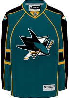
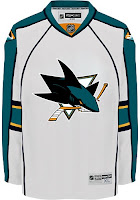
 Speaking personally, I'm a fan of the San Jose Sharks' new logo and uniforms. So I don't see a need for "fixing" it necessarily. But others have complained that the modern logo design clashes with the more traditional jersey design.
One alternative to the stripes they currently wear would be something more along the lines of what the Florida Panthers do. I guess those designs match a little better. But for my money, I'd go with white piping over the orange on the home sweater.
Other complaints deal with not being able to move past orange gaining more prominence on the jerseys. Here's a solution.
I like this one because it looks like there are shark fins under wavy water on the sleeves. I think it works a little better on the white. But here's hoping the Sharks consider something of the like for a future third jersey. Speaking of the whole "fin" element, here are a bunch of ideas, seen with orange versus silver.
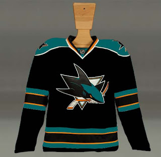
What I really like is the black jersey. Perhaps that would serve as a better third jersey as it has the last few years for the Sharks. But what do we think of it with the current striping pattern?
I know I said I like how the San Jose sweaters are now, but I'd be lying if I didn't say these were pretty awesome too. I guess it's hard to go wrong with the Sharks. So if they need fixing, there are plenty of ways of doing it.
Next up: Philadelphia Flyers.


Reader Comments (8)
I think the Sharks's new uniforms are the best of the bunch. Like the gold accents.
they just need to bring back the "original" black jersey...those were classy...
I'm not crazy about the orange, but I love their new jersey design...
How is the new Sharks logo so much more "modern" than the old one? There's some minor differences, but the logo is basically the same.
I agree with chris, no fixing needed. And now that the canadian dollar is officially more than the american dollar i may go buy a San Jose home jersey.
My issue with the Sharks jersey is a minor one. I think the numbers on the front make them look too busy. I think if those were removed it would make them super awesome.
It seems like a lot of the "fixes" go with the Panthers' style, which is not a good jersey IMO.
For me the biggest problem with Sharks the new jerseys is that the full-shark logo looks way better than the triangle-shark logo. http://picasaweb.google.com/nhlconcepts/SanJoseSharks/photo#5111981750533055346" REL="nofollow">this is the best Sharks concept I've seen.
That being said, the second set here looks pretty sharp. I don't like many jerseys that use the allstar template, but this one actually looks good.
I am not a Sharks fan. In fact, they are my least favourite team. That being said, they did a great job with their new logo and jersey design.
I do not get the orange accents. How does that relate to a shark? But, I must say it works.
Numbers on the front on any jersey do not do it for me. What ever happened to "you play for the name on the front of the jersey, not the back'?
And why do so many teams use black as a jersey colour when they have a unique one of their own? Teal works with the Sharks. Just like LA has purple, Old Anaheim with purple and green, new Anaheim with orange.
Dallas green, and sorry Chris, why not have a blue Lightning uniform?
did a guy named casey make this? I was there when he was. Its a great look.