Flames Unveil New Uniforms!
 Tuesday · Sep 4 · 2007 | 12:39 PM PDT
  73 Comments
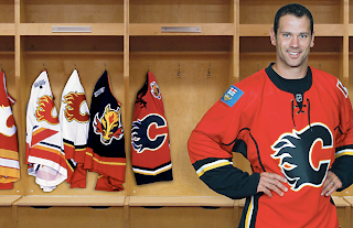
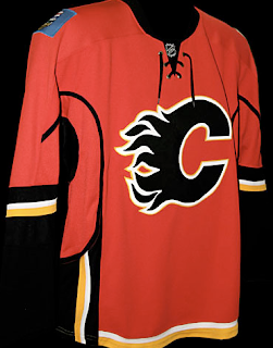
 The Calgary Flames have become the 14th NHL team to unveil their new Rbk EDGE uniforms. Check out Craig Conroy modeling the newest in the progression of Flames sweaters.
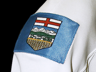
The element that seems to be causing the most controversy is the patch on the right shoulder which is the flag of the province of Alberta.
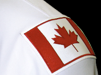 The left shoulder of the jersey features the Canadian flag. From the team's official release: “Among the enhancements, we are pleased to carry our National and Provincial flags on our home and road jerseys this season,” said Flames President & CEO Ken King.
“As proud Canadians and proud Albertans, our desire is to display the identity of our country and province and carry them throughout North America and the world. Our jersey incorporates our strong history, the latest in technology, and is something our players and fans will be proud to wear.”
These new jerseys are very nice and Flames fans should be thrilled! Enjoy your big day!
Coming tomorrow... the Pittsburgh Penguins.
 UPDATE (5:06 PM): Thought you guys might like to see these jerseys on players in full gear. Here, Dion Phaneuf and Matt Lombardi model the new uniforms at the unveiling ceremony at Flames Central today.
I can't say I have any complaints. I'm really liking the giant logos on the front. I never liked the huge jerseys with such small logos on the front. Never really made any sense to me. It's your team's symbol. Show it off, dammit!
Anyway, thanks for the comments you guys have posted so far. I'm sure there will be many more to come. As for my two cents, I think the flag shoulder logos are a very nice touch. I don't think the blue flag clashes at all. I think it just stands out.
I also like the idea someone suggested of the Oilers incorporating a new shoulder logo with the outline of Alberta. The Lightning's secondary logo has an outline of the state of Florida and I really like that.



Reader Comments (73)
i think the dude that was Anonymous that wrote that we should be proud of having our provinces flag and the countries flag on the jersey is right
The socks I'm pretty sure are the German National teams for away games...I don't like the overall look although the jerseys didn't change much. I don't think I'll be shelling out any $$ for the new look. The coat of arms with a gold trim would have been 1000x better than the flag.
Ok, so after a break to think about that, here is my comment about that jersey.
I'm in shock. And it's not because of the shoulders pads. The Canada one is correct, and should be on both shoulders if you ask me. Just replacing the horse on the now old flames jersey would have been an amelioration.
For the blue one, I think we will have to wait and get accomoded to. if I was a Alberta fan, maybe I would enjoy having my province on my shoulder. And don't think the blue is a bad contrast, it is in fact designed to be first thing noticed. So time will tell.
The problem start for me with the striping. No good if you ask me. In fact, it's not utile to have these stripes.
The terrible area is the bottom. The old one was curved, like a V, and was relatively hight (maybe 2-3 inches on each side.) It was neat and clean.
Now we have a mess up of lines, and a little bottom of about less than one inche. It don't look as good. It looks modern, but fragile.
So to sum up it's a donwgrade for me, and I'm shocked of that. The shoulders I can live with, but the piping and the messed up bottom is not correct.
Yes the Flames had one of the 3 bests uniforms in the league. Not for now. At least they keep the color sheme, with the C black, witch rule.
So a great day is off, with a sense of emptiness in my heart.
It really pisses me off that they went out and stuck on Canadian flag on their jersey. How did they get the NHL to approve this? They are going out and trying to make themselves look as Canadas team which I am sure they will now run market schemes for, when not only are they not Canadas team, we are mostly East populated, not West. And not to mention, if Canada had a team it would be Toronto or Montreal. Plain and simple. Same thing with the Alberta patch, they are just looking to give this braging rights to call them selves the team of Alberta and the team of Canada. Ridiculous!
The flags on the shoulders remind me of the N.A. vs World All Star era. The jerseys aren't overly bad though.
Ha ha ha! Wow, what incredibly bad taste. Why do the Flames feel the need to express national/regional pride? This is a big money NHL franchise not a representation of Canadian national identity. Why not just stencil the cities coat of arms on to their asses?
GROSS
Vancouver had to spread their name over the jersey so that we wouldn't forget where they are from, but Calgary has taken it a step further by putting the Canadian flag so we know what country they are from.
the only possible reason this could be a downgrade is because of how good the jerseys were before.
as for me i love em minus the side piping. flags look great!
Wow... you guys are so bitter about these patches.
Why would you be upset? It's just a patch for heck's sakes. If they're proud to be Canadian/Albertan, let them be. Nobody's ranting about how Tampa has a silhouette of the state of Florida in their secondary logo and notice how the Panthers are called "Florida" Panthers?
I have a Canada flag on my backpack, does that mean I'm proclaiming it to be Canada's backpack?
You guys just need to realize that there are other Canadian teams in Canada that aren't from Ontario or Quebec. Toronto should be the lastt to garnder the title of "Canada's team". They've sucked for way too long and frankly, it's embarrassing.
In conclusion, the old jerseys look way better anyways. RBK ruined the sport of hockey.
anyone know if the numbers are still the same or if they have changed?
fuckin calgary. what the fuck is up with the flags? not fucking canadas or albertas team. wish what you want calgary fans. youre not. youve one stanley cup and it was years ago. so dont put that shit on the fuckin jersey. i hope edmonton comes out with something so much better and not do something so rediculous. this isnt the allstar game. its like the national anthems being played. if your gunna play one play each anthem for each nationality a team has. its retarded. proves my point even more calgary is retarded and shows no class. because i agree with the other post, they are going to use it in marketing schemes now. no class. i do hope the go up in 'flames' and burn to nothing.
"fuckin calgary. what the fuck is up with the flags? not fucking canadas or albertas team. wish what you want calgary fans. youre not. youve one stanley cup and it was years ago. so dont put that shit on the fuckin jersey. i hope edmonton comes out with something so much better and not do something so rediculous. this isnt the allstar game. its like the national anthems being played. if your gunna play one play each anthem for each nationality a team has. its retarded. proves my point even more calgary is retarded and shows no class. because i agree with the other post, they are going to use it in marketing schemes now. no class. i do hope the go up in 'flames' and burn to nothing."
...This dude needs to go back to rehab.
The White Flaming "C" on the pants is a nice touch.
These sweaters are NASTY!!
....
And I don't mean the good nasty.
Is it just me, or do MOST of the old logos and jerseys look better...Buffalo, Edmonton, Calgary, Philly, North Stars, LA etc.
Maybe I'm just old...
"fuckin calgary. what the fuck is up with the flags? not fucking canadas or albertas team. wish what you want calgary fans. youre not. youve one stanley cup and it was years ago. so dont put that shit on the fuckin jersey. i hope edmonton comes out with something so much better and not do something so rediculous. this isnt the allstar game. its like the national anthems being played. if your gunna play one play each anthem for each nationality a team has. its retarded. proves my point even more calgary is retarded and shows no class. because i agree with the other post, they are going to use it in marketing schemes now. no class. i do hope the go up in 'flames' and burn to nothing."
LOL I LOVE THAT GUY LOL
As a big oilers homer i bleed Orange err... i mean copper and blue, I actually like the flames jerseys. Except the canada and alberta patch, the canada one isn't that bad cause the colors of the alberta patch just looks out of place. I guess trying to have a little oil colors! lol
I absolutly love it, I think the Canadian flag and the Alberta flag on the shoulders are a great idea I'm a proud Canadian and a proud Albertian and just seeing that on their jersey makes me want to stand up and chear
I really don't understand all the hissy fits that are being thrown here. So what, they put our flags on the shoulder's, yeah I think they're trying to shove it in everone's face that they're Canada's/Alberta's team, that was their motive. You bunch of moron's once you stop pouting and crying, take the time to realize, It's just a friggin jersey for a sports team, give it up.
I'm a Calgary fan and resident but I'm going to be as objective as I can be.
First of all, the flags right now are only a 1 year thing, they had to get permission from the government to actually use them so it's not that big a deal. I personally think they look out of place but I feel I should defend the team for using them. The purpose of the flags is to show pride in where they come from, it doesn't mean that they're trying to be the sole Canadian/Albertan team. As mentioned, Tampa puts the state of Florida on their side patch and I don't think I've ever heard anyone make a big deal out of it despite having two teams from the state of Florida. So why is this such a big deal? Furthermore, how does showing pride in where you came from come off as "classless"?
Lastly, the jerseys were better before sans the horse, the piping looks stupid especially around the sleeve where it just stops and the numbers don't even go to that spot, they are above it.
http://d.yimg.com/us.yimg.com/p/ap/20070904/capt.a2ec01e31a6843ae8b2c0bdf208d6be1.calgary_flames_uniforms_hockey_jmc101.jpg
I'm not too fond of the stripes going down into the pants either as the striping doesn't match colour wise on the road jersey with the pants. Personally I think they should have left the design alone and just retrofitted it to the shape of the new jersey.
Calgary homeboy talking.
Not to side with the dirty oilers, but they have a point.
Calgary is neither Canada's team, nor Alberta's. Using the flags as-is, is both simplistic and self centered.
If they wanted to use the Canadian/Albertan logos, they should've incorporated them in a better way (see CBJ).
Blue is by no means a Calgary colour, and the Canadian flag just has me thinking of the AllStar Games in Tampa.
And the racing stripes down the side? Terrible.
The V mark is gone, and the misuse of 'piping line' is off the chart.
Highly disappointed.
Oh, and by the way, nuts to you Edmonton.
I quite like the Alberta flag and Canadian flag. Nice touch. I'm not even from Alberta!
If there is anything to complain about, it's the screwed up design under the sleeves. What's up with that? Totally disjointed. A two-year old could come up with something more smooth.
Quite possibly one of the worst new jerseys. Right up there with Florida, Nashville and Vancouver.
Where to start. Let's see. The piping on the arms just stops in a random spot near the bicep. On the white jersey on the bottom a red and yellow vertical stripe runs directly into black, white, yellow and red horizontal stripes.
Just a mismash of garbage.
I love the jerseys. I like the Albertan and Canadian flags on the shoulders. Good job on the jerseys Calgary.
I'm really, really, REALLY getting the feeling that this is a subtle neener-neener gesture on the part of the Tories. Paranoid conspiracy-generating most likely, but throwing the whole nation's flag only onto the shoulders of the teams (I assure you the Oilers jerseys are going to have the exact same thing) from the heartland of the convervative gov't just feels a teensy bit too coincidential. I could potentially understand putting the Canadian flag onto all six canadian team jerseys (but even then it seems out of place given the huge Canadian presence in 'American' teams), but making it exclusive to the Alberta teams just comes off as more evidence of Albertans thinking their patch of dirt is the center of the universe.