Flames Unveil New Uniforms!
 Tuesday · Sep 4 · 2007 | 12:39 PM PDT
  73 Comments
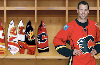
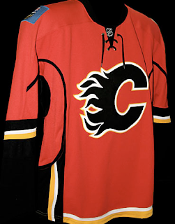
 The Calgary Flames have become the 14th NHL team to unveil their new Rbk EDGE uniforms. Check out Craig Conroy modeling the newest in the progression of Flames sweaters.
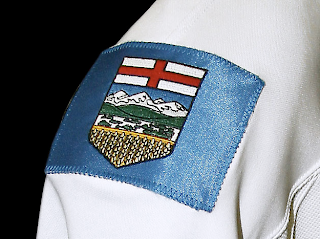
The element that seems to be causing the most controversy is the patch on the right shoulder which is the flag of the province of Alberta.
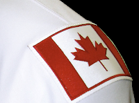 The left shoulder of the jersey features the Canadian flag. From the team's official release: “Among the enhancements, we are pleased to carry our National and Provincial flags on our home and road jerseys this season,” said Flames President & CEO Ken King.
“As proud Canadians and proud Albertans, our desire is to display the identity of our country and province and carry them throughout North America and the world. Our jersey incorporates our strong history, the latest in technology, and is something our players and fans will be proud to wear.”
These new jerseys are very nice and Flames fans should be thrilled! Enjoy your big day!
Coming tomorrow... the Pittsburgh Penguins.
 UPDATE (5:06 PM): Thought you guys might like to see these jerseys on players in full gear. Here, Dion Phaneuf and Matt Lombardi model the new uniforms at the unveiling ceremony at Flames Central today.
I can't say I have any complaints. I'm really liking the giant logos on the front. I never liked the huge jerseys with such small logos on the front. Never really made any sense to me. It's your team's symbol. Show it off, dammit!
Anyway, thanks for the comments you guys have posted so far. I'm sure there will be many more to come. As for my two cents, I think the flag shoulder logos are a very nice touch. I don't think the blue flag clashes at all. I think it just stands out.
I also like the idea someone suggested of the Oilers incorporating a new shoulder logo with the outline of Alberta. The Lightning's secondary logo has an outline of the state of Florida and I really like that.




Reader Comments (73)
Potential for a great jersey, ruined by silliness. The lines up the sides and under the bicep are idiotic.
They've made the same mistake as Washington, with thin stripes at the bottom across the waist. Sephiroth said it makes the jersey look "fragile" and I agree. Compare to their first jersey with that BOLD waist striping.
I do like how the jersey looks with a predominately black C as opposed to the white of the past. But like so many others, this is ruined by trying to be cutesy and cutting-edge.
Like another poster said, look how great their first jersey on the left looks.
i think we're all forgetting something here. and its that albertans are the most proud province in all of canada. so that they would plaster themselves with provincial/national symbols is no big surprise.
that being said as a quebecer(but proud canadian) i hate the flags being there it makes it seem as if they are the only ones who care about the country giving the rest of the canadian teams the preverbial F U we're more canadian.
the best thing the oilers can do is not retort. at this rate they'll be wearing hockey canada jerseys by xmas.
that being said we all need to realize there are only two TRUE canadian teams.
Habs and the leafs.
sorry other teams we're better.
Walt McKechnie, the Caps made no mistakes. Every Caps fan I have spoken to loves their new unis, and the ones that don't are the ones who don't think the team should wear red, white and blue, and they don't count. That said, all they really changed was the shoulder patches. They look fine. Representations can be argued, but for shear look - Fine. I'll stay out of the "if they belong" arguement though.
While the Alberta flag patch is a good idea "in theory", I think it looks ridiculous with the red of the Flames jersey.
i don't understand why us nhl fans complain about such small things relax there find jerseys
"Every Caps fan I have spoken to loves their new unis, and the ones that don't are the ones who don't think the team should wear red, white and blue, and they don't count."
Uh, so you're saying "everyone loves it because anyone out there who disagreed with the change dosen't count" Great statistics there, Reuters.
the jersey's kickass, sure. i love the lacing at the top of the home jersey now appears on the away... but from the waist down, it's depressing. those breezers are HIDEOUS. check out the pic on http://hitthepost.blogspot.com" REL="nofollow">my site...
Only complaint I have is that the Flames have unfortunately and unwisely eliminated yellow from their color scheme. The black does not go well with the red. I am really disappointed that they have kept the black pants and black trim.
not only do they have the Alberta flag and the Canada flag on the new unis, check out that sweet German flag on their away socks ;)
So much for improving on one of the best uniforms in the league. I am very disappointed and I doubt I'll be buying one right away. I understand the idea behind the flags but blue just doesn't go at all!!!! The pictures of the whole uniform really do look like the last Flames uniform was put in a blender with the German National team uniform. And what is up with the weird socks.....they don't even match. Somebody tell me why, why, why, why did they have to change the uniform at all?????????
"Ken King is right - Calgarians are proud Albertans and Canadians (just like Edmontonians) and it's ok to wave the flag to that effect."
Except how many of the PLAYERS identify with the Alberta flag? Or even with the Canadian one? Your goalie is from Finland for chrissake. Players are the core of a team, not the fans.
Jesus, what did the NHL do to Reebok to get it so pissed off? What did we do to deserve these aesthetic abortions? WE'RE SORRY, REEBOK! WE'RE SO FREAKIN' SORRY! PLEASE, ANYTHING TO STOP THE FLOOD OF POOR DESIGN!
The goalie may be from Finland, but the captain is from Alberta. The GM too. But that's not the point - players come and go, but the bond between the team and the city or region goes on.
I would like to see the flags on the shoulders for more than one year - although it does appear as if this is just a temporary thing, according to a Canadian Press report. There have been some really childish and ignorant comments on this post - I am surprised the moderator hasn't blocked comments yet. I am going to continue to take the high road and say only this: nobody has a monopoly on patriotism or nationalism. US hockey fans would not begrudge more than one team referencing US or state emblems, yet many of us Canadians are too insecure to let that happen. Almost like one person's expression of nationalism means that another person is less patriotic. It's simply not true, and it's ridiculous. We should all grow up a bit.
On another note...the Marketing grad in me has wondered these past few hours why they didn't go with a stylized secondary logo with provincial themes. Not because it would upset the Eastern Canadians or Edmontonians - but because it limits their ability to market a broader range of products to fans. With half as many logos - you get half as many choices of hats, shirts, etc.
I will leave it at that. Please people, stop looking for insults where there aren't any. Start realizing we can all be proud Canadians and wear the flag at the same time.
Flames most popular jersey ever was the reincarnation of the red, only with the black logo. Hands down, nicest jersey in the league...
Then this? I'd like to just draw attention to the side striping. What a wreck. The idea of the flags was a great one, but lost the baby blue- like a commenter said prior, PLEASE just throw on the coat of arms.
i think the design problem with the flags is that the canadian one is surrounded by white but the one from alberta.
if you ask me, both should be surrounded by a black line and the whole thing would be quite ok.
I am going to continue to take the high road and say only this: nobody has a monopoly on patriotism or nationalism.
Yet by putting the flags on the uniforms, the Falmes are claiming exactly that.
Yet by putting the flags on the uniforms, the Falmes are claiming exactly that.
Not really. Lots of other teams (like the Leafs, the Canadiens, the Canucks, the Rangers, the Capitals, the Blue Jackets) have done the same thing through their nicknames, colors, logos, etc, etc. And there are (and should be) no restrictions on anyone else from doing the same sort of thing.
Boy everyone sure jumps on Calgary for putting the flags they're proud of on their uniform. Hey, how come no one gets mad at Montreal, they named the freakin Canadiens for crying out loud, they are obviously arrogant jerks who think they are Canada's team, or the Canucks(as much as I hate being called a canuck) them too. So apparently Calgary, Vancouver, and Montreal are all monoplizing jerks who think they are Canada.
I think it's a great jersey, I already bought one.
And that comment about the tories trying to say naaaa naaaa. Give me a break you hoser, there's probably a conspiracy theorist blog ou can check out.
ok now im not going to criticize them for the alberta crest, its a good idea however, i dont think it was neccessary to get the full out FLAG.. maybe the outline of Alberta (although i know it isnt the most creative shape) or even that CREST.. i think the Blue Flag is a bit distracting and would be something ud expect to see on some sort of Provincial or International team.
the Canadian flag im not exactly thrilled about, i mean yes they can be proud theya re canadian, who isnt? but i dont think we need a big ass Canadian flag to remind us that they're a canadian team.. you can still incorporate Canada without putting the full out flag on the shoulders. take a look at ottawa's old shoulder crest for example.. the peace tower with the canadian maple leaf in the background.. thats all thats needed, and hell, even the alberta crest is plenty evidence that they're canadian
sorry for rambling, but im just saying, they didnt need to put the literal flags on.. there are other ways to represent your province/state/country (Tampa, Dallas come to mind)
The uniform is not bad, the changes were subtle but effective. I absolutely love the flag crests on the shoulders. It is a great step that a Canadian Franchise wants to publically display the pride in both their province and nation. The business model of NHL seems to bleed American blood a country who stole this great game from Canada and makes lame attempt after attempt to make it their own. The demographics of the USA allow this to happen with ease because yes, the NHL wouldn't be as strong without the American franchises but Calgary is making a bold statement here in publically displaying its Canadaian roots and I for one think it's great. I've always liked this franchise and now respect them all the more. GO LEAFS GO!
I think that the flags are a way to prove to everyone that they are canadian. every other canadian team has a way to represent itself as canadian or the province thier from.(ex. Montreal CANADIANS, vancouver CANUCKS, ottawa SENATORS-canadas capital city, toronto MAPLE LEAFS, edmonton oiler -alberta is famous for thier oil) Calgary flames has nothing to do with canada or alberta. They are just trying to show were they are from...but over all i think the alberta flag lok stupid because it is blue
The jerseys are actually quite nice. The stripes are unique and not too overwhelming. Still has a classic look.
I do have a problem with the shoulder patches however. Nothing to do with being patriotic about where the team is from, just seems like a bit of a cop out. There are many ways to incorporate the sheild of Alberta and the Canadian flag into a secondary logo with a greater effect. It would also save the Flames a Loonie per jersey buying the patches from the local Army & Navy shop.
all canadians and albertans that dont like the flames should be offended at the shoulder patches. first, the canadian flag is a great reptesentation for canadian nationalism but there are 5 other canadian teams out there, so why dont they put the canadian flag on the canucks, oilers, leafs, sens and canadiens? second, all oiler fans are going to hate the fact that the flames have the albertan flag as a shoulder patch which gives the impression that the flames are albertas team. im sure that debate will heat up the rivalry even more between those 2 teams but they are just playing hockey after all. thirdly, i really liked the secondary flaming horse logo and id prefer that design of that over the canadian and albertan flag.