Flames Unveil New Uniforms!
 Tuesday · Sep 4 · 2007 | 12:39 PM PDT
  73 Comments
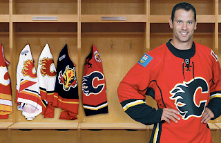
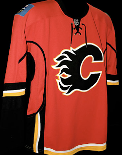
 The Calgary Flames have become the 14th NHL team to unveil their new Rbk EDGE uniforms. Check out Craig Conroy modeling the newest in the progression of Flames sweaters.
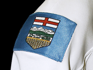
The element that seems to be causing the most controversy is the patch on the right shoulder which is the flag of the province of Alberta.
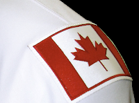 The left shoulder of the jersey features the Canadian flag. From the team's official release: “Among the enhancements, we are pleased to carry our National and Provincial flags on our home and road jerseys this season,” said Flames President & CEO Ken King.
“As proud Canadians and proud Albertans, our desire is to display the identity of our country and province and carry them throughout North America and the world. Our jersey incorporates our strong history, the latest in technology, and is something our players and fans will be proud to wear.”
These new jerseys are very nice and Flames fans should be thrilled! Enjoy your big day!
Coming tomorrow... the Pittsburgh Penguins.
 UPDATE (5:06 PM): Thought you guys might like to see these jerseys on players in full gear. Here, Dion Phaneuf and Matt Lombardi model the new uniforms at the unveiling ceremony at Flames Central today.
I can't say I have any complaints. I'm really liking the giant logos on the front. I never liked the huge jerseys with such small logos on the front. Never really made any sense to me. It's your team's symbol. Show it off, dammit!
Anyway, thanks for the comments you guys have posted so far. I'm sure there will be many more to come. As for my two cents, I think the flag shoulder logos are a very nice touch. I don't think the blue flag clashes at all. I think it just stands out.
I also like the idea someone suggested of the Oilers incorporating a new shoulder logo with the outline of Alberta. The Lightning's secondary logo has an outline of the state of Florida and I really like that.



Reader Comments (73)
I like them less the Alberta and Canadian flags. If they were hellbent on having the Alberta coat of arms they should have just put the crest and not the entire flag. The blue doesn't really go.
http://www.themayorofawesometown.com
ok, im an oilers fan, but i have nothing but respect for the flames because they are a classy club and have built a great team over the years. but when they play my oil, i'll say something different lol
and im all for canadian pride and alberta pride because im from edmonton. but to have the alberta flag? that just doesnt work for me. i think its cheesey and shows a lack of idea's for a other logo. it just seems to be an attempt to win the hearts of nonhockey fans because they will appear to be "alberta's team". but thats just me. i dont like the alberta flag being on there. if it was just the crest sure like what some people have submitted on their concept ideas, but not the whole flag.
Wow, that's ugly. The black sleeves and the large black collar make the red part look like it's just a really-bad fitting t-shirt. And the Alberta coat of arms on the side doesn't work either.
Yikes...
looks sharp...although I note with amusement that even though there are many native Albertans on the team, they picked an American to model the new shirts.
Love the flags, and think it would be great if the Oilers had the Alberta flag on their shirt as well.
Overall, the last Flames shirt was pretty good so I am glad to see only minor changes.
UGGGGGLYYYY.
So far canada is 1 for 4 in the jersey department.
looks pretty cheesy...good i hate the flames
Lose the black. It's not one of your colors. Otherwise awesome jersey. The flags are a NICE touch. Look for copycats to follow. Edmonton will have the shape of Alberta I'm sure.This has got to be a dig at them.
i like it just not the shoulder patches.
Again, what the bleeding crap is with this piping? Why do teams insist on this? It looks freakin' ridiculous.
Oh, and I have to laugh at the blue Alberta flag on there. Why not just put the coat of arms and a maple leaf on the shoulders, as the Mayor suggests? Or, really, why even bother? Remember when the Leafs and Bruins were pretty much the only ones with anything on their shoulders?
hey, i remember that jersey that's way over on the left side. the best looking one of the bunch.
Well unless Edmonton already had that patch in the works so both teams can share the province's 100 yrs of hockey in Alberta.
Mayor: the shield is an official government logo and there are restrictions on its use. The flag is ok, however.
Czar: Black is an official color, and has been since their first uniform change back in the mid 90's. Note also that Red and Black are the predominant colors for all of Calgary's sports teams: Flames, Stampeders, Dinos, Hitmen, Roughnecks and Vipers.
Everyone: I really don't think the Alberta flag on the shoulder is a dig at anyone. There may be an attempt to reach out to the region as a whole, however, in Alberta, there are very few (if any) in this region that haven't already made their mind up vis a vis Flames or Oilers. Ken King is right - Calgarians are proud Albertans and Canadians (just like Edmontonians) and it's ok to wave the flag to that effect.
Everyone: I agree - piping is unnecessary.
"Wow, that's ugly. The black sleeves and the large black collar make the red part look like it's just a really-bad fitting t-shirt. And the Alberta coat of arms on the side doesn't work either."
Most of that black "collar" comes from the model's shirt that he's wearing underneath the jersey. If you look at the jersery on its own, the black collar is fairly small.
I don't mind the coat of arms on the shoulder, but what in the hell were they thinking adding the blue flag portion? Looks too NASCAR. Rest of the uniform is great.
It's a shame that provincial crest is on a blue patch. Talk about out of place... it wouldn't be a terrible idea if they didn't add an abnormal colour to the shirt.
I hate the flags, it's like they think they're the only canadian team.
Conroy looks like he's in a dress in that photo. I like the colour scheme minus the flags. Even the Canadian flag as a secondary logo is odd. Bring back the flaming horseys!
It also makes you wonder what the Oilers will put on their jerseys. Maybe their whole uniform will use the Alberta flag as their colour scheme. =P
the flags on the jersey should only be used in the all-star game... thats brutal.. go back to the horse!
-Josh-
are u guys crazy have some freakin class and be proud of where your from ya the patches may not look that great but still it represents your province and a great country atleast it dosnt say CALGARY in huge fuckin letter over the god dam flame ITS JUST TWO PATCHES the rest of the jersey is great
i like the flags, but they would look much better on the last flames sweater from the mike vernon days.
THE PROVINCE PATCH AND CANADIAN PATCH SHOULD BE ON ALL CANADIAN JERSEYS
wowwwww thats a gross jersey.
the horizontal and vertical stripes are just too much. along with the random black line that goes up the side and down the sleve makes this jersey one of the worst yet. also the flags dont work for me. i can see them maybe if calgarys the only team in canada, but theres 5 others. theres also another in alberta so i dont think they work.
I think they should have an American flag somewhere for the way the name (Flames) represents the burning of Atlanta in the American Civil War.
As much as I love to hate the flames (Canucks fan) I think the previous flames unis were the best in the league. These ones are ok just lose the yellow and the patch and they will once again be the best. Also the Calgary stampeders have the best unis in the CFL after the Lions.
Wow, Red, Orange, Black, and BLUE!!! And everyone was bashing Vancouver.... Way to go Calgary, you have officially created BY FAR the 2nd UNGLIEST Jersey in the LEAGUE! (no disrespect to Atlanta's Blue home jersey. And Nashville's puke jersey was a runaway favorite, but they finally scrapped that idea). Good to see they didn't screw up their logo like Buffalo. Overall, 2 thumbs down!!