Penguins Unveil New Uniforms!
 Wednesday · Sep 5 · 2007 | 3:35 PM PDT
  39 Comments
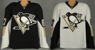
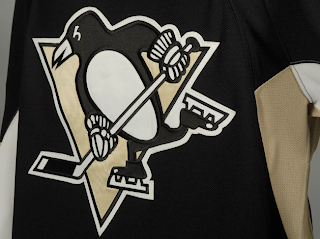
 The Pittsburgh Penguins have officially unveiled their new Rbk EDGE uniforms tonight!
The first thing you'll notice is the shoulder patch featured the recolored '90s logo is absent. I think some Penguins fans find that to be an upgrade. Though the general consensus seems to be that the jerseys are an overall downgrade.
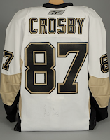 From the side and back views, you can see the striping along the sides that coincides with the leaked images we saw back in July. Even the giant numbers on the back match. And maybe it's just me but those numbers do seem awfully large. Not a complaint, just an observation.
Not a bad uniform set, overall, if you ask me. Plain but elegant. And no matter what, you can't please everybody. You'll always have your critics. But personally, I offer kudos to the Pens for not going overboard.
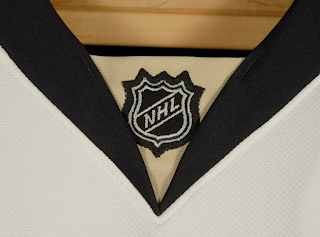
Before I take off, have a close-up look at the road jersey collar complete with the NHL logo.
And as always, you can find more photos of these new sweaters at my official Rbk EDGE gallery. Enjoy your night, Pens fans!
 UPDATE (7:07 PM): A lot of you have been wondering what the new special shoulder logo looks like. This photo of Maxime Talbot modeling the new road jersey shows there's a patch there but doesn't offer a very good look.
When I come across a better photo, I'll post it right here.
UPDATE (9/6 2:21 AM): Thanks to everybody who emailed in this photo while I was asleep last. For anyone who hasn't seen it yet, have a look for yourself.
Here you see Talbot signing an autograph with a shoulder patch that reads "Pittsburgh 250" — not a 40th anniversary logo. Though I'm not even sure I'd go so far as to call it a logo. That's not a dig, I'm just saying.
Anybody know if that patch is on both shoulders or just the right? Seems like every photographer there was confined to the left side of the room because all the angles I've seen only show the right shoulder clearly.





Reader Comments (39)
Has anyone else noticed that these are not the same jerseys as the ones in the post below? The striping on the sleeves is different. (The stripe closer to the shoulder has sharp corners on the actual jersey, whereas the "preview" jerseys have a rounded stripe.) It also looks like the "preview" jerseys may not have anything on the sides. It's a little confusing...
There is a semi leak for the Blues jersey. On the Blues forum, there is a blurry picture someone took today and a informal practice of Paul Kariya in the new pants.
http://forums.stlblues.com/index.php?showtopic=1421
The jerseys in the "preview" post below are replicas, hense the rbk square tag on the bottom corner. These are the actual authentic edge jerseys. The cut of the colours and fabric will obviously be a bit different.
Is it just me, or does anybody else find it strange that Mr. Reebok himself - Sid the Kid - wasn't there showing off his new duds. The Media has only been interviewing Reebok players so of course they have to say it's a great new jersey. Weird with no Crosby there though. The patch looks like it'll be interesting, and I'm looking forward to the main view. Also, how sweet would it have been to bring back the baby blue? That could have been something else!
thanks for nothing reebok.
stay out of hockey and leave our jerseys alone.
To Tampa Bay's credit, at least the Lightning have a few nice touches away from the pattern (the striping under the sleeves, the sleeves themselves making a slightly different pattern towards the cuff).
I agree that the team should go back to Pittsburgh Gold (yellow) though, like the Pirates and the Steelers.
The lack of the stupid 90s logo for a patch is a nice touch, but overall a downgrade. The sad thing about all this is that many of the 'original six' teams have proven that you don't HAVE to follow Reebok's awful pattern. Unfortunately, it looks as if (original six aside) only Columbus has realized this.
While I like the Pens jerseys, I must agree with everyone who is concerned and dissappointed with the rbk templates or cookie cutters. This is not a 1st. It's been done in world soccer, CFL and U.S. college football. What's pathetic is one of the "big 4" pro sports is allowing this to happen (regardless of who's responsible). The NFL didn't allow Reebok to do this. Oh, and the Panthers jerseys a simply awful!
That's a nice looking "250 Cent piece" they have for a shoulder patch.
I'm glad they didn't make too many changes. Not bad overall.
i dont know why everyone is saying that the jerseys are the same as ottawa and tampa bay. ottawa doesnt have stripes on the sides and tampa bay only has the armpit thing. the old pens logo on the shoulders was removed because of the rules that say only logos being in use. the old logo was seen no where else but the jersey, so thats why they took it off. if the pens went back to thier old yellow, they would look too much like boston. overall i love the unis and the large logo makes it really stand out among the rest of the league. for everyone complaining, at least they arent as boring as boston's or montreal's and at least they dont look like this -> http://nhllogos.blogspot.com/2007/08/islanders-unveil-new-uniforms.html
Hard to believe Pittsburgh will be a quarter millennium old.
For those of yuinz that miss the "Pigeon" logo on the shoulders need to get a freakin clue. Those of us that are lifelong/die hard Pens fans (31 years this coming season)HATE the "Pigeon" and are filled with joy that it's finally gone! The "pigeon" or "corporate logo" was a disgrace to the team! Mario was smart enough to realize this and brought back the "skating Penguin". and FYI the "skating Penguin" has been around since the '70s when the team wore Blue/White.......I hope the "pigeon" dies a slow and painful death LONG LIVE the "skating penguin"
once again another team that had a good jerseys and down graded, and now 5 or 6 six teams have the excact same design,just different color. rediculous. and why are those numbers so big on the back?
Because back before Reebok came into the NHL no two teams ever had the same jersey design but in different colors... I'm getting tired of that argument...
Short and sweet: I'm not sure about this style they introduced, I do like the style that was used the last few years running. Has anyone else noticed this but RBK makes the jerseys for the NFL and they are also form fitting with the NFL logo in the exact same location as the NHL shield. Hmm, just an observation on my part. I think as fans of the NHL, if one is not happy with the way things are going, let's send a message in the only way that we can: do not buy these jerseys! Personally, I will miss seeing the wingers streaking down the ice with their sweater flapping behind them. The new "fit" seems to have taken that out of the equation - RIP.