Wednesday
Sep052007
Preview The New Pens Threads
 Wednesday · Sep 5 · 2007 | 2:21 PM PDT
  24 Comments
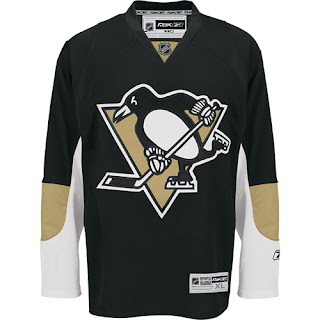
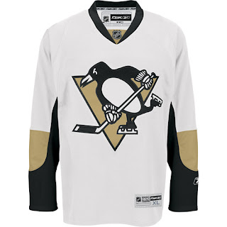
 The Pittsburgh Penguins will unveil their new Rbk EDGE jerseys in just over an hour. But we have them early! Big thanks to a reader who found a couple of links via the NHL.com shop. Take a gander!
They're a little plain compared to the pictures we first saw — likely prototypes Reebok pitched to the team that were ultimately turned down. Overall, they're sharp and very clean looking. For those of you keeping track, they're dead ringers for the new Senators jerseys as far as basic design.
Thanks to Wayne for the links! More to come tonight!


Reader Comments (24)
if these are the actual jerseys... I'll take them.
it could've been worse.
I love them
Yes they are quite plain looking but overall quite nice. No extra frills or gimmicks.
looks great!
WHAT??? that's just stupid. take something good and make it boring.
not the ugliest jersey, but the worse change we've seen so far.
the EDGE design just destroyed a 2 of the best jerseys in the league (pitts' black and white jerseys).
i must say i was tired of the EDGE complaints, but in this case, reebok really downgraded what existed. i perfectly remember when lemieux came back and the pens wore their new black jersey at home vs toronto. all this history goes down the drain thanks to reebok and the braindead new yorkers who run the nhl.
I agree with _, but I also feared the jerseys could be absolutely terrible.
I'll take boring over terrible.
And these don't destroy any history. Nobody is going back in time and slapping this jersey on Mario's (oft-injured) back
These aren't real. They are photoshopped Sens jerseys.
These aren't real. They are photoshopped Sens jerseys.
Nope, they're real, Alex. They come directly from the NHL.com shop. Here are the links. Check the address bar.
http://nhl.imageg.net/graphics/product_images/p3536421dt.jpg" REL="nofollow">Home. http://nhl.imageg.net/graphics/product_images/p3536416dt.jpg" REL="nofollow">Road.
(Also, if you look close you'll notice a big difference in the way the sleeves are positioned in the Sens and Pens jerseys on that web site.)
Yeah i dont think these are real i just went to the nhl.com shop and there is no picture... and where is the new patch that is supposed to be on the jersey?
... and where is the new patch that is supposed to be on the jersey?
The patch will be on the authentics worn by the players, not the replicas sold in stores. Trust me guys, I haven't lied to you yet and I don't plan on starting now.
For one thing, the images are far too clean to be Photoshop jobs. And second, they're on the NHL.com servers. They haven't posted them in the store because the team hasn't unveiled them yet.
Shouldn't be long before images from the unveiling event start trickling out. Thanks for the comments!
Wow, they look exactly like my photoshopped pens. I was right on target! I like them, although I would have perferred that stuff on the sides, like the leaked jerseys.
Nice.
I meant sens, not pens.
You wanna see photoshopped sens?
Here are mine:
http://img404.imageshack.us/my.php?image=penguinsconcept1du3.png
it kinda sucks that they got rid of their sholder patch, i liked it
Chris said...
Nope, they're real, Alex. They come directly from the NHL.com shop. Here are the links. Check the address bar.
Home. Road.
Are you sure about that? Those links have nhl.imageg.net as their address, not nhl.com or even shop.nhl.com.
Excellent jerseys. But only one thing bug me about these ones. Why no shoulder patch? The old one was great...I just loved that new stylised pen on the shoulders...
That logo is a little big, Hopefully they look smaller when they unvail.
I like the huge logo. I hate jerseys that are two busy. It has proven time and time again that the best jerseys, Rangers, Canadiens, Blackhawks, Red Wings, are simple and to the point.
What NHL teams can't afford original designs anymore? Or did RBK Fleece the Sens and Pens, "trust me, this is completely original Mr Lemieux"
I hope these aren't real....although I am pretty sure they are considering the source. Looks exactly like the Sens jersey. I was definitely expecting something a bit more unique from the Pens.
They're on the Pens website, so that confirms it. I like em.
Great log site, I often visit at least 2 to 3 times a day. I seen the Pens have the new duds on their front page now.
They're not terrible, but they're a downgrade.
I wouldn't mind them if they didn't look so much like the Sens' sweaters.
I was at the mills tonight and saw the jerseys in person. They looked great on the players. The logo is enormous and takes up a good portion of the front of the jersey. VERY CLEAN would be the best way to describe the style. I was glad to see the "constipated pigeon" missing from the shoulders. I wasn't close enough to get a good shot of the patch, but it has to do with Pittsburgh's 250th anniversary. Not the penguins 40th. I agree with the one previous user I would like to see the Pittsburgh crest with the penguins colors (not like the flames who's patches look out of place). Or maybe the circle penguins logo from the 60's (maybe next year). But overall I can't complain. The simple look is great because the focus of this jersey is on the LOGO not the dumb pipping (Nashville and Florida). Nor is it on out of place patches or horrible new logos (Calgary and Washington). It's just about the Pittsburgh Penguins. *note next year Calgary will have a deal with Taco Bell's new firey taco and will have a giant Taco Bell Patch on it's shoulder :-)
Has anyone else noticed that the design of the panels on the replica jersey isn't quite the same as on the authentics? I wonder if the replicas are sublimated. Either way, that's a total bummer. You'd hope for $150 you could at least get the same design.