Penguins Unveil New Uniforms!
 Wednesday · Sep 5 · 2007 | 3:35 PM PDT
  39 Comments
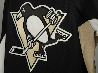
 The Pittsburgh Penguins have officially unveiled their new Rbk EDGE uniforms tonight!
The first thing you'll notice is the shoulder patch featured the recolored '90s logo is absent. I think some Penguins fans find that to be an upgrade. Though the general consensus seems to be that the jerseys are an overall downgrade.
 From the side and back views, you can see the striping along the sides that coincides with the leaked images we saw back in July. Even the giant numbers on the back match. And maybe it's just me but those numbers do seem awfully large. Not a complaint, just an observation.
Not a bad uniform set, overall, if you ask me. Plain but elegant. And no matter what, you can't please everybody. You'll always have your critics. But personally, I offer kudos to the Pens for not going overboard.
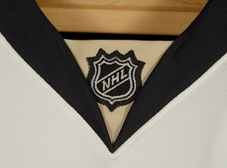
Before I take off, have a close-up look at the road jersey collar complete with the NHL logo.
And as always, you can find more photos of these new sweaters at my official Rbk EDGE gallery. Enjoy your night, Pens fans!
 UPDATE (7:07 PM): A lot of you have been wondering what the new special shoulder logo looks like. This photo of Maxime Talbot modeling the new road jersey shows there's a patch there but doesn't offer a very good look.
When I come across a better photo, I'll post it right here.
UPDATE (9/6 2:21 AM): Thanks to everybody who emailed in this photo while I was asleep last. For anyone who hasn't seen it yet, have a look for yourself.
Here you see Talbot signing an autograph with a shoulder patch that reads "Pittsburgh 250" — not a 40th anniversary logo. Though I'm not even sure I'd go so far as to call it a logo. That's not a dig, I'm just saying.
Anybody know if that patch is on both shoulders or just the right? Seems like every photographer there was confined to the left side of the room because all the angles I've seen only show the right shoulder clearly.





Reader Comments (39)
count me as one of those who will miss the shoulder patch of the old logo
You might be the only one. It wasn't an awful logo, but I was tired of seeing it.
I wish we'd use the crest of Pittsburgh on the shoulders, but it would look like we were just copying off of Calgary.
I really like them!
I really liked the shoulder patc - sorry to see it go. Also, does anyone else think the logo is too big?
Otherwise this is a nice jersey, but they're all starting to look the same (Ottawa, Tampa etc).
to the other ryan... i'm definitely not the only one. i've heard many other people say that. i mean, it's not like it would've been "too busy" with the patch. i don't see why it needed to go.
i definitely like the skating penguin better than the old one, don't get me wrong. i just thought it was a nice touch to keep it around.
that's nitpicking tho...the major things i would change
1) change back to yellow instead of gold
2) screw those stupid blocks of color that rbk is cramming down our throats. why not just have the gold block wrap around and be a *gasp* stripe? it just looks so weird to have the main jersey be solid black, and have the stripes be black/gold/white.
yeah i agree tampa, ottawa and the pens jersey are all too similar
overall downgrade
no pigeon patch = upgrade
no patch at all = fail
What happened to the "special patch" they were going to unveil?
Yeah, we see that patch on their site, but not in full view...
I can't believe we may have 4 or 5 teams this year wearing different color paterns on the same jersey !
It's so lame..
Agreed with Ryan, yellow was way better than gold..
I think they look ok...i actually kinda like the large numbers...and i agree with previous comments, i would have liked to see yellow instead of gold, never really liked the gold. The logo, while very nice, looks as though its too big...as i was sitting here looking at it...I thought to myself...wheres the "C" gonna go?
super clean and simple. two colours, huge logo - not some squiggly monstrosity like the new Flame jersey.
looks good.
The logo crest is huge. All-in-all, I think these jerseys look fine. Pens fans should be proud to root on their team in their new threads. Good riddance to awful 90's era logo that had been used as the shoulder patch.
has anyone else noticed how different the placement of the sleeve #s are on the player-modeled jerseys as opposed to the other ones (the crosby's on the manaquin).
the player-modeled #s are MUCH higher
Hey Chris,
I found a photo of the 250th anniversy patch:
http://images.sportsline.com/u/ap/photos/PADW103090520_1024x768.jpg
I'm following your blog every day since I knew it. Awesome job, man! Keep it going! =)
There is nothing to be proud of with these jerseys. Major downgrades in every facet. Boring design that is the same as Tampa and Ottawa, and probably a few more teams who havent released theirs yet. The Pens went from one of the best to completely lame.
Almost all the originality is gone because of the Reebok designs, nothing but some cookie cutter uniforms being rehashed with different colors. This is really pathetic.
solid jerseys
i think there decent jerseys, there has definatly been worse ones unvaled this summer (calgary, nashville etc) and i agree with some people that the solid black looks weird and it seems to be missing something, but the way these new jerseys are shaped at the bottom, stripes at the bottom dont excatly look good. i saw a picture of the new white vancouver jersey from the back and the stripe looks out of place.
I'm relieved, overall. Sad to see the 90s logo gone from the shoulders, but the nod to the city's history is a nice touch. I wish there were a little more to the new patch, though.
Whew!
I wish they'd sell them with the patch and without the rbk tag in the lower left corner.
i don't like them at all... they should've stayed with the same jersey as before. if it aint broke dont fix it. they look exactly like ottawa and tampa bay
This is off-topic, but I don't know how to email you.
The Avs will unveil their jerseys on the 12th according to a press release they sent to media and staff at the Pepsi center:
"Unveiling is Next Wednesday the 12th, 10am MST at Pepsi Center."
To be fair, they're not exactly the same pattern as Tampa's jerseys.
Wow, how bland is that anniversary shoulder patch?