Just To Freak You Out... Some More!
 Friday · Sep 7 · 2007 | 4:12 PM PDT
  19 Comments
 Yes, you read that title right. Back by popular demand, I'm going to get your weekend off to a kicking start. I have the weird and crazy; a whole slew of new and wacky concept designs just meant to freak you out. So buckle in, it's going to be a long one.
I'm going to have a theme of red and black tonight. You'll see what I mean, but first I need to show you this.
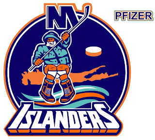
From the brilliant creator of the Sabres and Canucks mish-mash logos comes this gem. True art in its rawest form. I dare anyone to attempt to improve upon that.
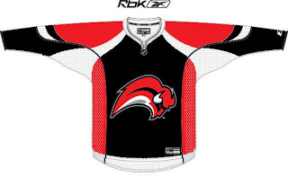
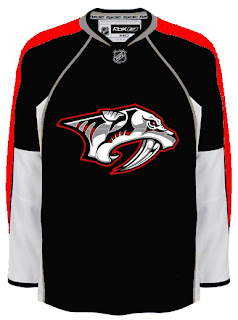
But since you can't, we'll move along. Do you like the color combination of red and black? Sure, if you're a Devils, Hurricanes, Senators or Coyotes fan. But what about Sabres, Predators and Canadiens fans? What about Leafs fans? Look on if you're brave enough.
It's a little blinding, isn't it? You might be surprised to discover that these designs all came from different people. Bad enough to have one disturbed mind out there Devil-ifying all these jerseys. There are at least four.
This Canadiens concept just scares me so I want to stop looking at it. The Sabres one just looks like a bloody slug (I knew that comment was coming so I wanted to head it off). And the Predators... well that doesn't look half bad if you ask me.
But imagine what kind of disturbed mind I must be to posting this stuff.
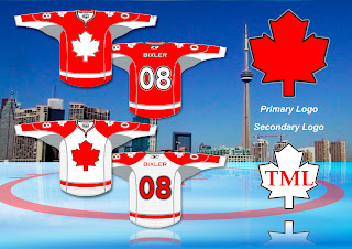
Wait. You need to catch your breath before you see this. Maple Leafs fans, ready your eyeballs for this one.
Wow, you're still here. I'm impressed.
All right, now I'm going to ease off a little bit. These designs are not so much horrifying as funny.
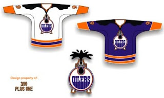
Dude, you spilled some oil on your— oh, wait... I see... yikes. Yeah. Oilers fans, I'm genuinely interested to know how you feel about this particular concept. I know it's been floating around a little, but it's just so... out there.
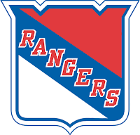
So what if the Rangers did this?
We probably ought not think about it.
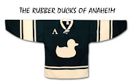
Someone spent at least 30 seconds making this.
A missed opportunity, I say.
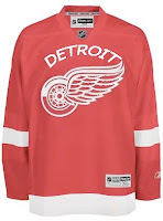
As a tribute (or not so much) to what I'm going to start calling the "VANCOUVER Incident," someone had some fun with other jerseys.
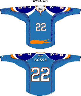
Similar work on the Sens, Isles and Jackets can be found in the Concepts Gallery. Now I'm going to wrap up where I began — Long Island. Imagine if Reebok decided the NHL should go the way of basketball.
Check out that outline of the island in place of a horizontal stripe. All is well.
Just remember, you guys asked for this. Let this be an object lesson in the notion of being careful what you wish for. Actually, if this keeps up, we'll make it into a weekly feature. So if you've made or found crazy crap like this, feel free to send it my way at nhllogos@gmail.com and who knows, you just might freak somebody out.



Reader Comments (19)
I actually think the Red/Black/Silver look works for Nashville! Looks intimidating IMO.
And be fair Chris, what did I say when I sent you that Toronto concept? I've NEVER seen a BLUE Maple Leaf!!! Plus it's the bloody national symbol so they should be red!
Thanks Chris! :o)
Good point! I meant to put a disclaimer in there. I don't want to offend anybody by calling their designs crazy. But you have to admit, some of them are pretty far out.
But Kindred, along with never seeing a blue maple leaf, I've also never seen a yellow buffalo either. I think what's weird is the idea that the Toronto Maple Leafs could be red. Probably taboo in some circles. Anyway, thanks for sending in your work!
Wow. The Isles concept says Bosse instead of Bossy. Haha.
I like the red and black designs for Montreal and Nashville, makes both teams look more intimidating. I know all Habs fans will criticize it, but I like it.
The Oilers one is interesting, but I wouldnt want to see it as an actual jersey.
And I got a good laugh out of the "Rubber Ducks of Anaheim" one.
those fading black numbers on the Canadiens jersey, those are actually available. theyre called "Black Knight" T-Shirts. have a look for yourself. http://shop.nhl.com/searchHandler/index.jsp?searchId=21592651624&sGroup=Men%27s&keywords=Black+Knight
well, that didnt go to well. anyway, just go to shop.nhl.com and type in "Black Knight" and itll work, they have habs, kings, buffaslugs, Preds, and all kinds of stuff.
As a Oilers fan, I like it. I would change the colours to the Copper and Midnight blue, but other than that, I think it is a good change. I thought that when the Oilers re-vamped their look in the 90's, that they should have included the "Oil Explosion" at that time. The Oil Derrick behind the logo is a nice touch as well, as this brings togeather the 2 main logo's that they use (and it also works well with their on ice enterance with the derrick)
I actually like the Rubber Ducks of Anaheim.
yellow buffalo... hmmm.... touché!
Oiler fan here.
If the Oilers go wild like that, I'll kill myself (possibly killing a few Flames fans beforehand, of course).
The Oilers copper & midnight blue are probably the best colors in the NHL right now. I hope they don't deviate too much from what they have now.
I think that Islanders logo is hilarious. Look close. The fisherman sitting on Long Island... with his underwear pulled down! Hilarious! Fans may just feel that way for them if things go poorly this year!
Too much red and black with the others. I love that color combination, but it's just too much. I could see it if Buffalo went back to the old buffalo symbol, but not with the slug. The rest; just no. The Leafs jersey looks like a Canadian national team jersey may look like. The Wings and Bruins jerseys are truly scary (especially as Wings fan). Rubber Ducks of Anaheim is fun though; hey, they were originally named for a childrens movie anyway. I am actually a bit curious about the oil rig Oilers jersey; could make an interesting third jersey. Can't stand baby-blue hockey jerseys, so the Isles jersey is out for me (and that's not even considering the stupid bottom).
Hahaha.
Welcome back Things To freak You Out!
Rubber Ducks of Anaheim. Brilliant.
And that fisherman crapping his pants? He'll probably joined by loads of Islander fans before the year is done. Hilarious.
In serious though, the maple leafs one is nice. But then 4 of the 6 Canadian teams have red jersey. Plus, Blue and White has been Toronto's sporting colours sinc ethe 1800's. Tht's why Conn Smythe switched to it from the green(that and I think he had a thing against the Irish).
I mean then 4 out of the 6 Canadian teams WOULD have red jerseys.
I actually really like the Oilers jersey. The rubber ducks' jersey is hilarious.
Why does it look like that Mr.Fishsticks is shitting on Long Island, LOL!
Great Job!
Ok the red and black Nashville jersey looks amazing!
Am I the only one?
I agree with brandon that the red and white Maple Leafs concept would make a great Canadian National team sweater. Just a simple leaf. The typography of the number is readable and attractive. Change the colouring to blue and I think you have a great Leafs concept.
I've always hated the current logo of the national team (the one with the black and red maple leaf bisected by a hockey player) because it is the logo of Hockey Canada, the organizing body for hockey in the country.
In my opinion, any logo that uses a stick, puck, skate, or player is weak and unimaginative.
hey chris, you gonna keep this up? this is hilarious. anytime you make these, it makes my day!
Just to let all of you know,
the Buffalo Sabres and Anaheim Ducks are not getting a makeover as they are the only 2 teams that got the new design last season, their jersey style and look will remain the same but obviously in the new fitter rebook jerseys.