Sunday
Jan132008
Quest For The Worst Starts Monday!
 Sunday · Jan 13 · 2008 | 2:01 PM PST
  11 Comments
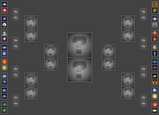
 The NHLToL Quest For The Worst officially has a start date. It's Monday, January 14!
Tomorrow afternoon, the first poll will be posted in the competition which will include 32 of the worst logos in the history of the NHL as determined by you, the readers. While you wait, have a look at how the first round will shape up. Below is the bracket for the tournament.
Hope you guys enjoy this one. As always, feel free to drop me a line in the comments if you so desire.


Reader Comments (11)
Nice job setting up the grid. It's cool to have the same team go against each other. Maybe the Sabres will finally win something seeing that they haven't won in nine games.
Great job on the bracket :]
I think the canes are safe here... Pucky is pretty bad! lol
Whaddaya mean?...I like Pucky (he's so cute)
Hockey logos aren't supposed to be cute.
this is funny. I think the two worst logos will be the ones who tied for best vintage logo in Buffalo and Hartford.
Between the two Bruins logos and Pucky it looks like New England will have a good shot at the finals. The other side of the bracket is anyone's guess, between Wildwing, the Buffaslug, and Mooterus.
These are my predictions for the results of the upcoming Quest For The Worst Tournament. They do not necessarily reflect my opinions or who I will be voting for.
ROUND ONE:
Sabres slug over Sabres goathead
Blues trumpet over Scouts
Mighty Ducks celebrating wild wing over Mighty Ducks goalie mask
Islanders fisherman over Rangers
Ducks current primary over Seals
Oilers oil rig worker over Avs big foot
Blue Jackets bug over Blue Jackets cbj
Stars bull constellation/meteor over Stars current primary
Bruins `90s bear over Bruins `80s bear
Kings angry king over Kings original crown
Coyotes Picasso over Flames horse
Predators Sommet tower over Preds fwd facing tiger
Canucks 2000s stick-in-rink over Canucks `70s stick-in-rink
Canucks giant V over Canucks flying skate
Penguins original over Lightning original
Whalers pucky over Hurricanes
ROUND TWO:
Sabres slug over Blues trumpet
Mighty Ducks cww over Islanders fisherman
Ducks current primary over Oilers oil rig worker
Blue Jackets bug over Stars bull
Kings angry king over Bruins `90s bear
Coyotes Picasso over Predators Sommet tower
Canucks giant V over Canucks 2000s stick-in-rink
Whalers pucky over Penguins original
QUARTERFINALS:
Sabres slug over Mighty Ducks cww
Ducks current primary over Blue Jackets bug
Kings angry king over Coyotes Picasso
Whalers pucky over Canucks giant V
SEMI-FINALS:
Sabres slug over Ducks current primary
Whalers pucky over Kings angry king
FINALS:
Whalers pucky over Sabres slug
I totally agree, hockey logos shouldn't be cute. That Whalers pucky the whale is way too cute to be a hockey logo. And very cartoonish. What were they thinking? I can't believe that was actually a logo in the NHL. Sorry if I hurt your feelings, michael. And it portrays what they're hunting, not what their team is called. That would be like if the Sharks had a small fish as a secondary logo. Or if the Avalanche had a skier. Cute logos are for baseball. Although you could say that the Bruins bear is cute, even though it's not intended to be. Or the Penguins logo(every one they've had).
The Bruins bear from the late '90s was cute. He was a little furry teddy bear. LOL...
The yellow snarling menace they had before that just looked like he'd been tripping on crack before he got his picture taken.
Needless to say, I was thrilled to death when Boston finally came up with a good bear this season :-P
Hmm.. Sabres and Whalers have the two best vintage logos.. Yet they also carry two of the worst logos.
Hopefully this will show the fans hatred for the new Buffalo SLUG logo! This hopefully will be the beginning of the END of that EMBARRASSMENT!
The WORST logo in the NHL without a doubt is that SLUG!
We're the SABRES for crissakes!