Just To Freak You Out XXIII
 Saturday · Jan 12 · 2008 | 8:06 PM PST
  9 Comments
 I've been pretty bogged down with getting this next tournament ready. I really hoped I'd have it posted by now, but obviously it hasn't happened yet. Patience. In the meantime I've got some other cool stuff for you guys to enjoy.
First thing, a reader emailed in a link to a site called MG's Helmets — specifically to a page where the designer has come up with a bunch of NHL concept football helmet designs. It's quite clever actually. My favorite thing is how any references to hockey have been removed from the logos. You'll find no hockey sticks and no pucks. Haters of the "Buffaslug" might notice at a quick glance how ridiculously appropriate that logos looks on a football helmet. The only other logo that even comes close to looking good on a helmet is the Flyers.
It's just weird.
Now you're good and prepared for the freak out stuff. I would've done this yesterday, but I didn't. This one is all wacky logos.
First, the Atlantington Thrashitals.
Then the Phitroit Flyer Wings. I know, creative names.
This next one here is a combination of the two Colorado clubs that have graced the NHL — the Rockies and Avalanche.
Not too horrible. I haven't quite figured out how the avalanche of snow has passed directly through the mountain, but I've found in my life it's best not to ask questions.
Here, I think we've got an amalgamation of just about every Edmonton Oilers logo ever used.
Learn what it means to be freaked out. Learn it well.
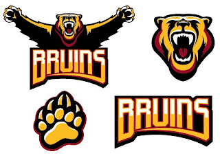
And finally, a weird generic Bruins logo design that could be used for absolutely any team called the Bruins whether they happen to be located in Boston or not.
Thanks, but I'll keep the spoked B.
Saw Charlie Wilson's War tonight. Philip Seymour Hoffman is my hero. Enjoy the other half of your weekend. The Quest For The Worst is imminent.



Reader Comments (9)
the football helmets are pretty neat.
the Flames,Wings,Bruins and Sabres work really well..the Sabres look surprisingly good actually.
Those helmets suck. They'd be better if they actually used colors that matched. Vegas gold for the Panthers? Silver for the Predators, Maple Leafs, or for the Capitals? That site is a failure.
That's one angry bear.
Andrew,
I'll agree that the gold for the Panthers probably isn't the best choice but what would you have for the Preds that mustard yellow from the 3rd jersey? I think the silver looks preetty good. I see nothing wrong with silver for the Caps. The Leafs is ok. A white helmet would just look too plain. It's plain enough as it is, but so is the Leafs logo. The ones that really disturb me are the Blues and the Sharks. Is it just me or does it look like the Shark is trying to fly? The blues k\just looks wrong. Just my $.02
I like the Thrashers/Capitals logo. The upside-down bird at the bottom looks silly, but the Thrasher at the top, coming up out of the "W", is kinda cool-looking.
Is that bear doing the "YMCA"?
If you look at the Buffalo Bills logo, it has the same look to it, a charging bison. But i thought the Blues one looked good on the helmet.
The football helmet's look good EXCEPT for the fact that the Penguin helmet has the wrong LOGO. That GODAWFUL PIGEON logo finally died this year and yet people still use it. When are people gonna get it through their thick heads that the PIGEON Logo sucks. LONG LIVE the skating Peng
Arrowcat11,
Whoever did the football helmets took out all hockey references, so I guess the artist decided the pigeon was better than taking the stick and skates off of the skating pen.