Sens Logo For Your Cap
 Tuesday · Feb 12 · 2008 | 2:53 PM PST
  15 Comments
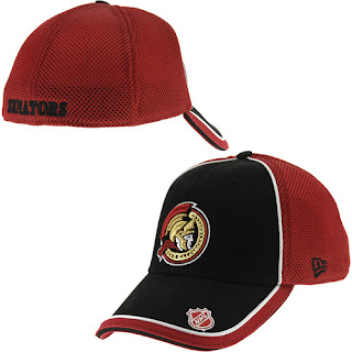
 Back in August I first posted images of the Ottawa Senators' new logos. And everybody was hoping they'd be making the new 2D logo the primary. But the team went the other way and said the 2D logo would only make appearances on fan memorabilia.
But I had yet to see any of it until I got an email this afternoon.
Check out this hat.
No one can deny this is the superior logo. Much more balanced than the "3D" version currently donning the Sens' sweaters.
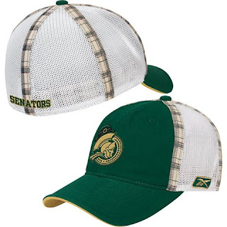
Now you want to laugh? Seems they've also put together a special edition St. Patrick's Day cap. I'm not making this up.
Plaid accents?! Sign me up!
Anyway, sometimes I find real items make for a better post than concept art, you know? You can't make this stuff up. So I'd like to hear from actual Ottawa fans. How do you guys feel about the new logos? Have you got a beef? Or nothing really to complain about here? Comment!


Reader Comments (15)
I think the old 2D logo is the best they ever had.
But I would take the new 2D over the 3D.
The 3D is good for merchandising, but for a jersey crest, the 2D looks best.
The Senators are absolutely insane not to use that logo as their primary. It's perfect.
I actually prefer the new 3D logo. Guess I am crazy.
Personally, I really am not crazy about this 2-D logo, although it was sorta cool on the St. Patty's day hat. I like the look of the current 3-D logo. A Lot. Period.
P.S. My condolances to Richard Zednik and his family. Talk about a scary incident.
yea the 3-d should be on merchandise, but it looks so akward on a jersey.
why does 'every' team have to have st. patrick's day theme merch?
does anyone (other than the irish) buy this crap? what is the point of it? you only get to wear it one day out of the year..and you still look like a dork.
anyway, i like the 2d, way better than the 3d
That cap logo is much, much, much (did I mention much?) better than the current jersey logo.
They should have that as a secondary logo.
I think the old 2D logo is the best they ever had.
Amen. I don't know why they messed with that one.
Call me crazy, but I actually think the St. Patty's day hat is pretty neat. Maybe I'm just a sucker for plaid accents. Actually, I don't think the Sens ever had St. Patty's day themed merch before, I know other teams have had t-shirts and what not.
I absolutely love the new 2D logo. It is more solid, more rounded, and less busy. And at the same time, carries on the traditional look of the old 2D logo. I do not like the new 3D logo. It's too complex in shape and the senator's face looks like Mark Messier's. The Moose's face belongs on the Rangers' jerseys, not the Sens'. Lol. :)
When I finally go about replacing my Sens cap with the old logo, I would love to wear that first hat. I suppose I could see myself wearing the St. Patrick's hat on St. Patrick's day... but... I don't really wear hats that much, and I don't really want to spend the cash for a hat to be worn once a year.
I like the St. Patty's merch - screw it, wear it all year. You guys sound like a bunch of ladies. Next, you'll be afraid to wear your away jerseys after Labor Day.
The new 2D logo is a joke. Didn't like it when it came out, don't like it now. The new 3D logo is far superior, although nothing tops the old 2D logo. I'm not touching any Sens gear with that new 2D logo.
Does anyone know where I can find a hat with the sens old 2D logo? Just like the one in the picture???? Thanks so much!!!
Does anyone know where I can find a hat with the sens old 2D logo? Just like the one in the picture???? Thanks so much!!!