Bruins Show Third Jersey "Finalist"
 Thursday · Feb 28 · 2008 | 11:24 PM PST
  18 Comments
 I got a few emails from readers tonight regarding the NESN broadcast of the Bruins-Penguins game. Apparently, they showed what's being called a "finalist" for a third jersey to be worn, I'm assuming, next year.
Here's an email I received about it:
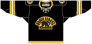
NESN just showed one of the "finalists" for the Bruins third jersey next year. It was a black jersey with a thin gold stripe on the very bottom of the jersey, white, black and gold stripes on the elbow. The secondary logo is the primary and the spoked "B" is the shoulder logo.
Evidently, the Penguins broadcasters mentioned it to, according to this email:
While watching the Pens-Bruins game on Thursday, the Pens announcers made reference to the Bruins practicing in new jerseys that they intend to use next season. I have no photos but I thought that you could know about this.
The best part is one person even sent in a mock-up of what he saw. He says he's unsure about the collar and which logo was used (Boston or Bruins), but the uniform apparently looks a little something like this.
At least it's not yellow, right?
If anyone happened to record the game on NESN, perhaps you can send a screengrab my way so I can post it here. In the meantime, this appears to be a decent possibility for a Bruins alternate jersey for the fall. I'll post more as I find out.
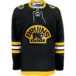
UPDATE (2/29 4:33 AM): Got one more concept for the Bruins' new third from a reader, based on the NESN broadcast. Check it out.
I'll post more as I get it.
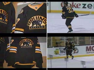
UPDATE (2/29 2:20 PM): Turns out someone did record last night's Bruins game and now there's video posted on YouTube. See the third jersey finalists for yourself right here.
UPDATE (5/4 8:13 PM): Because I'm slow I just realized that video above has been removed from YouTube. If anyone knows where another copy might be available, please let me know so I can embed a new link. In any event, someone was smart enough to grab freeze frames from the clip before it disappeared.
It's better seeing the video, but what can you do? At least you're getting a glimpse of what might be.


Reader Comments (18)
Yes, at least it's not yellow. I'll have to see the final version, but from the mock-up it looks excellent.
Ya i agree, very sharp.
If that's it...great jersey for the Bruins - even better than their already classic original jerseys.
Just like their current unis, that jersey is WIN. Excellent job by Boston.
The Sabres on the other hand...
Good to see that Toronto is the only massive failure at jersey making from the Original 6 era.
very very sharp!
I don't think that the lace up front was included, however I may be wrong. From what I can recall, it was simply an extension of the yellow neckline.
I saw the jersey on NESN (through Center Ice) and it looked great.
Wow, seeing it in motion is even better. That thing is SHARP!
I think Boston was the first to unveil the new RBK Edge jersey last year.
One with stripe looks better. Other one with all...looks all black.
one more thing, No laces? i like laces. And i am glad they will not put numbers on the front of the jersey. Stupid idea.
Not bad. I'm not sure what I don't like about it, but it's not knocking me down and kicking me in the face screaming "I'm awesome!" like the Bruins' regular set. Maybe my expectations were too high.
wow, that looks really good. i am pleased.
Pause the video at 2 seconds for a good look at the jersey. The collar is all yellow, including that little triangle thingy where the NHL logo is - no laces.
That yellow collar is really odd. other than that, looks good to me. hopefully boston and other teams will continue to practice with the finalists for their 3rds. Then teams could actually get positive feedback from fans on what designs they like. might ruin the surprise but a lil more democratic.
Thumbs up!
Outstanding job...now Boston by far will have the best uniform set in the NHL in my opinion.
Like the retro logo for the Bruins 3rd jersey, but they should go with a retro style jersey that looks like one of the ones they used in the mid to late 1920's (brown was used instead of black as the main colour ,or a white jersey with brown and 'gold' stripes).
can find those on www.nhluniforms.com