Just To Freak You Out XXIX
 Friday · Feb 29 · 2008 | 5:08 PM PST
  5 Comments
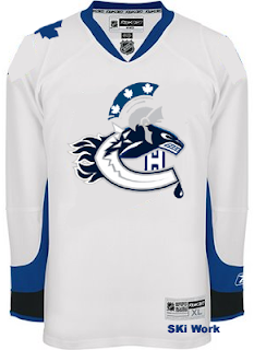
 Since I leave in four days for my trip up to Canada, I'm going with a Canadian theme here in order to freak you out tonight. So let's start with the most obvious one. The usual "If They Mated" concepts typically mix two and in rare cases three teams. One artist went above and beyond, mixing all six Canadian teams onto one jersey. The result will shock you.
I warned you. And I love how it's on the Lightning's white sweater. Creativity at its finest there, friends.
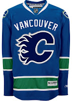
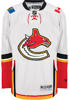
But back to more familiar territory now. Imagine the Canucks and Flames swapping colors and sweaters. Wait, you don't have to. I've got it right here for you.
The Atlantawa Thrashators, if you will.
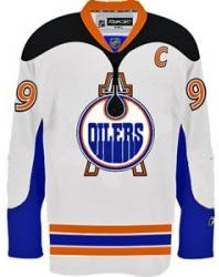
What happened to that dude's face? Not to be outdone, ladies and gentlemen, the Edmonton Oilers.
Gotta love the oil shooting out onto the shoulders. But back to the nation's capital, for a small handful of teams the state/provincial outline works well in the logo — Lightning, Islanders and Stars to name the only ones. Here's a good example of why not everyone should try it.
Yeah, I didn't even mention the stripes. Can you believe that?
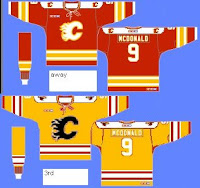
And as you know, it's difficult to pull of a yellow jersey that actually looks good. Unlike most of you, I was a fan of Nashville's gold alternate jersey but not Boston's yellow third. Weird, I know. But the Flames should absolutely not try yellow.
That's why. And if they ever decide to look for a new logo, here's what else they shouldn't try.
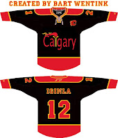
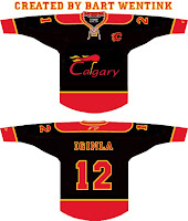
Balls of fire! And that is all I have to say on the matter.
And with that I'm going to go pack a bag and prepare myself for weather in which a native Floridian can only freeze. But I'll be loving every frozen second.





Reader Comments (5)
Fancy all 6 in one logo! looks....decent! and the Oil shooting on to the shoulders is unique and would look really good in bronze.
Looks like an Olympic torch on that one Flames jersey. Fans/residents of Calgary really need to let go of that. Really it's been 20 years since you hosted the Olympics, move on already!
It only just occurred to me, thanks to that first concept, that three of the six Canadian hockey clubs have primaries that involve the letter "C".. COINCIDENCE???
Also, I love that Sens/Thrashers logo. And by "love" I mean "will likely have disturbing nightmares thanks to"
Great work on the Atlanta/Ottawa merger!
The Canadian mashup is OK, but if you really want to impress me, do all the American teams!
The only element that Canadian combo jersey is missing is the Quebish Albario flag on the shoulder. Nice work!