Something New For NYR
 Thursday · Feb 7 · 2008 | 4:27 PM PST
  5 Comments
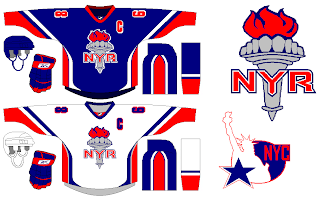
 I've always been a proponent of updating the look of the New York Rangers. Classic schmassic. And while I can't deny theirs is among the most recognizable of hockey uniforms, I can't help but think how much better they'd look if they made the Statue of Liberty logo a permanent fixture.
You see what I mean? Despite the crest and shoulders, they still look like the New York Rangers to me.
But if you really want to go nuts — and I love getting stuff like this emailed to me — you could rethink their look completely.
Though I'm well aware of the taboo nature of something like this, I can't help it. I still like the Lady Liberty design better. But this design certainly has its redeeming qualities — maybe not so much the secondary logo.
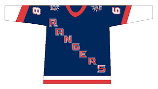
However, here's the mistake some might be tempted to make when discussing and update for the Broadway Blueshirts.
Resist that temptation.


Reader Comments (5)
these are all horrible ... the rangers have the best jersey in the league. they don't have to use gimmicks to get more fans. we like our jerseys and support our team without stupid gimmicks.
I second that opinion... Rangers jerseys are signature... It's probably the only team for which the word mark works really well...
Besides, I've heard Chris's comment about how well the lady liberty would fit on their jerseys too many times...
I actually don't mind the look of the white jersey with the Lady Liberty crest. The white jersey isn't iconic like the "blueshirt" so it wouldn't be as controversial a change. I love the wide shoulders.
I like the Liberty logo for an alternate, but I still think the Rangers are best left as is.
Oh, and untuck that jersey, Jagr!