Just To Freak You Out XXVI
 Friday · Feb 8 · 2008 | 4:03 PM PST
  9 Comments
 After a week off, Freak Out Friday is back in action tonight! And there's some pretty crazy stuff here. We're beginning in Alberta with a rivalry between the Edmonton Oilers and Calgary Flames.
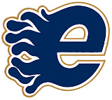
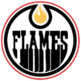
Now, we've seen "If They Mated" concepts created simply by recoloring one team's logo with the other's colors. This goes a step beyond that. Actual time and effort was put into this. And that in itself is frightening.
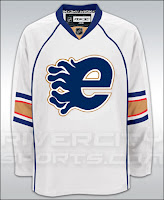
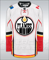
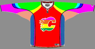
Yeah, I'll understand if you need a minute after seeing that. But hold on, now. Wait until you seem these logos on jerseys.
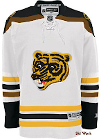
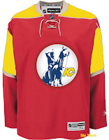
I really don't know what to say about that. But while we're on the topic of odd jerseys, I have these.
The Boston Bruins should never use this logo ever again. I understand it as something coming out of the 1970s. But we're all a little older now and just look at it. It's ridiculous. Meanwhile, the Kansas City Scouts on a Wild jersey? Just weird.
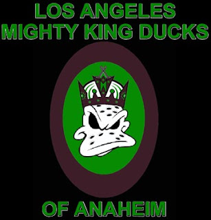
Now I've got some offbeat logos. The first is a Kings/Ducks mixture.
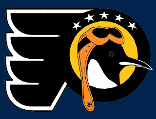
The Los Angeles Mighty King Ducks of Anaheim is pretty spectacular. But how about the Pennsylvania Flying Penguins? (No, I didn't make that up.)
Also we've got a morphed Minnesota Wild logo, making obvious use of the letters MW much to my disapproval.
It's not like I don't appreciate the work put into this, but the Wild have a pretty awesome logo as it is. To do this to it has got to be considered heresy in some manner. Which reminds me...
Yeah, it takes "Flaming C" to a whole new level. (No pun — or offense — intended.)
All right, yes the pun was very much intended.



Reader Comments (9)
That Flames logo at the end is probably inspired from the old Apple logo. It's grotesque and hilarious at the same time.
There is something really unwholesome about that Oilers "E" logo.
I'm kind of embarrassed to admit this, but I never realized that the Minnesota Wild logo was in the shape of a bear's head until I randomly decided to read their wikipedia entry yesterday. I seriously could not see it and thought it was just an oddly-shaped picture of the wilderness.
Thanks for posting, Chris. Hope to do more for you soon.
oh that ducks/kings logo is a blasphemy!
i seriously laughed out loud at the "flaming c."
And i love the Pennsylvania flying penguins...hilarious!
keep up the good work on the freak out fridays.
The Internet Explorer logo seems to have sprung a leak.
Don't worry about it emo, I didn't know it was in the shape of a bears head until I started visiting this site.
Hahahaha Jason, I think your right!
Not onto the concepts themselves....
I love Freaky Friday, I always look forward to it, it's always good for a laugh.
The Flaming C......hilarious.
The Los Angeles Mighty Duck King Of Anaheim..priceless...
Keep up the good wrk all you deranged concept artists out there XD.
And thank you Chris for giving us a place to view them.
emo, i too thought the Wild log was just a randomly shaped crest that depicted the wilderness. i didnt realize that it was a bear head until i read the description on Chris Creamers logo database! and i was blown away when i finally saw the bear head!
is it possible to find this wild logo anywhere in higher quality?