NHL Tournament of Logos

Entries in scouts (10)

Sunday
Feb102008

Poll: Scouts vs Mighty Ducks


vs
Kansas City
SCOUTS
Anaheim
MIGHTY DUCKS


REMEMBER: You're choosing the WORST logo!

Time for the third round now. Anyone else surprised that, despite the uproar over the Buffalo Sabres' new logo, it managed to get eliminated from the Quest for the Worst in only the second round? Anyway, just thought it was worth noting.

Place your vote and then feel free to leave a comment as to how you came to your decision. Tell all your friends to drop in and vote! The more voices heard, the more accurate the results!

Poll opening date
Sun Feb 10
Poll closing date
Thu Feb 14

Friday
Feb082008

Just To Freak You Out XXVI

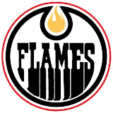
After a week off, Freak Out Friday is back in action tonight! And there's some pretty crazy stuff here. We're beginning in Alberta with a rivalry between the Edmonton Oilers and Calgary Flames.

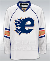
Now, we've seen "If They Mated" concepts created simply by recoloring one team's logo with the other's colors. This goes a step beyond that. Actual time and effort was put into this. And that in itself is frightening.

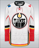
Yeah, I'll understand if you need a minute after seeing that. But hold on, now. Wait until you seem these logos on jerseys.

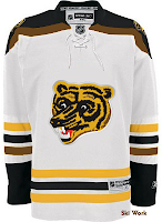
I really don't know what to say about that. But while we're on the topic of odd jerseys, I have these.

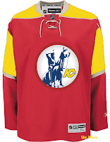
The Boston Bruins should never use this logo ever again. I understand it as something coming out of the 1970s. But we're all a little older now and just look at it. It's ridiculous. Meanwhile, the Kansas City Scouts on a Wild jersey? Just weird.

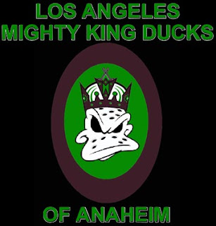
Now I've got some offbeat logos. The first is a Kings/Ducks mixture.

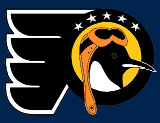
The Los Angeles Mighty King Ducks of Anaheim is pretty spectacular. But how about the Pennsylvania Flying Penguins? (No, I didn't make that up.)

Also we've got a morphed Minnesota Wild logo, making obvious use of the letters MW much to my disapproval.

It's not like I don't appreciate the work put into this, but the Wild have a pretty awesome logo as it is. To do this to it has got to be considered heresy in some manner. Which reminds me...

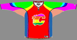
Yeah, it takes "Flaming C" to a whole new level. (No pun — or offense — intended.)

All right, yes the pun was very much intended.

Thursday
Jan312008

Poll: Sabres vs Scouts


vs
Buffalo
SABRES
Kansas City
SCOUTS


REMEMBER: You're choosing the WORST logo!

The second round is now underway! Place your vote and then feel free to leave a comment as to how you came to your decision. Tell all your friends to drop in and vote! The more voices heard, the more accurate the results!

Poll opening date
Thu Jan 31
Poll closing date
Mon Feb 4

Wednesday
Jan162008

Poll: Blues vs Scouts


vs
St. Louis
BLUES
Kansas City
SCOUTS


REMEMBER: You're choosing the WORST logo!

Place your vote and then feel free to leave a comment as to how you came to your decision. Tell all your friends to drop in and vote! The more voices heard, the more accurate the results!

Poll opening date
Wed Jan 16
Poll closing date
Sun Jan 20

Wednesday
Nov282007

If They Were Still Around Today

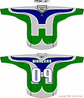
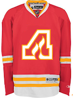
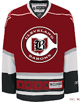
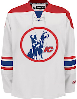
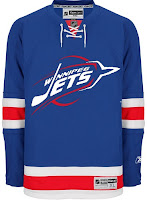
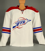
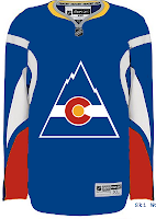
In today's concepts post, we'll be getting all nostalgic for the old teams that doesn't exist anymore. The fun part is we're going to take a glimpse at what some of those classic clubs might have looked like if they'd made it into the Rbk EDGE era. Just to make things easy, we'll go geographically from east to west.

Kicking things off in Hartford, how about a Whalers logo that covers the entire jersey?

The sweater on the right features the Atlanta Flames logo in a design borrowed from the Chicago Blackhawks. If that's not classic enough for you, remember the old Cleveland Barons? Here's what they might look like if they had hurricane flags wrapping around the waist.

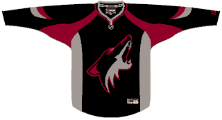
And next to that is a Kansas City Scouts design sans the yellow in the flavor of the Phoenix Coyotes. Speaking of the Coyotes, enjoy this irony.

The Winnipeg Jets logo you see on these jerseys is a concept design that I posted a while back here on the blog. As you can see, these jerseys borrow from the New York Rangers and, ironically, the Coyotes. And we'll finish our trip westward in Colorado. Here's what the Rockies might've looked like in a uniform modeled after that of the Buffalo Sabres.

Don't forget that if you have any concept art you'd like to share with the folks here at NHLToL, you can always email me at nhllogos@gmail.com.

Friday
Oct262007

Poll: Devils Franchise Logos


SCOUTS
ROCKIES
DEVILS


Place your vote and then feel free to leave a comment as to how you came to your decision. Tell all your friends to drop in and vote! The more voices heard, the more accurate the results!

Poll opening date
Fri Oct 26
Poll closing date
Tue Oct 30

07BONRF | RFNJD

Wednesday
Oct172007

Result: Maple Leafs vs Scouts

Toronto
MAPLE LEAFS

67% 1,522 votes

Kansas City
SCOUTS

33% 748 votes

2,270 total votes

Toronto Maple Leafs
Advancing to face Washington Capitals

Kansas City Scouts
Eliminated


Poll opening date
Sat Oct 13 @ 7:17 AM
Poll closing date
Wed Oct 17 @ 11:59 PM

07VNTRN | #1H | TOR38vKCS

Saturday
Oct132007

Poll: Maple Leafs vs Scouts


vs
Toronto
MAPLE LEAFS
Kansas City
SCOUTS


Place your vote and then feel free to leave a comment as to how you came to your decision. Tell all your friends to drop in and vote! The more voices heard, the more accurate the results!

Poll opening date
Sat Oct 13 @ 7:17 AM
Poll closing date
Wed Oct 17 @ 11:59 PM

07VNTRN | #1H | TOR38vKCS

Friday
Sep212007

Just To Freak You Out VII

I've decided to make the Freak Out series into a weekly feature to be posted on Fridays from now on as long as crazy artwork keeps landing in my inbox. And man, do I have some stuff for you this week.

We'll begin with our friend Pfizer who's created mish-mash logos for the likes of the Vancouver Canucks, Buffalo Sabres and New York Islanders (check out the Freak Out series for those if you haven't yet). Now comes another shot at logo merging for the Los Angeles Kings.
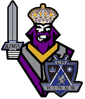
For my money, it's not his best effort, but it makes me laugh no less. I'm a little disappointed he couldn't find a way to work in the current crown logo. But then it does feel a little thrown together. You have to admit, though, that king face is a great logo. Don't mess with that son of a bitch.

Meanwhile, I've got some completely new takes on a couple of team logos and uniforms. Imagine the Boston Bruins swapping out the yellow for red. Then imagine a cartoon bruin the likes of which might be owed money by Yogi Bear.
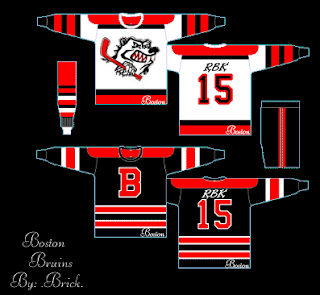
He's come to collect. Then imagine the Colorado Avalanche adopting a yeti for their primary mark. Might it frighteningly go a little something like this?
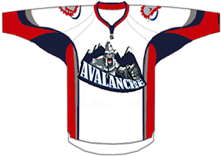
We should hope not. Lest ye bear the brunt of the abominable snowman's ever-clenched fist. And what's up with the upside-down feet on the shoulders?

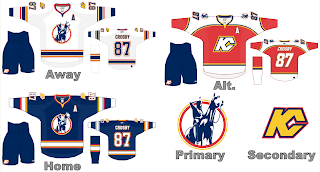
Speaking of what-ifs, let's say the Kansas City Scouts were to make their glorious return to the NHL. Let's also say their return was marked by the uprooting of the Pittsburgh Penguins. Yes, this design was made in the days when the Pens' future was uncertain. I point that out merely to explain its color usage.
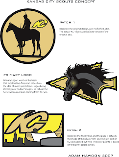
If you enlarge the image, you can read the designer's explanations of the three logos, so I'll spare you the details here. What I will say is that I like Patch 2. I'm a big fan of city skylines in logos, though you don't see that a whole lot. What's cool about this one is the new Sprint Center being placed to look like a puck. Clever.

The horse's eyes are freaking me out, by the way.

This next image is probably best viewed while high. I don't condone drug use, but chances of one having an "experience" are rather great. See for yourself.
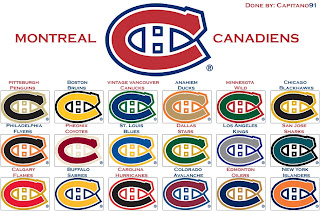
Someone with a good deal of free time and an inability (or not) to cure boredom came up with this. He basically recolored the Montreal Canadiens' logo in the colors of various teams around the league. Conspicuous is the absence of the Tampa Bay Lightning's colors. But I guess not everything is about the Lightning.

Now I want to show you some of the scariest things of all — because they're real! Okay zombies aren't real, but movies are real. A reader emailed me a production still from the new Resident Evil movie. One of the zombies appears to be wearing an old Nashville Predators sweater.
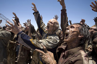
Talk about foreshadowing. That's not even right.

And finally, a reason for all those NHL fans out there bemoaning the arrival of the new Rbk EDGE jerseys to quiet themselves. It could have been so much worse. A fact proven by the AHL's Philadelphia Phantoms.
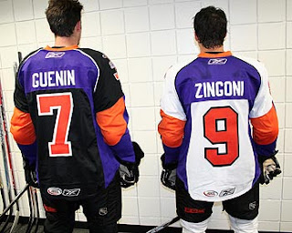
AHL fans, continue your bemoaning. It's perfectly warranted.

Freak.

Out.

Friday
Aug312007

Just To Freak You Out, Part 5 of 5

I know you'll all be sad to see it go, but today I'm wrapping up my week-long series of whacked-out and crazy images. So let's get this final show on the road. Our first stop is Pittsb— er, Kansas City. Or, well, I don't really know. You figure it out.

I know we've seen a lot of crazy shit, but wow. A Kansas City Scouts Rbk EDGE jersey with Sidney Crosby's name and number. I'm sure this design was concocted in the days when the Pens' future was largely uncertain. With KC looking like a predator ready to pounce, you never know. Just, wow. I don't really have any other words. Maybe you guys can find some.

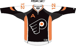
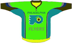
Over in Philly, there's a consortium that can't tell the logo forms a "P" unless it's cockeyed.

My neck hurts from looking at that. My eyes hurt after looking at this.

Ha ha. Now your eyes hurt too. I promise I won't do that anymore.

Oops, gotcha! You guys are easy. Anyone want to see a black coyote?

Probably not anymore, huh? Seriously, though. Charlie, from SabresNotSlugs.com really needs to see this. It could be the new logo for his site.

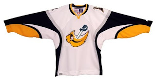
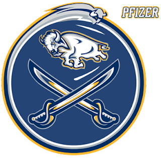
Somebody didn't like the slug. Showed it what a sabre is. Then gutted it. Sad story, really. But you guys haven't seen the half of it yet. Remember the amazing composite logo Pfizer created for the Canucks. He dropped the Sabres logos into the same blender. It produced this.

Maybe that should be your new logo, Charlie. Sometimes we just don't recognize how good we have it.

I hope I've been successful this week in freaking you all out a little bit. My goal is to show you that what you have, despite what some of you think, isn't that bad. We all like to moan and complain about changes but just remember, they could've done so much worse. And then where would we be?

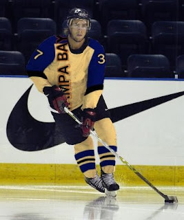
I'm going to leave you one last little nugget, though. On Tuesday I posted a crazy concept for the Tampa Bay Lightning. I also asked if someone might be able to show me what it would look like on a player. As I close out this series, let me leave you with that image. Let me burn it into your soul.

Big time thanks to Russ for that one!