Wednesday
Apr232008
New Look For Team Canada
 Wednesday · Apr 23 · 2008 | 9:17 AM PDT
  11 Comments
 A reader emailed in to say that apparently Team Canada will be unveiling a new look next month. CBC has the story if you're interested. I'll post pictures here when it happens so keep checking back.
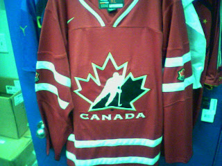
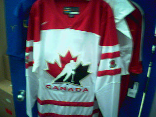
UPDATE (3:13 PM): Shortly after I posted this information I got an email with "leaked" in the subject line which always makes me wary. But if for no other reason than to cover all my bases, I figured I'd post these pictures and see what you guys make of them. This isn't something I'm following very closely, not being Canadian myself (though if wishing made it so), but perhaps some of you might have answers.
Post your comments and conspiracy theories below.


Reader Comments (11)
Thank goodness. The current jerseys are miserable.
Should be interesting to see the change. It is getting about time they change the main Hockey Canada logo...it has been about 12 years. However, I think it is near impossible to improve upon. I hope they go back to having a waving Canada flag on the bottom part. Those were the best ones. 1996 World Cup style.
WHAT!?! they better not change the logo....only the jerseys hopefully, and they better include more black.
changing the hockey canada logo is stupid. it's by far the best logo in the IIHF.
the new jerseys are okay. the red one is nice, but the white looks a little too yolk-y.
hopefully we see still have a black third kit. i was hoping for '72 throwbacks, but this isn't bad.
They are nice. A huge improvement on the crappy ones they have now. I like the traditional hockey look.
One thing I've always been a fan of is having "CANADA" written on the back where the names go so it can be left off the front. (But then you don't know who the player is.)
Well, at least they've got a more traditional look than the current ones, so that's good. I'm not feeling the white jersey. The red on the shoulders go too far. The red jersey isn't bad. I'm not sure how I feel about the patches so low on the arms. I wish we could go back to the 2002 set. Those were perfect and shouldn't have been changed.
I sure hope these aren't the Canada jerseys, they're awful.
That's overstating it a bit, the red one is ok but that white jersey is truly ugly.
Red one's ok, except the white stripe on the collar just ends abruptly. The white one is horrendous. It looks like those knockoff "jerseys" they sell on ebay.
http://i10.ebayimg.com/07/i/000/83/bd/6a53_1.JPG
hmm. those are rather ugly imho.
They are already selling replicas:
http://www.icejerseys.com/team_canada.php
Those white jerseys are horrendous! They look like those female fashion jerseys except they're red and not pink. my 2 cents.