Primarily Pennsylvania
 Wednesday · Apr 23 · 2008 | 12:43 PM PDT
  11 Comments
 Did you see what I did there? I'm a day late on the joke, but still. To thank all you Pennsylvanians for going out in record numbers to perform your civic duty, I have concept art tailored especially to you.
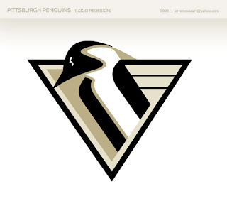
We'll begin with a cool new logo redesign for the Penguins.
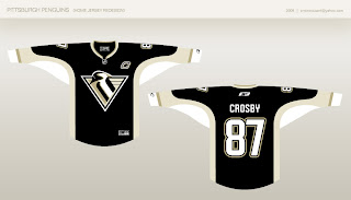
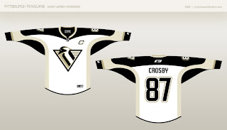
It's a really sharp logo that pays tribute to the past in a big way while also bringing something new to the table. There are also jerseys to go with it.
The black one doesn't do much for me, but oddly enough, the white one blows me away. I think it's the shoulder striping.
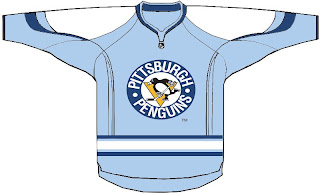
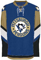
A likely third jersey candidate for the Pens going into next season is a version of the powder blue sweater they wore for the Winter Classic.
But stepping outside of that for a moment brings us some interesting designs. This dark blue strikes me as slightly strange, however.
And remember the days when gold was actually yellow (though no one wanted to admit it)? Well there's a little more where that came from.
We'll wrap up our Pennsylvania trip in Philly. Not much to speak of with this.
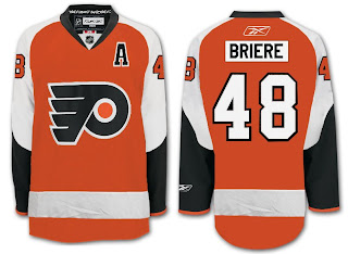
But one designer came up with a notion of what might well be a good candidate as an alternate for the Flyers next season.
They could do worse.






Reader Comments (11)
Grr, couldn't figure out how to edit my own comment. Anyways, the Pens one is very sharp. I had to look through the old logos http://www.sportslogos.net/team.php?id=24 to see the differences. I just wish they would go back to a brighter shade of yellow.
those last 2 pens concept are awesome.. i love the mix of the old circle logo and the newer one. plus i really like the blue and gold mix
Not crazy about that new logo, but you're right about the white jersey. Really sharp.
The black, blue, and gold is very cool! Much better than the bronzish gold they have now.
The first Pens set is pretty good, but the colours... well, they need colour! Give me some yellow or gold, not khaki or tan or whatever that is.
The first Penguins and last Flyers jerseys are excellent...as is the bright yellow jersey on Crosby.
I've always been more fond of the skating penguins, than the penguins stuck in triangles.
The logo looks like a Penguin with a broken neck.
Sorry. As a life long Pens fan, I don't approve of any of these designs.
I agree with demondg1.
The penguins neck is completely wrong as it hangs down. It makes the logo look weak, which is one of the last things you want a logo to say.
Some very nice design sensibilities -- but the way the penguin's beak reaches the triangle right at the edge is a bit awkward. I would extend the head out and past the triangle.
I personally am so glad they got rid of the old 90s bank penguin logo completely. It "jinxed" the team when they introduced it in 93 and they never won a cup since because of its stupidness.
All hail the Old School Pissed Off Skating Penguin!
agree with the general consensus here...
yellow > vegas gold > the tan/beige on this year's jersey's. that logo doesn't do it for me, and neither does 2 different shades of tan.
an interesting stat: the penguins now have an 18-game playoff winning streak without the "pigeon" adorning their jerseys. i personally think that logo looks great as a shoulder patch, but you can't argue with science.