NHLToL & GhettoFarmBoy Joining Forces!
 Thursday · May 1 · 2008 | 12:21 PM PDT
  33 Comments
 The big changes here at NHLToL are beginning. Today I'm announcing that this blog is partnering up with popular NHL concept artist GhettoFarmBoy (whose real name is Matt) to bring you some of the highest quality fan artwork around.
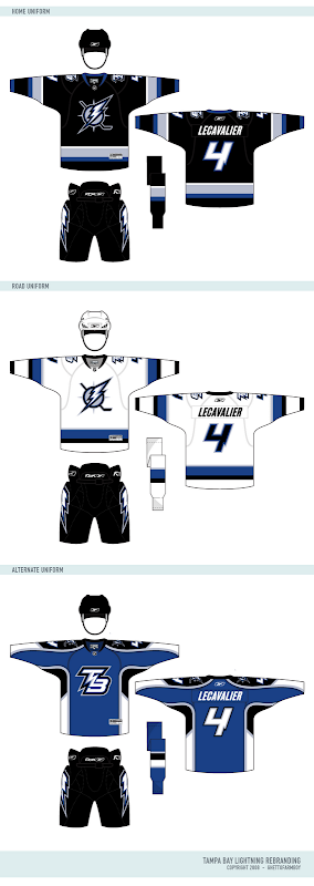
A lot of you have been big fans of his work for a long time and as of today, this blog is your official source for all of his work. I'm also using this post to unveil his most recent NHL rebranding set, featuring my team, the Tampa Bay Lightning.
But first, a message from Matt himself.
First off, I want to thank all the loyal readers who have for followed Chris's blog as well as my concept series. And of course, I would also like to thank Chris for running such a great site. I'm really going to enjoy being his partner in crime...
The reason I started the Rebranding the NHL series was to give the fans of NHL teams the logos and uniforms they deserve. I remember starting RtNHL shortly after the Buffalo Sabres introduced the "buffaslug", even though almost the entire fan base wanted a return (or something similar) to the retro identity. I wanted to see if I could do better job than the people doing the rebranding, and well, the rest is history...
By making this series an interactive fan experience, it allows RtNHL to fulfill it's purpose: give the fans what they want. Now, fans can guide the rebranding to what they would like see. You (the fans) will be able to choose which team to rebrand, the colors, the logos, almost anything!
But it doesn't stop there. Through all of Dave's hard work, you will soon be able to use my rebranding series in EA Sports NHL series. So not only will you be able to dictate your team's rebranding, but you can also play as you team with your logos and uniforms! You become, in a way, the owner of your team, which is actually true in som regards, because without you, there wouldn't be an NHL to begin with...
So be sure to stop by, participate, and voice your opinion!
Matt
Now check out the logos.
And the jerseys are killer.
I wish the Bolts could look this good. I especially like the blue third jersey.
What else is on the horizon?
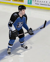
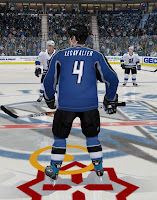
In his note, Matt mentioned that our friend Dave will be making these designs available to use in video games. Here are some samples of what that will look like.
I'll have more to come on this.
Also, I'm working on some other stuff as well. The blog is going to undergo a facelift. But before that, it's going to get a completely new identity. "NHL Tournament of Logos" just doesn't accurately describe this blog anymore. We've become so much more than that. In fact, there isn't even a logo tournament going on right now. Plus, the site's becoming well known for the concept art you guys send in. We need a title that's more appropriate and you guys are going to decide on it. If you have ideas, hold onto them. I'll be asking for submissions soon.
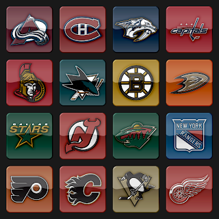
Plus, I'm going to start incorporating a new logo set that's vastly different from what is used now. You can see a sample below. I hope you guys like it.
Post your thoughts below and stay tuned over the next few days as I make more announcements.


Reader Comments (33)
i think that all of matt's work is amazing but how is he going to change classic jerseys and logos like the canadiens and rangers??
just wondering...
how do u do this
what progrma wow amazing!!!
Excellent logos - wow! Tampa Bay's logo look like crap. They should call you guys ASAP!
I'm not going to lie...those Lightning jerseys are the worst things I've ever seen. If they came out in that, I'd feel a little bit better about the Senators' awful 2D logo.
Man, I hate to be a buzz kill here, but I'm not a huge fan. They're well done, but the primary logo feels out of balance with only one stick. That would be a better secondary/teritary logo.
Really not a fan of the teritary logo. It's just another modern day logo, smashed into new mold with the Lightning colors (see Golden State). This style rules the day, which is why it's like everything all other teams come out with.
The TB with the lightning is close, might be a good secondary/teritary logo. THAT is different, like it.
Don't get me wrong, these are fantastically made, very professional looking, just trying to push Matt into even better, and hopefully away from the ordinary logos the Nike's of the world are churning out almost on a template basis.
As a man obsessed with the Tampa Bay Lightning, I have to say that Jay Feaster needs to be shown these designs and to impliment them ASAP! Great job!
The logos are AMAZING!!! Same goes for the jerseys.
Here are my thoughts on what the Lightning jersey/logo combinations should be. Let me know what everyone thinks:
First jersey: Ghetto's primary jersey design + current Lightning primary logo
Second jersey: Ghetto's secondary jersey + current Lightning primary logo
Third jersey (home alternate): Ghetto's third jersey + Ghetto's primary Lighting logo
Fourth jersey (away alternate): white version of Ghetto's third jersey + Ghetto's secondary Lightning logo
wow. this rivals the new stuff vinik and co just debuted