NHL Tournament of Logos

Entries in rebranding (15)

Wednesday
May282008

GFB Exclusive: Unused Lightning Marks

Earlier this month, I posted Matt's new Tampa Bay Lightning logos as part of his Rebranding The NHL series. They were met with much admiration. But there is a logo you haven't seen yet.

It was left out of the final design but as part of my partnership with Matt (aka GhettoFarmBoy), he's made some of his unused work available for your viewing pleasure.

I'm not sure what to make of it myself, so I'm looking forward to your comments. Post them below!

Don't forget, there's a Freak Out Friday coming at the end of the week. Get your wacky artwork in by tomorrow night if you want it included! Email me at nhllogos@gmail.com.

Tuesday
May132008

Poll: Guide GFB's New Rebrand

By about a 100 votes, you guys chose the Buffalo Sabres as the subject of Matt's concept series, Rebranding The NHL. The point of my partnership with him is to allow you guys to guide the direction of his work since, after all, this is for the fans anyway. You guys know what you want and Matt knows how to make it look great.

So as he gets started on creating a new look for the Sabres, let him know what color scheme he should go with. Do you want the royal blue, yellow and white of the '70s? Should it be the new navy, yellow, silver and white of the Buffaslug era? Would you want to see something more along the lines of what John Slabyk introduced with navy, gold and white? Or did you love the "goathead" era of blue, red, silver and white?


Place your vote and then feel free to leave a comment about your decision. Get your friends to drop in and vote too! The more voices heard, the more accurate the results!

This poll will close at 6 PM a week from today on Tuesday, May 20. So get your votes in now.

If you're thinking Matt should go with an entirely new color scheme or you have other suggestions regarding logos, uniforms, or the general direction of this new design, you can even email him directly at gfb_designs@yahoo.com.

Happy voting!

Wednesday
May072008

Get GFB Jerseys For NHL 08

When I first announced the partnership with Matt (aka GhettoFarmBoy), I told you you'd be able to download his designs to incorporate into your PC version of NHL 08. Below are the step-by-step instructions from Dave (who transferred the illustrations to be used in the video game).

—————

First of all, this is only for the PC version of the game. Xbox and Playstation, or any other system cannot be edited. You need a few things first. I will try to make this as simple as possible, but for first time game modders, it might be a little complicated.

To download anything from hockeydownloads.com, you must first be a registered member. You can view anything without registering, but again, to download, you must register.

Things Needed:
1. EA Sport’s “NHL 07” or “NHL 08” for PC.
2. NHLView - This is available here.
3. Tools for NHL08 - This is available here.
4. Any of my GhettoFarmBoy released jerseys - These are available here:
Devils | Islanders | Thrashers | Ducks

Now, what to do with what you have?

First, NHLView:
Once downloaded, just open up the nhlview.exe program.
- An “Open NHL Database” window pops up.
- Check “Static Database” and load “C:\program files\ea sports\NHL 08\db\db.viv”
(For NHL 07, use “C:\program files\ea sports\NHL 07\db\db.viv”)
- Check “Exibition Rosters Database” and load “my documents\NHL 08\exhibition.exh”
(For NHL 07, use “my documents\NHL 07\exhibition.exh”)
- Now click “Open”
- Once open, you have to change the jersey count as per my jersey installation instructions available on each jersey’s download page.
- To do this, click the “Teams” tab.
- Select your team you are editing
- Where it says “Number of Jerseys”, change as instructed on the installation page.
- Now, click somewhere else, anywhere else (important step or you cannot save it), then hit “Save”.

Now for the Tools for NHL08:
- Download this pack and unzip it to your “C:\program files\ea sports\NHL 08” folder.
(For NHL 07, it’s C:\program files\ea sports\NHL 07” folder.)
** Note** - These instructions are for Windows XP. Vista users need special steps as described on the Tools for NHL08 page.

- Now download any of my jersey files and unzip to your” “C:\program files\ea sports\NHL 08” folder.
(For NHL 07, it’s C:\program files\ea sports\NHL 07” folder.)
- Run the “.bat” file included with the jersey file as per instructed in the jersey’s installation instruction.
- Run the “Bimport08” file.

That’s it! As long as the person is using a legitimate copy of NHL 07 or NHL 08, everything should work, and the jerseys available when the jersey selection screen appears in game.

To see my thread on hockeydownloads.com, visit here.
For any other questions regarding add-ons, visit the forums.

I hope this all makes sense and is clear enough for everyone.

—————

If you have any problems with these instructions, unfortunately I would be completely unable to help you. Just visit Dave's page at Hockey Downloads and with any luck he'll be able to help you out. Enjoy!

Thursday
May012008

Matt's Next NHL Rebrand

I know you've barely had enough time to digest Matt's latest NHL rebranding, but he's already looking for your input on his next project. There's a new poll in the sidebar and he wants your voice to be heard! Vote for the Sabres, Blues or Stars to be the next victim of the Rebranding the NHL series.

Thursday
May012008

NHLToL & GhettoFarmBoy Joining Forces!

The big changes here at NHLToL are beginning. Today I'm announcing that this blog is partnering up with popular NHL concept artist GhettoFarmBoy (whose real name is Matt) to bring you some of the highest quality fan artwork around.

A lot of you have been big fans of his work for a long time and as of today, this blog is your official source for all of his work. I'm also using this post to unveil his most recent NHL rebranding set, featuring my team, the Tampa Bay Lightning.

But first, a message from Matt himself.

First off, I want to thank all the loyal readers who have for followed Chris's blog as well as my concept series. And of course, I would also like to thank Chris for running such a great site. I'm really going to enjoy being his partner in crime...

The reason I started the Rebranding the NHL series was to give the fans of NHL teams the logos and uniforms they deserve. I remember starting RtNHL shortly after the Buffalo Sabres introduced the "buffaslug", even though almost the entire fan base wanted a return (or something similar) to the retro identity. I wanted to see if I could do better job than the people doing the rebranding, and well, the rest is history...

By making this series an interactive fan experience, it allows RtNHL to fulfill it's purpose: give the fans what they want. Now, fans can guide the rebranding to what they would like see. You (the fans) will be able to choose which team to rebrand, the colors, the logos, almost anything!

But it doesn't stop there. Through all of Dave's hard work, you will soon be able to use my rebranding series in EA Sports NHL series. So not only will you be able to dictate your team's rebranding, but you can also play as you team with your logos and uniforms! You become, in a way, the owner of your team, which is actually true in som regards, because without you, there wouldn't be an NHL to begin with...

So be sure to stop by, participate, and voice your opinion!

Matt


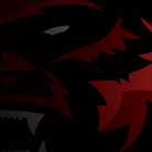
Now check out the logos.

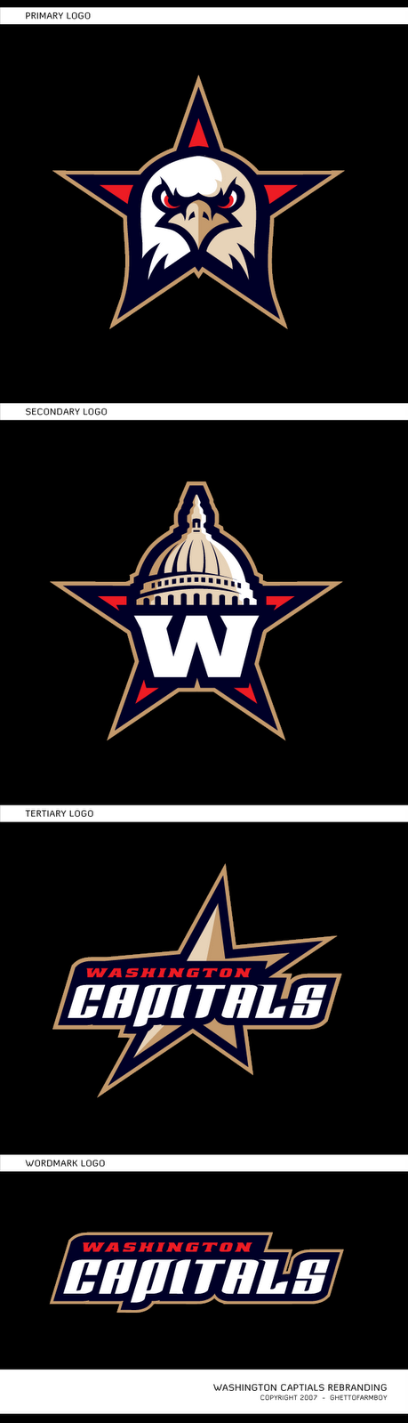
And the jerseys are killer.

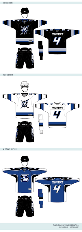
I wish the Bolts could look this good. I especially like the blue third jersey.

What else is on the horizon?

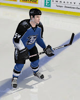
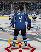
In his note, Matt mentioned that our friend Dave will be making these designs available to use in video games. Here are some samples of what that will look like.

I'll have more to come on this.

Also, I'm working on some other stuff as well. The blog is going to undergo a facelift. But before that, it's going to get a completely new identity. "NHL Tournament of Logos" just doesn't accurately describe this blog anymore. We've become so much more than that. In fact, there isn't even a logo tournament going on right now. Plus, the site's becoming well known for the concept art you guys send in. We need a title that's more appropriate and you guys are going to decide on it. If you have ideas, hold onto them. I'll be asking for submissions soon.

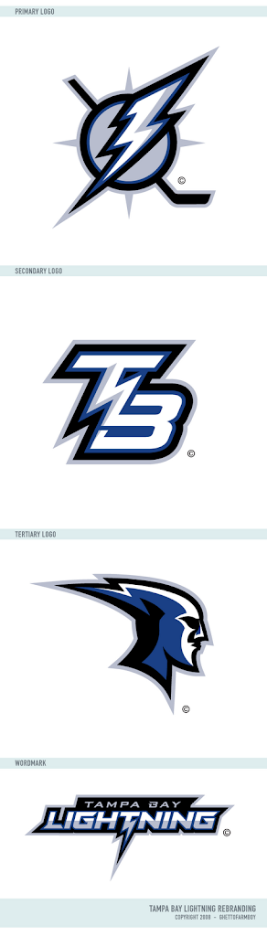
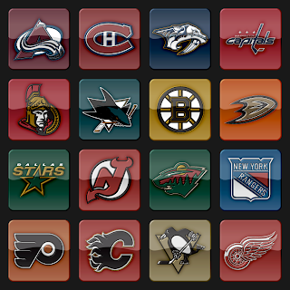
Plus, I'm going to start incorporating a new logo set that's vastly different from what is used now. You can see a sample below. I hope you guys like it.

Post your thoughts below and stay tuned over the next few days as I make more announcements.

Wednesday
Mar262008

New Rebrand On The Way

Thought I'd let you guys know our friend Matt is hard at work on his next rebrand. His series has impressed a lot of people and shown us in a dramatic way what many teams are missing in terms of good logo and uniform design.

Back to the point, though. His next team is... (drum roll)... the Tampa Bay Lightning. Yes, my team! Expect to see the design posted here some time in the next few weeks. In the meantime, feel free to check out his previous work.

Saturday
Dec082007

Rebranding The Devils

Continuing his rebranding of the NHL, our friend Matt has taken a shot at the look of the New Jersey Devils. He emailed me these images to share with the rest of you.

If you want my opinion, the logos look fantastic, but I think the current primary works too well to throw out altogether. So my suggestion (which I feel like I've made before) would be to swap the primary and secondary marks. I think the secondary here is a great update of the classic Devils logo. I'm also a fan of the wordmark.

These jerseys are another great update, but I couldn't be more impressed by the alternate uniform. That one really grabbed me first. While overall not as impressive as some of his previous work, these are some very sharp designs.

By the way, Matt went ahead and painted his home jersey onto Martin Brodeur. And while I normally wouldn't post a photo of Brodeur on my blog without a puck in the goal net behind him, I'll make an exception here.

Like I said, great logo, but it seems like it belongs more to a minor league team on the front of the jersey. Those black jerseys are my favorite.

By the way, Matt wanted me to let everyone know that if you'd like to contact him directly about his work, feel free to email him at gfb_designs@yahoo.com. Otherwise, leave your comments below for all of us to read.

UPDATE (6:34 PM): Hey guys, due to popular demand, I'm introducing a small new feature. You can now access all of the rebranding concepts by Matt (aka GhettoFarmBoy) by clicking on the link under NHLToL Series in the sidebar. Or by clicking here. I'm considering creating an album solely for his work in the Concepts Gallery.

Saturday
Dec012007

Devils Sneak Peek

I almost went all day without a new post, didn't I? My apologies for that. I was out of town all day and therefore away from my computer. I've been driving for most of the night so I don't have the wherewithal to write a lot right now. What I can offer is a sneak peek at Matt's rebranding of the New Jersey Devils. He emailed me a simple square to share with you all.

Apparently that's all we get for now. Expect to see his full designs some time soon.

Friday
Nov302007

Rebranding The Capitals

I got an email yesterday from the graphic artist we know as GhettoFarmBoy, responsible for the San Jose Sharks redesign I recently posted. His real name is Matt, by the way, and he's got a new rebranding concept that's been out for a little while. As I mentioned in that Sharks post, he said his next venture would be the Washington Capitals.

Prepare yourself.

The primary logo is awesome, but my favorite is the secondary. That is the best logo representation of the Capitol dome that I have ever seen. There's just so much about that logo that's right on the money. He just keeps outdoing himself, doesn't he?

And I couldn't be a bigger fan of the jerseys.

One of my favorite things is the gold accent color in the logo. But at the same time I think it's right that only red, white and blue were used in the uniforms. It's knowing when to stop that can make or break a design. I'll continue to say that any team would be lucky to wear a uniform or logo that looked this good.

And by the way, since it was brought up a while back, yes I would put these designs right on par with the likes of the Blues and Canadiens. Talk about making hockey look good.

I'm continually impressed. As it happens, Matt has informed me that his next project is the New Jersey Devils. He says he's nearly finished so I'm looking forward to being able to post that here very soon. I thought I'd finish off this post with something he wrote in his email to me.

I want to thank you for posting my concepts on your site. I sincerely appreciate all of your hard work putting together the site/blog. It's been a great resource for me and I will continue to visit it.

I'm so glad people are enjoying my concepts. As a young graphic designer (I just turned 18 a few months ago) it means so much that my designs are appreciated. I have never taken any design clases or anything of the sort, so when I hear a compliment like "fire reebok and hire this guy" it makes my day....

Sunday
Nov252007

Rebranding The Sharks

Yesterday we got a look at some first class concept art. And afterward I promised some more from a designer we've all come to think very highly of. He's been on a mission to rebrand the NHL and teams he's already seen to include the Islanders, Thrashers, Senators and Bruins. Most recently, his work on the Panthers and Ducks has been stunning.

Now, he's taken on a new challenge. Witness the rebranding of the San Jose Sharks.

The logo set is unbelievable. It's different yet recognizable in that it's mainly an upgrade of the old logo — essentially what the Sharks did over the summer, anyway.

My personal favorite is the secondary mark. That by itself, should be the primary. The wordmark is notably nice as well, but it's the fin logo that I think is spot on. That's why the alternate jersey here is the one that gets my vote.

And that's not to say I don't love the other two jerseys. Even the lettering and numbering is pitch perfect if you ask me. This design shows that while it makes a nice accent, the orange isn't necessary at all. You can achieve an amazing look with just the teal, black and silver. We can only hope that one day any team looks as good as this.

Finally, there was a slight change the designer made before unveiling his design. Take a look.

The logo on the left is the one he ultimately went with but I certainly see the validity of the other one. It adds more color to the shark, yes, but it's not entirely necessary since the triangle behind the shark is teal (as opposed to white).

I'm very interested in seeing what you guys have to say about this latest design by GhettoFarmBoy, as he is known. He says his next rebrand will focus on the Washington Capitals. No word yet on when we should expect to see it. I, for one, am looking forward to it.