NHLToL & GhettoFarmBoy Joining Forces!
 Thursday · May 1 · 2008 | 12:21 PM PDT
  33 Comments
 The big changes here at NHLToL are beginning. Today I'm announcing that this blog is partnering up with popular NHL concept artist GhettoFarmBoy (whose real name is Matt) to bring you some of the highest quality fan artwork around.
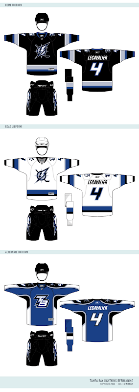
A lot of you have been big fans of his work for a long time and as of today, this blog is your official source for all of his work. I'm also using this post to unveil his most recent NHL rebranding set, featuring my team, the Tampa Bay Lightning.
But first, a message from Matt himself.
First off, I want to thank all the loyal readers who have for followed Chris's blog as well as my concept series. And of course, I would also like to thank Chris for running such a great site. I'm really going to enjoy being his partner in crime...
The reason I started the Rebranding the NHL series was to give the fans of NHL teams the logos and uniforms they deserve. I remember starting RtNHL shortly after the Buffalo Sabres introduced the "buffaslug", even though almost the entire fan base wanted a return (or something similar) to the retro identity. I wanted to see if I could do better job than the people doing the rebranding, and well, the rest is history...
By making this series an interactive fan experience, it allows RtNHL to fulfill it's purpose: give the fans what they want. Now, fans can guide the rebranding to what they would like see. You (the fans) will be able to choose which team to rebrand, the colors, the logos, almost anything!
But it doesn't stop there. Through all of Dave's hard work, you will soon be able to use my rebranding series in EA Sports NHL series. So not only will you be able to dictate your team's rebranding, but you can also play as you team with your logos and uniforms! You become, in a way, the owner of your team, which is actually true in som regards, because without you, there wouldn't be an NHL to begin with...
So be sure to stop by, participate, and voice your opinion!
Matt
Now check out the logos.
And the jerseys are killer.
I wish the Bolts could look this good. I especially like the blue third jersey.
What else is on the horizon?
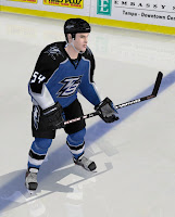
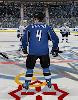
In his note, Matt mentioned that our friend Dave will be making these designs available to use in video games. Here are some samples of what that will look like.
I'll have more to come on this.
Also, I'm working on some other stuff as well. The blog is going to undergo a facelift. But before that, it's going to get a completely new identity. "NHL Tournament of Logos" just doesn't accurately describe this blog anymore. We've become so much more than that. In fact, there isn't even a logo tournament going on right now. Plus, the site's becoming well known for the concept art you guys send in. We need a title that's more appropriate and you guys are going to decide on it. If you have ideas, hold onto them. I'll be asking for submissions soon.
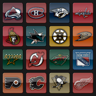
Plus, I'm going to start incorporating a new logo set that's vastly different from what is used now. You can see a sample below. I hope you guys like it.
Post your thoughts below and stay tuned over the next few days as I make more announcements.


Reader Comments (33)
Wow!!! Not expected at all! Those jerseys and logos are very nice, maybe the best so far.
Also, is this it for today? Is the rest of the stuff coming in the days to come?
Matt, That Primary Logo for the Lighting looks like one of the Best You've produced. But What's with the Teritary Logo?
Can't wait to see what comes next, Chris.
I look forward to the evolution of your blog Chris.
Matt...great work on the designs. I love the new primary and think the "Mercury" teritary is brilliant and would love to see that on the third jersey instead of the TB logo, which is the only one that leaves me wanting a bit more - although still leaps and bounds better than what the Lightning currently have.
Chris...very cool news indeed and I'm really excited to see where things go!
OMG!!!!! i have fallen even more in love with this site!! i've visited this site everyday and i havent been disappointed yet!!! now i want to get NHL 08 for my computer now that can use Matt's designs!! thank you so much!
OMG
SICK!!!! CHANGES
wow!!!
The tampa jerseys are so nice
I hope you can do the same with oilers jerseys
The logo looks great on the uniform redesign. Good stuff. Maybe we can get Oren Koules (or whoever the next owner will be) to take a look at these designs.
Love the TB logo and jerseys... the best yet and Matt should be contacted by the new owners (are there any yet) as soon as they get their mitts on the team.
Great news about the site and I'll definitely put my thinking hat on in regards to your new name AND... I can't wait to see the logo that Matt comes up with then.
Keep up the great work!
Why have the logos been made to look 3D? Not a fan of that as it doesn't accurately represent the logos.
Good luck with all the changes and thanks for the last year.
post your templates
i'm definitely gonna miss the whole friendly neighbourhood blog feel .... but i guess that's what happens when sites get too big .... of course, im still gonna visit the site.
wow just have to say that i appreciate all the energy you guys have been putting into this site. and making the designs available for NHL 08 is a very nice touch.
TB rebrand is awesome. THANKS MATT for taking the wordmark out of the logo! it never seemed right there.
sample logos seem a little dark
The tertiary TB logo is awesome! I would have never thought of such a great logo for a team whose name does not allow for much of flexibility. WOW!
matt-sick designs, but I just can't see them working for some reason.
but still, good work. I sincerely hope you keep it up.
and as far as changing up the blog into whatever its going to be, just please don't let the apple fall too far from the tree, this is an incredible blog which gained so much popularity and momentum moving forward and I really do hope that any changes don't f*** that up
LOVE the home and road jerseys. They actually look like HOCKEY jerseys unlike most of the "Edge" monstrosities. I can deal with the "Edge" look for a 3rd jersey. They're supposed to be a little out there. I have to agree with Michael that the 3rd would look better with Mercury on them rather than the initials, although the TB looks great as a shoulder patch.
I liked the old logo sets better...the new one seems to have all the colors washed out of it.
The primary logo is the best I've ever seen for the Lightning (which isn't saying much). But is that a compass in the background? Why?
The new logo style looks cool, but it also changes the appearance of the logos. If we're going to be voting on their artistic merit I think they should be represented as accurately as possible.
The new logo style looks cool, but it also changes the appearance of the logos. If we're going to be voting on their artistic merit I think they should be represented as accurately as possible.
I think I agree with you guys on this. I'll probably scrap this idea and go back to the drawing board. I still do want to update the graphics though. I'll probably have something new for you in the next few days.
Okay... after a busy day of finals, I finally have time to explain and answer questions....
Primary Logo: Some of the obvious changes include no text, nor florida map, but the addition of a hockey stick and sun rays... yes, its supposed to be a sun, with the bolt and the hockey stick completing the other four points.... Another reason for the spikes or rays (whatever) is that I just think they look cool...
Secondary Logo: I'm suprised that you guys haven't picked up on it... yes, there is the "T" and "B" and lightning bolt, but there is also an "L" found between the "T" and "B". So you have Tampa Bay Lightning with a lightning bolt all rolled into one neat little package... i thought it was pretty ingenius myself....
Tertiary Logo: Oh, how can I explain this? Well, I originally wanted to do a Thor-type logo for the Bolts, but I never liked anything I came up with. So then I moved onto a superhero (the Flash) but that fell apart somewhat too (though this guy looks like him a little bit). Finally, I came up with this guy. he's based off of Mercury, the messenger of the Roman gods. I figured that this would be a clever way to incorporate something else besides a lightning bolt...
The Uniforms: I talked to numerous Lightning fans, and after talking to them, I felt that the best way to go for the home and away was a simpler design. The Lightning have always had rather simple uniforms, so I decided to continue the trend. Call me crazy, but I loved those rainstorm jerseys they used to wear. While I didn't bring those back, I did go with a more modern design that would bring back memories of those uniforms....
The Numbers: I wanted to bring back bolt-inspired numbers, so I made a custom number set. It isn't as crazy as the bolt numbers of the past, but it fits the jerseys nicely... I'll post a pic of them when I have a chance later...
Chris...
I agree, your new logo set looks a little murky. Not much contrast in them, so its hard to see what's what in each logo. I've always liked your big, bright, clean logo plates you've had all along. its one of my favorite things about the site.
Matt...
Been a fan of your work since Atlanta. Love the new Tampa logos. My personal feeling is that the primary has shades of a secondary logo vibe (see Panthers), but totally forgivable. Its great in all other aspects. I especially like that i get a slight nautical feel from it, which is great being that its Tampa Bay (you know, pirates and all that). Not so keen on the Bolthead-superhero dude though.
Looks great, Chris. I'm also digging the new number font, although it does look a little thick to me. I'll have to see some of Dave's in-game shots to see the effect for myself.
Once again, great job! And, oh yeah - do the Sabres next. :P
Wow...that is simply outstanding. Blows Boston out of the water.
Why are not some of these guys getting paid serious cash to re-branding these teams for real?
matt....those designs are amazing. All 3 logos are sick. I would've loved to see the teritary logo on the third jersey, but it looks sick regardless. The only thing is that i think the jerseys should still have those stripes in the under arm area like the team has the now, and had them on their older jerseys.....hopefully the lighting will give you a call asap to make them look like a real team
Is that in NHL 09? I know it's not 08 cause of that icon at Lecavalier's feet. If it is 09, wow, even more things to look forward to! Great job.