Speaking Of The Sabres...
 Tuesday · May 13 · 2008 | 2:47 PM PDT
  18 Comments
 First thing: don't forget to vote to help Matt choose the color scheme for the Sabres rebranding. Second: I have Buffalo concept art to go along!
I know you guys have been eagerly awaiting the new batch of concept art and I apologize for the delay. I've been focusing my attention on the launch of Icethetics. I'm anticipating having it ready at some point in the next few weeks. At some point I should probably explain how that's going to work but that's not what this post is about.
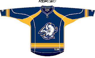
We've got a very nicely designed blue sweater there with the old "goathead" logo on the chest. Nice color/logo mix there but probably not something we're apt to see at any point the future.
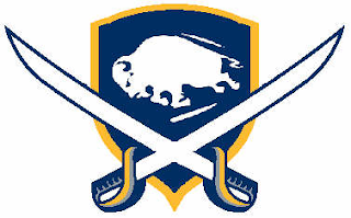
We've also got a nice shield which accents the "sabres" part of the design a little better.
And this would be a great throwback concept if Buffalo didn't already have the perfect vintage jerseys with the 1970s look.
Then, going totally off the beaten path is one of the coolest looking jersey concepts I've seen in a long time.
I know it's out there and it's contrast makes it difficult to place as a home or road sweater, but I love this idea. It's done so well. The design is based off of a logo created by John Slabyk.
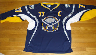
All of these make for great artwork but will likely never see the light of day. However, that hasn't stopped a few fans from making their dreams come true. Recently, if you did an ebay search, you might have come across this gem.
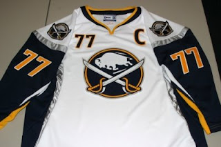
You could even find it in white.
I'm not sure that what you see here is available anymore or even legal under copyright laws. But it's a beautiful design and I'd be willing to bet there are countless Sabres fans who would die for that logo to don that jersey on NHL ice.
So I hope you guys enjoyed the return of the concept art. I plan to have more up this week. You guys have been submitting some really great work! And stay tuned for a Freak Out Friday at the end of the week!


Reader Comments (18)
whaaaat
that buffalo head jersey is AWESOME.
the nhl should do like the MLB did in 99. 'turn ahead the clock night' i think that would be buffalo's jersey forsure.
Two things:
I would die to see those vintage-esque jerseys be the team's sweaters...even with the 1970 thing. Those jersey's scream "class" and "epic win!"
Also, that buffalo head jersey is OMGZ. Honestly, that's the only way I can think of to articulate how I feel about it. That, too, is epic win.
I think I'm in love with those designs...
The buffalo head on is SICK!!!!!!
these are one of the best sabres concepts EVER!!!! and the one with the buffalo head is INTENSE!
that buffalo head is badass. I can even imagine it saying, "don't f*** with buffalo."
those 'real' jerseys are awesome. if the sabres used them, it would be the BEST jerseys in the NHL...sports!
i like the buffalo head one, too.
I should hate that Buffalo head concept jersey... but I don't. It's just so bizarre that it's awesome. lol
I like how Cody Brown compared the Buffalo Head to the 99' turn ahead the clock night'. If you think of the jersey in that sense, it rocks.
Definitely like all the concept and logos presented, particularly the number 77 jerseys which both are hanging in my closet oddly enough with the team's managing partner. I waiting for him to come out of there any day now...
Some awesome stuff here.
For those not in tune with the Sabres logo disaster it was quoted by Buffalo management that during the process they were told by the NHL or RBK a circular logo like the classic or a variant "would not work" in the re-design of the jersey. The reason has pretty much been nailed down to the early RBK Edge System initiative of tucking in the jerseys and setting off the whole form fitting trend.
The result, swooshy logos, cookie cutter templates, Football jersey piping,a play-dry gimmick fabric, and shirt tails on hockey jerseys. It was too late in the Edge sysetem's design time table to start over so teams that rebranded one year prior like the Ducks and Sabres with their slim logos had to stick to the Edge friendly design.
Either the owners or NHLPA rejected the tuck-in idea...So what do the Sabres have to hide behind? Blame RBK and go back to the drawing board. It cost $200,000 for them to rebrand, do it again right this time and sell scores more merchandise that the slug could ever bring in...even with a winning or losing team.
i have an angels jersey from the 'turn ahead the clock' night. it is soo ugly. but SOME of those jerseys did look good. like san fransiscos.
but still. maybe i'll mess around with some 'turn ahead the clock' stuff..
saying a circular logo would not work is the dumbest thing i have ever heard..
if you look at some of the logos out now on the rbk jerseys, alot have a circular feel to it.
boston, calgary, carolina, edmonton, islanders, canadiens, senators, canucks.
talk about a cop out... im with you charlie, i hope one day the jerseys on sabres not slugs will be in the nhl. one day.
im sure you've petitioned and everything right?
Thanks for the nice comments about my concepts. I'm glad that Chris pointed out that the "head" came from one of John's designs. I actually compressed it vertically to make it a little fatter (less goat, more buffalo) for another concept. I was really happy with how the horns came out and how this jersey, in general, turned out.
Surprisingly, my throwback logo was not influenced by one of John's (unless it was subconsciously), though he does have a very similar logo (even had the Sabres and 1970). I just wanted to get the old buffalo on the red third jersey logo. Taking some influence from the SabreSpace.com logo and a little of the Wild jersey, this is what I came up with.
Oops, I should have pointed out that only the throwbacks and the buffalo head third are mine.
i cant find those jerseys anywhere on ebay anymore!
OMG what a shock this morning. The 1970 jersey is absolutely incredible. The head is Kickass.
Why the slug god?
"Why the slug god?"
Because me Larry Quinn am smarter than all you dumb peepulz in BuffLo.
i know i know
everyone likes the head jersey
i dont like it
im soory carpandean it must have spent alot of time to make
im just not a fan of it
o and i made the first one with the goathead(the 2nd jersey i EVER made)
look for designed by mykl
thats me