Back To The Canucks
 Tuesday · May 20 · 2008 | 1:24 PM PDT
  12 Comments
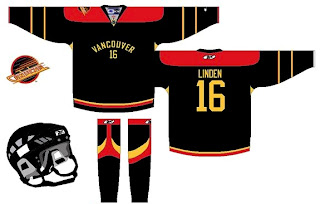
 It occurs to me I haven't posted any Vancouver Canucks concept art lately. Figured I ought to rectify that.
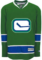
This design or a version of it has been floating around for a while as a dream third jersey for the Canucks. Unfortunately, the rumors have the stick-in-rink logo on the chest of the new alternate. On that same tack, how about another green one?
It's hard to deny they would look good in green. Or somebody would. Between the Stars and Wild, it's almost like someone in the NHL is deathly afraid of the color.
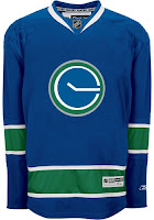
But if neither that nor the stick-in-rink is your cup of tea, how about stick-in-pond? A perfectly circular pond, that is.
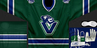
There are even some folks partial to the good ol' whale — with the new colors.
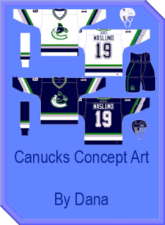
Or you could just go way back and mess with everything.
I think we can safely count that one out as a potential third sweater contender.
More to come this week. And by the way, the images above, as with all images posted here, are the work of readers like you. To have your work posted on the blog for all to see, email it to me at nhllogos@gmail.com.



Reader Comments (12)
I'm actually kind of fond of the first design. Classy and very...green. Makes you think of spring time.
I like the green stick-in-rink, but I would prefer the original stick-in-rink over the new one.
What program is used to make the first jersey? i would really like to know.
Please email me at strentacosta09@yahoo.com
I want some more Greeen.
I absolutely love the green Johnny Canuck V sweaters. Very sharp indeed. Rumours are only rumours. I firmly believe that the Johnny Canuck V will be on the third sweaters. It is already on souvenir white hockey sticks. The modified Stick 'n Rink logo will not sell even half as well as the Johnny Canuck logo. The truth is, is that the Johnny Canuck V logo was supposed to be our new crest, but due to legal and financial issues in relation to trademark rights at the time, the Canucks were forced to keep the orca and therefore added the 'Vancouver' wording just to "tone down" the orca. Let's hope the Canucks do the right thing for once: Go with Johnny Canuck.
that stick-in-pond looks like wall clock... quarter past ten, eh?
That last concept is pure beauty.
I'd love to see Johnny Canuck on the third sweater too...
And the stick in pond? Can you say 10:15?
Ahhh! Chris! For the love of PETE!! PLEASE, PLEASE, NO MORE DIAPER EFFECT CONCEPTS!!
a green canucks jersey would be cool...if only we could put a sweet logo like the hartford whalers one on it...go vancouver whalers
Hey Chris, if we are looking at teams you havent posted in a while, the last time you posted flyers concepts was back in december.
Hey Chris, if we are looking at teams you havent posted in a while, the last time you posted flyers concepts was back in december.
Actually it was March. http://nhllogos.blogspot.com/2008/03/third-jersey-ideas.html" REL="nofollow">Here and http://nhllogos.blogspot.com/2008/03/lfv-day-6-last-day-in-canada.html" REL="nofollow">here. Oh, and http://nhllogos.blogspot.com/2008/01/concepts-in-photos.html" REL="nofollow">January too. But really I just go with whatever I have ready at the time.