Albertan Art
 Sunday · May 25 · 2008 | 4:17 PM PDT
  4 Comments
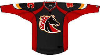
 No new poll today (first time in weeks, I know). Instead I've got concept art all for our favorite two clubs from Alberta. We'll start in Calgary and work our way north.
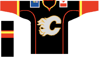
It's a flaming horse. I was a fan of the original black third jersey, but I'm not so sure on this one. Especially on a black sweater. But speaking of black sweaters, one might make for a nice, if not predictable third jersey.
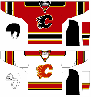
This one's even got the provincial and national flags on the shoulders. But if your tastes are more suited to the traditional striping patterns, well we've got that as well — in red and white.
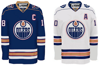
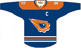
Next we head to Edmonton for a nice pair of jerseys.
The secondary on the shoulders of the white one is cool. But both of them work really well and have stripes that are actually stripes.
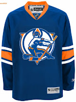
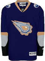
In this next set, we reintroduce the rigger in an updated version of the original logo as well as revisiting the old third jersey.
Believe when I tell you it could be worse. And if you don't, here's proof.
That thing should definitely always be silver. Never orange. Ever.
The next poll in the Goalie Mask tourney is coming up tomorrow. It's Luongo against the winner of the Fleury-Theodore match-up. At the moment, Fleury is ahead. Enjoy what's left of your long weekend — for those of you not in Canada.



Reader Comments (4)
HAHAHA
The first OILERS one is MINE!!!
i like the classic looking flames jerseys. very classy looking
although the current flames jerseys are a bit too busy, i don't really mind them (save the flags).
i also kind of like the horse logo concept. it does remind me of a knight's piece and is very similar to the poorly executed pistons logo from the 90's
The red flames one looks like a dEVILs jersey.